CSS基础知识---扫盲必备~~~
文章目录
- 什么是 CSS
- CSS的基本规则
- CSS的引入规则
- 内部样式
- 外部样式
- 内联样式
- 选择器
- 标签选择器
- 类选择器
- id选择器
- 通配符选择器
- 后代选择器
- 子选择器
- 并集选择器
- 伪类选择器
- 元素属性设置
- 字体属性
- 文本属性
- 背景属性
- 圆角矩形
- 块级元素和行内元素
- 盒模型
- 块级元素的水平居中
- 浏览器默认样式的去除
- 弹性布局
什么是 CSS
CSS:即 Cascading Style Sheets,层叠样式表,它是一种用来表现html或xml等文件样式的计算机语言;通过使用CSS,可以精确控制网页中元素的位置及样式,使页面更加美观。
CSS的基本规则
- CSS在html文件中的书写位置是在style标签中;
- html对style标签的位置没有特殊规定,即可以是页面的任意位置,一般习惯放在head标签内;
- style标签中的代码就是CSS的,必须遵循CSS的语法规则;
- CSS不区分大小写,但一般默认使用小写字母;
- CSS中的冒号之后一般带有一个空格;
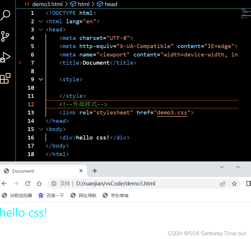
CSS的引入规则
内部样式
即在html文件的style标签中:
<!DOCTYPE html>
<html lang="en">
<head>
    <meta charset="UTF-8">
    <meta http-equiv="X-UA-Compatible" content="IE=edge">
    <meta name="viewport" content="width=device-width, initial-scale=1.0">
    <title>Document</title>

    <style>
        div{
            color: blue;
            font-size: 30px;
        }
    </style>
</head>
<body>
    <div>hello css!</div>
</body>
</html>
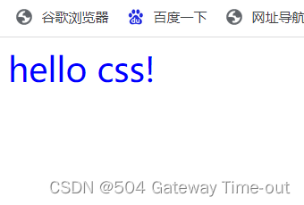
外部样式
外部样式即首先在当前html文件外创建一个CSS文件,然后使用link标签引入这个CSS文件;
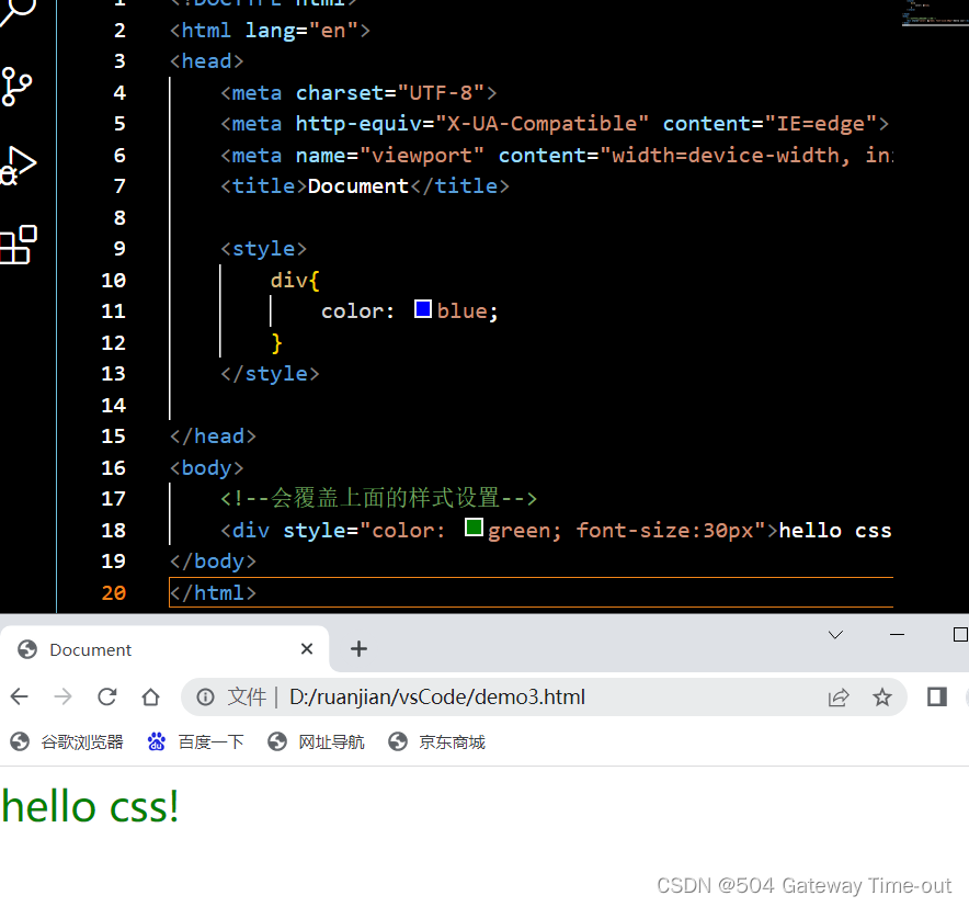
内联样式
即在元素中使用style标签,写入CSS内容:
<!DOCTYPE html>
<html lang="en">
<head>
    <meta charset="UTF-8">
    <meta http-equiv="X-UA-Compatible" content="IE=edge">
    <meta name="viewport" content="width=device-width, initial-scale=1.0">
    <title>Document</title>

    <style>
        div{
            color: blue;
        }
    </style>

</head>
<body>
    <!--会覆盖上面的样式设置-->
    <div style="color: green; font-size:30px">hello css!</div>
</body>
</html>
选择器
CSS中的选择器分为基本选择器和复合选择器,首先是基础选择器:
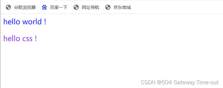
标签选择器
<!DOCTYPE html>
<html lang="en">
<head>
    <meta charset="UTF-8">
    <meta http-equiv="X-UA-Compatible" content="IE=edge">
    <meta name="viewport" content="width=device-width, initial-scale=1.0">
    <title>Document</title>

    <style>
        div {
            color: blue;
            font-size: 20px;
        }
        p {
            color:aqua;
            font-size: 20px;
        }
    </style>

</head>
<body>
   <div>hello world !</div>
   <p>hello css !</p>
</body>
</html>
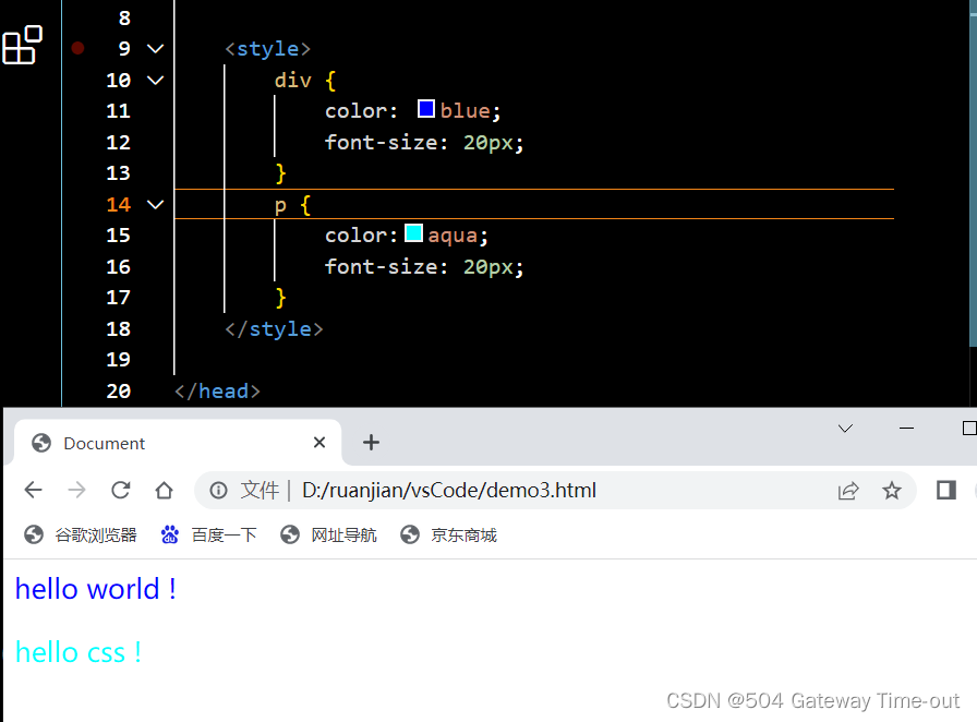
使用标签选择器可以同时对同一类型的标签进行选择,来同时设置同类型标签内容的样式;
但是标签选择器会带来的问题是,无法进行差异化选择,因此引入了类选择器;
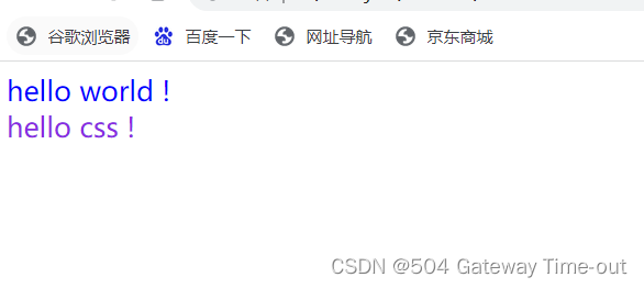
类选择器
<!DOCTYPE html>
<html lang="en">
<head>
    <meta charset="UTF-8">
    <meta http-equiv="X-UA-Compatible" content="IE=edge">
    <meta name="viewport" content="width=device-width, initial-scale=1.0">
    <title>Document</title>

    <style>
        .one{
            color: blue;
            font-size: 20px;
        }
        .two{
            color: blueviolet;
            font-size: 20px;
        }

    </style>

</head>
<body>
   <div class="one">hello world !</div>
   <p class="two">hello css !</p>
</body>
</html>
类选择器是以点 . 开头,后面是类选择器的名称,名称任意;
调用类选择器时,使用class属性;
一个类选择器可以被多个标签使用,一个标签中也可以有多个类选择器,中间以空格隔开;
使用类选择器可以进行差异化选择;
id选择器
<!DOCTYPE html>
<html lang="en">
<head>
    <meta charset="UTF-8">
    <meta http-equiv="X-UA-Compatible" content="IE=edge">
    <meta name="viewport" content="width=device-width, initial-scale=1.0">
    <title>Document</title>

    <style>
        #one{
            color: blue;
            font-size: 20px;
        }
        #two{
            color: blueviolet;
            font-size: 20px;
        }

    </style>

</head>
<body>
   <div id="one">hello world !</div>
   <div id="two">hello css !</div>
</body>
</html>
id选择器以#开头;
调用id选择器时使用id属性;
id作为一种身份标识,不可以被多个标签共同使用;
通配符选择器
<!DOCTYPE html>
<html lang="en">
<head>
    <meta charset="UTF-8">
    <meta http-equiv="X-UA-Compatible" content="IE=edge">
    <meta name="viewport" content="width=device-width, initial-scale=1.0">
    <title>Document</title>

    <style>
       * {
        color: red;
        font-size: 50px;
       }
    </style>

</head>
<body>
    <div>好好学习,天天向上</div>
</body>
</html>
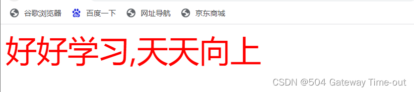
使用通配符选择器,可以选择所有标签进行设置;
下面是复合选择器:
复合选择器是对基础选择器的组合;
后代选择器
<!DOCTYPE html>
<html lang="en">
<head>
<meta charset="UTF-8">
<meta http-equiv="X-UA-Compatible" content="IE=edge">
<meta name="viewport" content="width=device-width, initial-scale=1.0">
<title>Document</title>
<style>
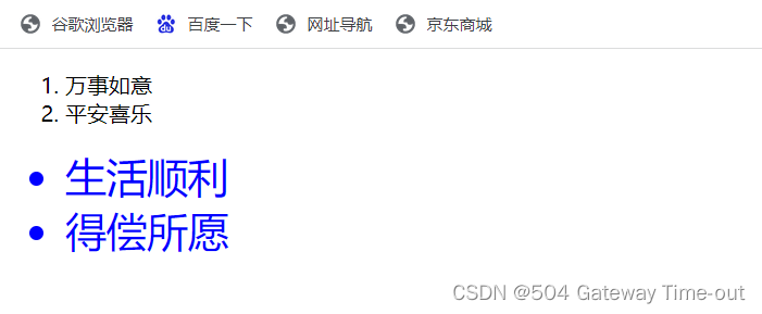
ol li {
color: blue;
font-size: 30px;
}
</style>
</head>
<body>
<ol>
<li>万事如意</li>
<li>平安喜乐</li>
</ol>
<ul>
<li>生活顺利</li>
<li>得偿所愿</li>
</ul>
</body>
</html>
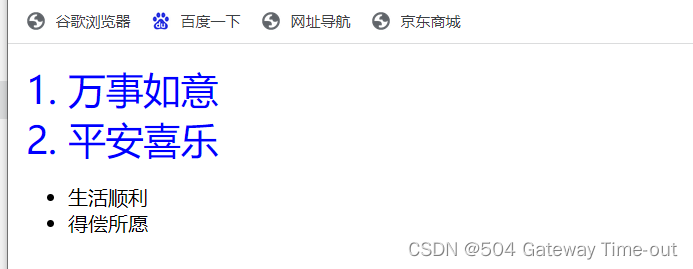
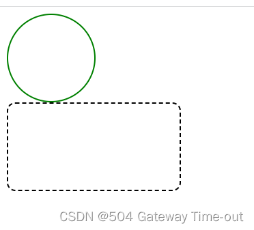
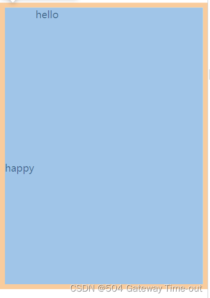
后代选择器,即选择一个元素的某个子元素,也可以选择这个子元素的子元素;
两个元素之间要有空格隔开,否则不构成后代选择器;
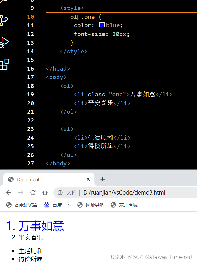 如上图,红色方框的位置必须有空格,否则不构成后代选择器,设置就不会生效;
子选择器
<!DOCTYPE html>
<html lang="en">
<head>
<meta charset="UTF-8">
<meta http-equiv="X-UA-Compatible" content="IE=edge">
<meta name="viewport" content="width=device-width, initial-scale=1.0">
<title>Document</title>
<style>
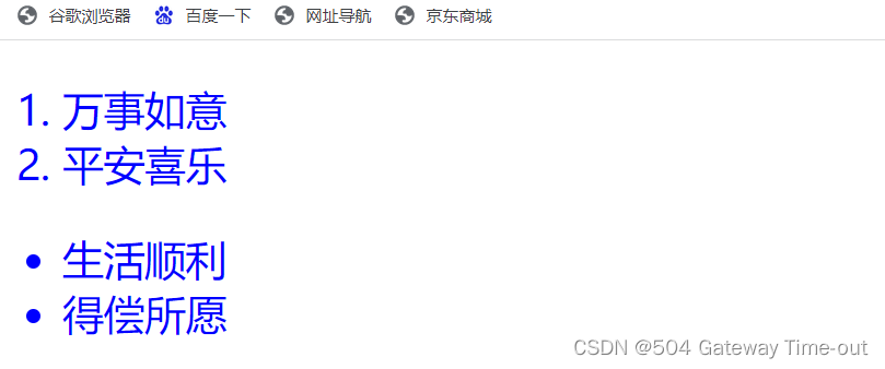
ul>li {
color: blue;
font-size: 30px;
}
</style>
</head>
<body>
<ol>
<li>万事如意</li>
<li>平安喜乐</li>
</ol>
<ul>
<li>生活顺利</li>
<li>得偿所愿</li>
</ul>
</body>
</html>
子选择器与后代选择器基本相同,但是子选择器只能选择某个元素的子类元素,对子类元素的子类元素不生效;
使用大于号来分隔元素与子元素
并集选择器
<!DOCTYPE html>
<html lang="en">
<head>
    <meta charset="UTF-8">
    <meta http-equiv="X-UA-Compatible" content="IE=edge">
    <meta name="viewport" content="width=device-width, initial-scale=1.0">
    <title>Document</title>

    <style>
       ul,ol {
        color: blue;
        font-size: 30px;
       }
    </style>

</head>
<body>
    <ol>
        <li>万事如意</li>
        <li>平安喜乐</li>
    </ol>

    <ul>
        <li>生活顺利</li>
        <li>得偿所愿</li>
    </ul>
</body>
</html>
并集选择器适用于多组标签同时设置;
并集选择器的元素之间使用逗号分隔;
伪类选择器
关于css的伪类选择器实际有多种类型,这里只简单的介绍2种:
<!DOCTYPE html>
<html lang="en">
<head>
    <meta charset="UTF-8">
    <meta http-equiv="X-UA-Compatible" content="IE=edge">
    <meta name="viewport" content="width=device-width, initial-scale=1.0">
    <title>Document</title>

    <style>
       div:hover{
        color: red;
       }

       p:active{
        color: aqua;
       }
    </style>

</head>
<body>
    <div>hello css!</div>
    <p>hello world!</p>
</body>
</html>
标签名:hover,当鼠标悬停在元素上时,生效;
标签名:active,鼠标按下但未弹起时生效;
元素属性设置
字体属性
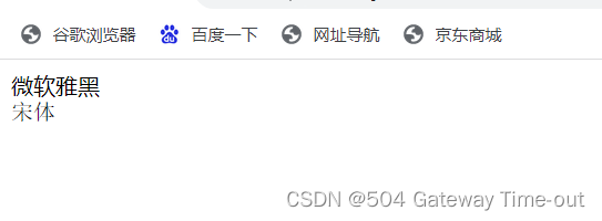
字体样式设置:font-family属性
<!DOCTYPE html>
<html lang="en">
<head>
    <meta charset="UTF-8">
    <meta http-equiv="X-UA-Compatible" content="IE=edge">
    <meta name="viewport" content="width=device-width, initial-scale=1.0">
    <title>Document</title>

    <style>
       .one {
        font-family: 'Microsoft YaHei';
       }

       .two {
        font-family: '宋体';
       }
    </style>

</head>
<body>
    <div class="one">微软雅黑</div>
    <div class="two">宋体</div>
</body>
</html>
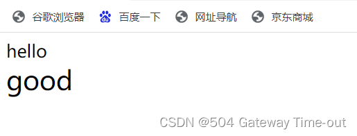
设置字体大小:font-size属性;
<!DOCTYPE html>
<html lang="en">
<head>
    <meta charset="UTF-8">
    <meta http-equiv="X-UA-Compatible" content="IE=edge">
    <meta name="viewport" content="width=device-width, initial-scale=1.0">
    <title>Document</title>

    <style>
       .one {
        font-size: 20px;
       }

       .two {
        font-size: 30px;
       }
    </style>

</head>
<body>
    <div class="one">hello</div>
    <div class="two">good</div>
</body>
</html>
字体粗细:font-weight:
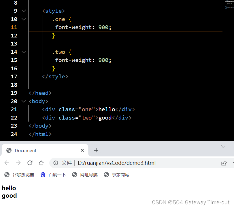
字体粗细可以使用font-weight来设置;
字体粗细可以使用数字来表示,取值范围为100-900;
当设置为normal,表示不加粗;
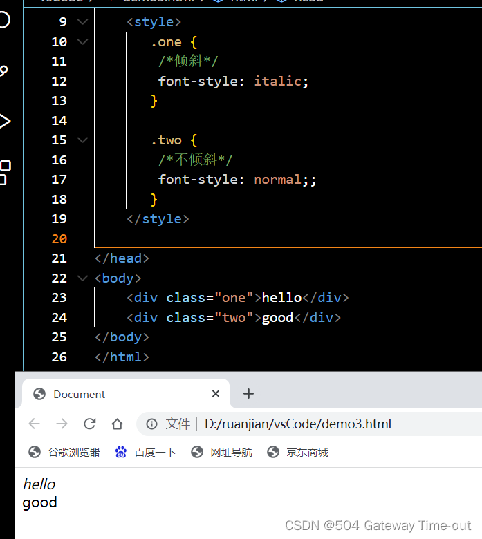
字体倾斜:font-style
 <style>
       .one {
        /*倾斜*/
        font-style: italic;
       }

       .two {
        /*不倾斜*/
        font-style: normal;;
       }
    </style>
文本属性
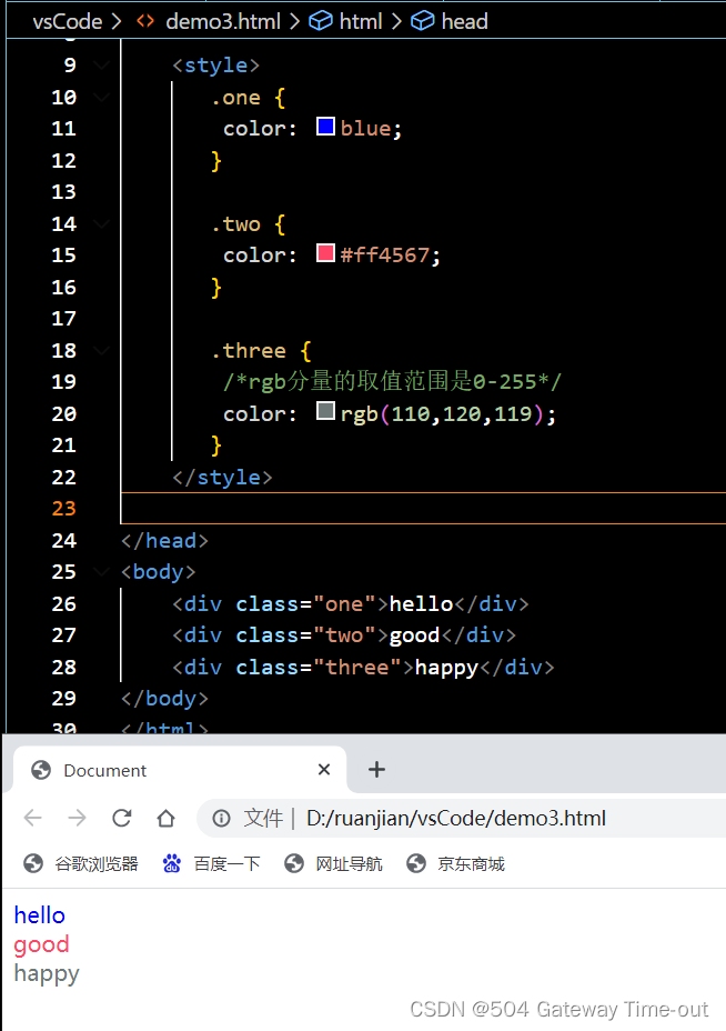
文本颜色:color
文本颜色的设置主要有3种方式:
- 直接使用颜色的英文单词;
- 使用十六进制来表示;
- 使用RGB方式(通过对R (red), G (green), B (blue)设置不同的分量大小,来得到不同的颜色 );
<style>
       .one {
        color: blue;
       }

       .two {
        color: #ff4567;
       }

       .three {
        /*rgb分量的取值范围是0-255*/
        color: rgb(110,120,119);
       }
    </style>
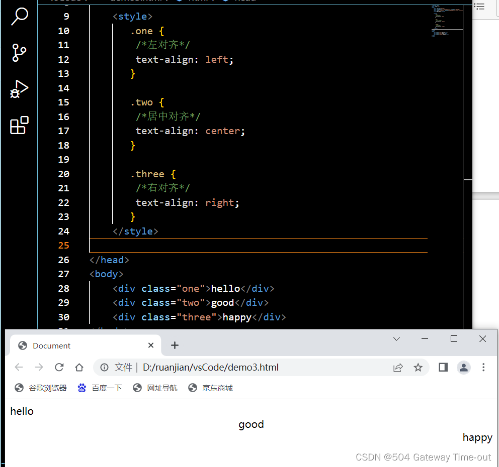
 文本对齐:text-align
这里的文本广泛代表图片等元素;
<style>
       .one {
        /*左对齐*/
        text-align: left;
       }

       .two {
        /*居中对齐*/
        text-align: center;
       }

       .three {
        /*右对齐*/
        text-align: right;
       }
    </style>
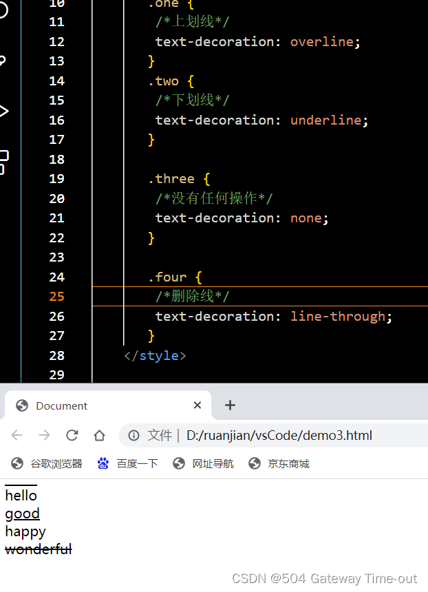
 文本装饰:text-decoration
 <style>
       .one {
        /*上划线*/
        text-decoration: overline;
       }
       .two {
        /*下划线*/
        text-decoration: underline;
       }

       .three {
        /*没有任何操作,可以用来删除下划线*/
        text-decoration: none;
       }

       .four {
        /*删除线*/
        text-decoration: line-through;
       }
    </style>
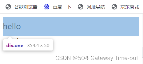
文本缩进:text-indent
<style>
       .one {
        /*向右缩进,正值*/
        text-indent: 2em;
       }
       .two {
        /*向左缩进,负值*/
        text-indent: -2em;
       }


    </style>
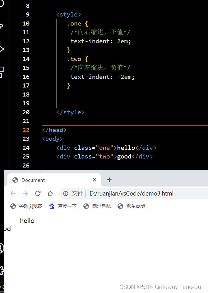
这里文字向左缩进,导致文字显示不完整;
行高设置:
<style>
       .one {

        line-height: 50px;
        font-size: 20px;
       }


    </style>
行高实际就是上下文本之间的基线的距离,即文本上边距加上下边距以及字体大小即文本的行高;
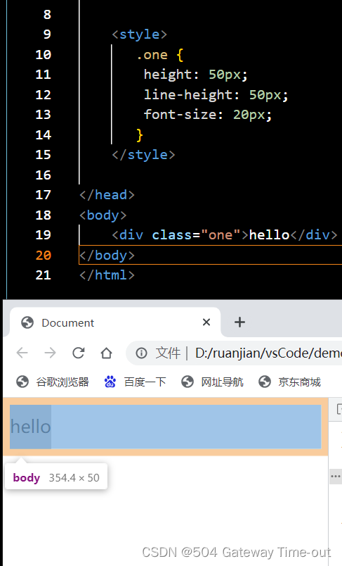
当行高与元素的高度相等时,文字可以居中对齐;
背景属性
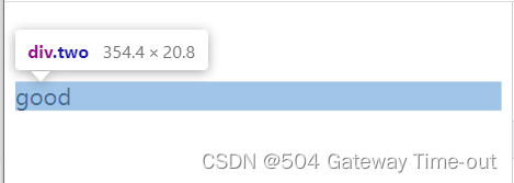
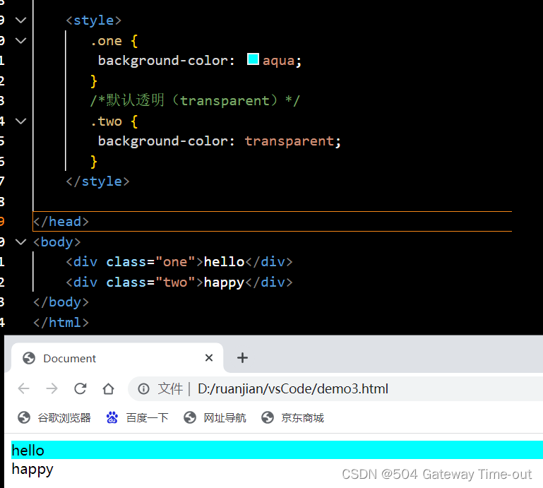
背景颜色:background-color;
<style>
       .one {
        background-color: aqua;
       }
       /*默认透明(transparent)*/
       .two {
        background-color: transparent;
       }
    </style>
- 背景图片设置:background-image: url(图片路径);
<style>
       .one {
        background-image: url(2.jpg);
        height: 350px;
       }

    </style>
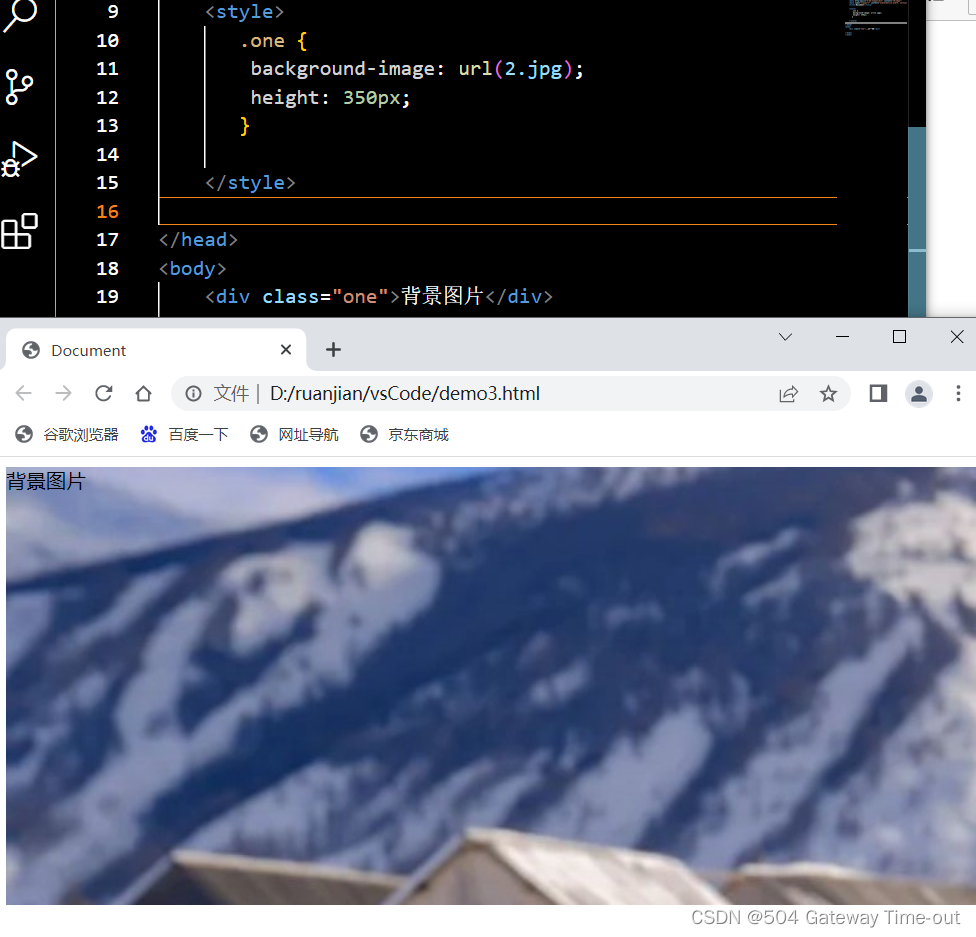
url可以是绝对路径,也可以是相对路径;
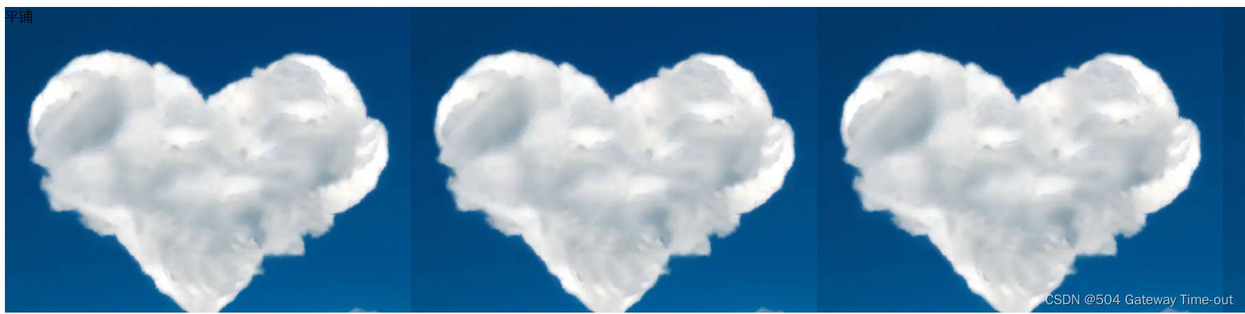
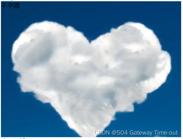
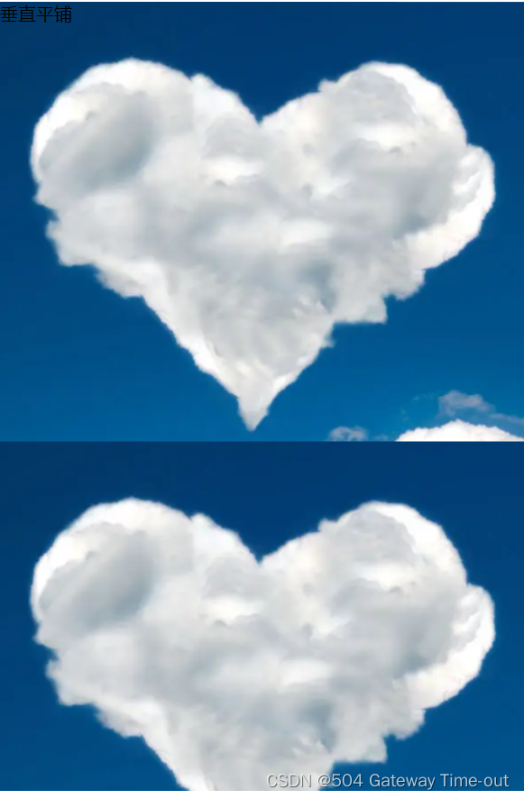
- 背景平铺:background-repeat;
<style>
        /*平铺*/
       .one {
        background-image: url(yun.png);
        height: 350px;
        background-repeat: repeat;
       }
       /*不平铺*/
       .two {
        background-image: url(yun.png);
        height: 350px;
        background-repeat: no-repeat;
       }
       /*水平平铺*/
       .three {
        background-image: url(yun.png);
        height: 350px;
        background-repeat: repeat-x;
       }
       /*垂直平铺*/

       .four {
        background-image: url(yun.png);
        height: 700px;
        background-repeat: repeat-y;
       }

    </style>

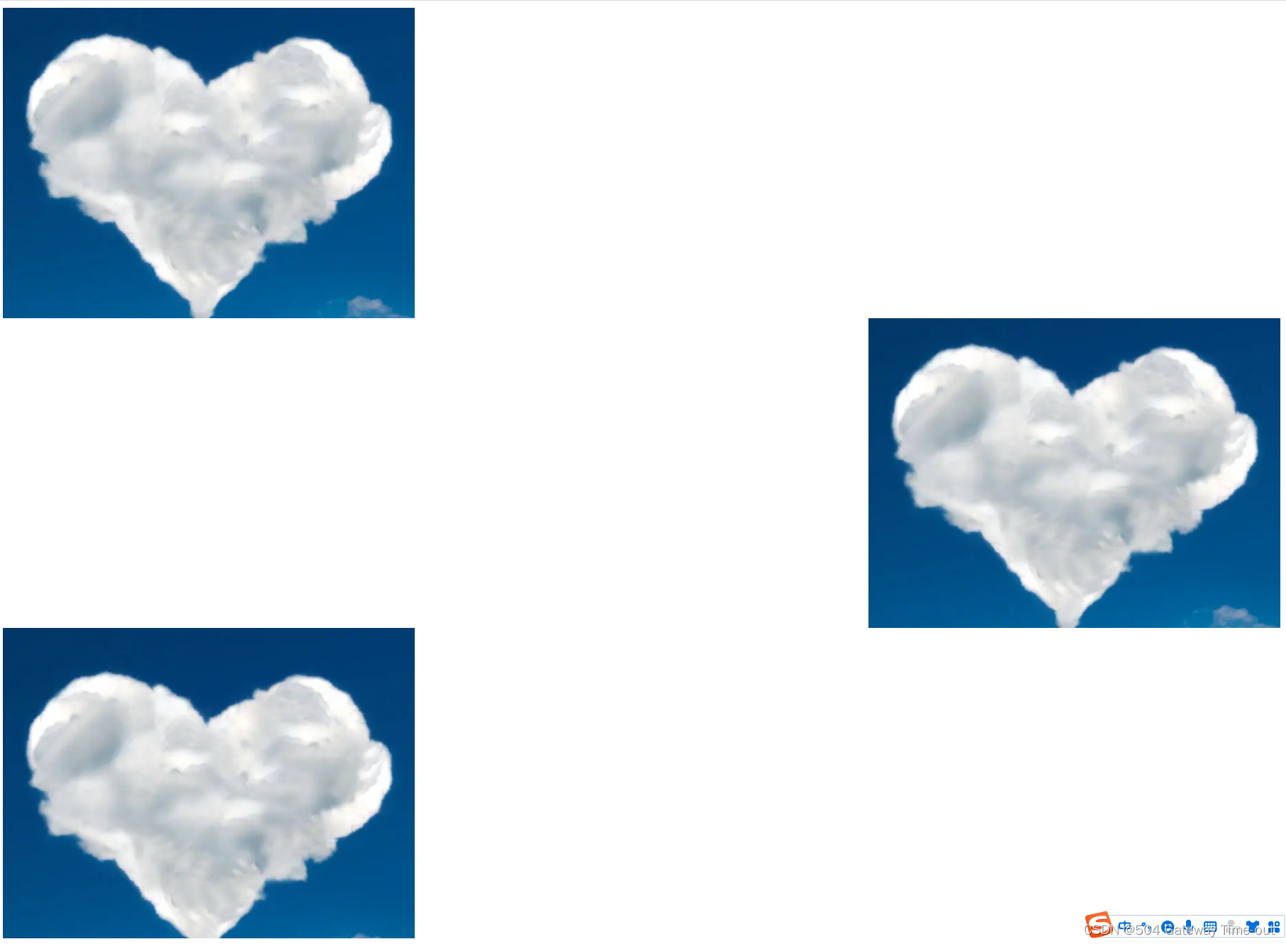
- 背景位置:background-position
背景位置是以坐标系(左上角为原点)为基准,由x和y2个值来确定,也可以使用方位名词来确定;
方位名词有:top, left, right, bottom;
当x和y都是方位名词时,2个方位名词的顺序等效;
当只指定了一个方位名词(或具体数值)时,第二个默认居中设置;
当x和y都是具体数值时,就是基于原点的位置;
<style>
        /*使用方位名词设置,表示左上*/
        .one {
        background-image: url(yun.png);
        height: 350px;
        background-repeat: no-repeat;
        background-position: left,top ;
       }
       /*只指定了一个方向,第二个方向默认垂直居中*/
       .two {
        background-image: url(yun.png);
        height: 350px;
        background-repeat: no-repeat;
        background-position: right ;
       }
       /*使用具体数值确定*/
       .three {
        background-image: url(yun.png);
        height: 350px;
        background-repeat: no-repeat;
        background-position: 300,500 ;
       }

    </style>
- 背景尺寸:
可以使用具体的数值来设置,单位为像素;
也可以使用contain或者cover 2个关键词来设置;
 <style>
        /*contain*/
        .one {
        background-image: url(sky.png);
        height: 350px;
        background-repeat: no-repeat;
        background-position: center ;
        background-size: contain;
       }

       /*cover*/
       .two {
        background-image: url(sky.png);
        height: 350px;
        background-repeat: no-repeat;
        background-position: center ;
        background-size: cover;
       }


    </style>
cover:缩放背景图片以完全覆盖背景区,可能背景图片部分看不见;
contain:缩放背景图片以完全装入背景区,可能背景区部分空白;
圆角矩形
<style>

        .one {
        width: 100px;/*宽高一致,代表是个正方形*/
        height: 100px;
        border: 2px solid green;/*边线的格式-2个像素的绿色实线*/

        /* 用 50% 表示宽度的一半 */
        border-radius: 50%;
       }

       .two {
        width: 200px;/*宽高一致,代表是个正方形*/
        height: 100px;
        border: 2px dashed black;/*边线的格式-2个像素的黑色虚线*/
        /*圆角的弧度设置*/
        border-radius: 10px;
       }
    </style>
border-radius,通过设置矩形内切圆的半径来控制弧线的程度;
也可以对矩形的四个角分别进行圆角弧度的设置;
块级元素和行内元素
块级元素和行内元素都属于CSS中,Html的元素显示模式;
- 块级元素
块级元素主要有这样几个特点:
块级元素一般都是独占一行;
块级元素的高度、宽度、内外边距、行高都是可以进行设置的;
块级元素的高度默认与父级元素一样宽;
块级元素的内部,可以是块级元素或者行内元素;
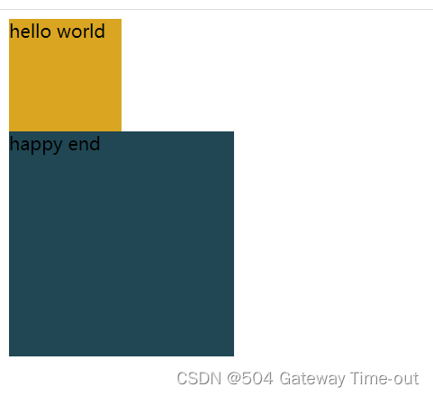
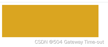
常见的块级元素有:标题标签:h1-h6、段落标签:p、无语义标签:div、ul、ol、li;
段落标签p内不可以存放块级元素;
<style>
.one {
width: 100px;
height: 100px;
background-color: goldenrod;
}
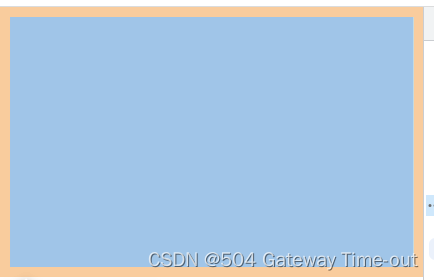
.two {
width: 200px;
height: 200px;
background-color: rgb(32, 71, 83);
}
</style>
</head>
<body>
<!--块级元素-->
<div class="one">
<div class="one1">
hello world
</div>
</div>
<div class="two">
<span>happy end</span>
</div>
</body>
- 行内元素;
行内元素不独占一行,同一行可以显示多个;
行内元素设置高度,宽度,行高均无效;
行内元素可以设置左右外边距、内边距,上下边距设置无效;
行内元素内部只能有其他行内元素,不可以有块级元素;
常见的行内元素有:a,span,strong,em,u,d等;
<style>

        .one {
        width: 100px;
        height: 100px;
        background-color: goldenrod;

       }

       .two {
        width: 200px;
        height: 200px;
        background-color: rgb(32, 71, 83);
       }
    </style>

</head>
<body>
    <!--行内元素-->
    <span>
        <span class="one">hello world</span>
        <span class="two">happy end</span>
    </span>


</body>
 块级元素和行内元素可以使用一定的方法进行转换,即display:
display: block 改成块级元素 [常用];
display: inline 改成行内元素(很少使用)
display: inline-block 改成行内块元素;
盒模型
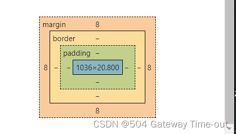
我们可以将Html的元素视为一个矩形,即盒子,这个盒子一般包括这样几个部分:
边框(border)、内容(content)、内边距(padding)、外边距(margin);
- 边框:
<style>

        div {

        width: 300px;/*边框宽度*/
        height: 100px;/*边框高度*/
        background-color: goldenrod;/*边框颜色*/
        border-style: none;/*边框样式:无*/
        box-sizing: border-box;/*修改浏览器的行为,保证边框的存在不会撑大盒子*/

       }

    </style>

</head>
<body>
    <div></div>
    </body>
- 内边距:padding;
<style>

        div {

        width: 300px;/*内边距宽度*/
        height: 100px;/*内边距高度*/
        /*分别给四个方向都加边框*/
        padding-top: 3px;
        padding-bottom: 3px;
        padding-left: 3px;
        padding-right: 3px;

       }

	* {
        box-sizing: border-box;
       }

    </style>
内边距的设置可以进行合并,当padding后只有一个变量时,表示四个方向均为该大小;padding后有2个变量时,第一个变量表示上下内边距的大小,第二个变量表示左右内边距的大小;三个变量表示左,上下,右;
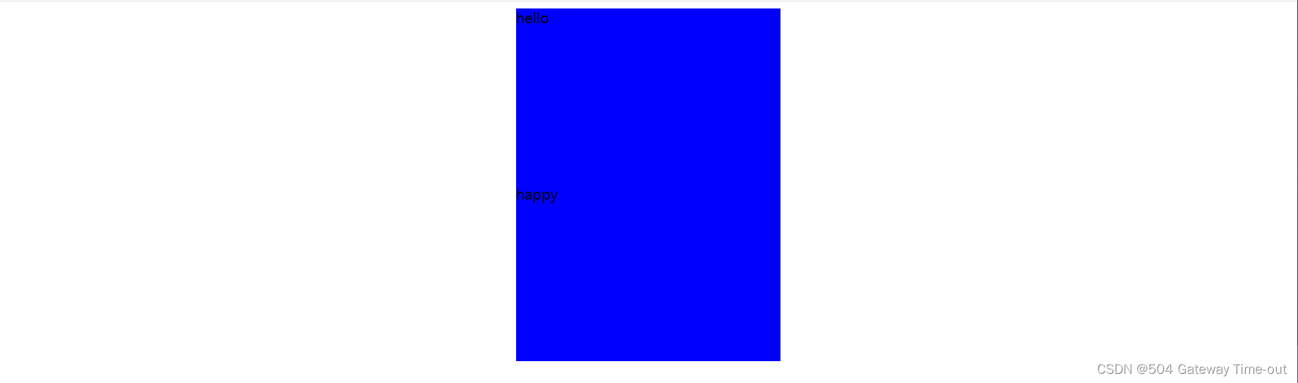
- 外边距:margin
<style>

        div {

        width: 300px;
        height: 200px;
        background-color: #fff;


       }
       .one {
        margin: 50px;
       }

    </style>

</head>
<body>
    <div class="one">hello</div>
    <div class="two">happy</div>
    </body>
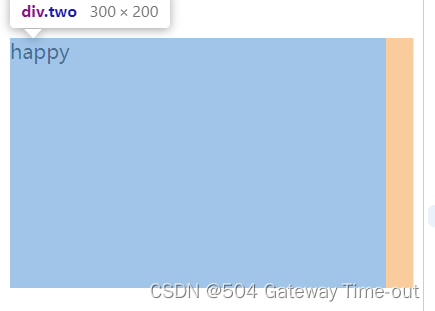
 上图1,2表示分别的2个盒子,3表示2个盒子形成的整体;
外边距也可以进行合并设置或四个方向分别设置,与内边距设置类似;
块级元素的水平居中
块级元素的水平居中即让整个盒子位于整个页面的中心位置,与文本的居中不同,也不可混淆;
<style>

        div {

        width: 300px;
        height: 200px;
        background-color: #fff;
        margin: auto;
        }
    </style>
块级元素水平居中即将水平内边距设置为auto;
浏览器默认样式的去除
由于将来我们的网页具体运行在哪个浏览器上是不确定的,而一般情况下浏览器都会默认给元素加上一些样式,像内外边距或者其他元素,为了保证我们的代码在不同的浏览器上可以得到相同的效果,需要使用一些方法来去除这种浏览器默认带来的样式;
* {
margin:0;
padding:0;
 }
使用通配符即可;
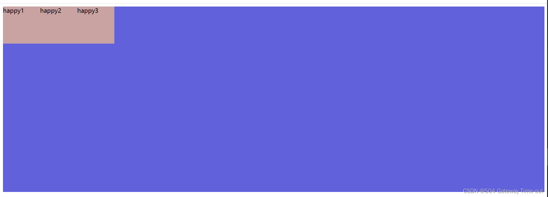
弹性布局
弹性布局:flex布局;即为html的元素指定一个display:flex的属性,即可使元素在任意我们希望的位置出现;
被设置为 display:flex 属性的元素, 称为 flex container;
它的所有子元素立刻称为了该容器的成员, 称为 flex item;
对容器成员的排列,可以横向排列和纵向排列;
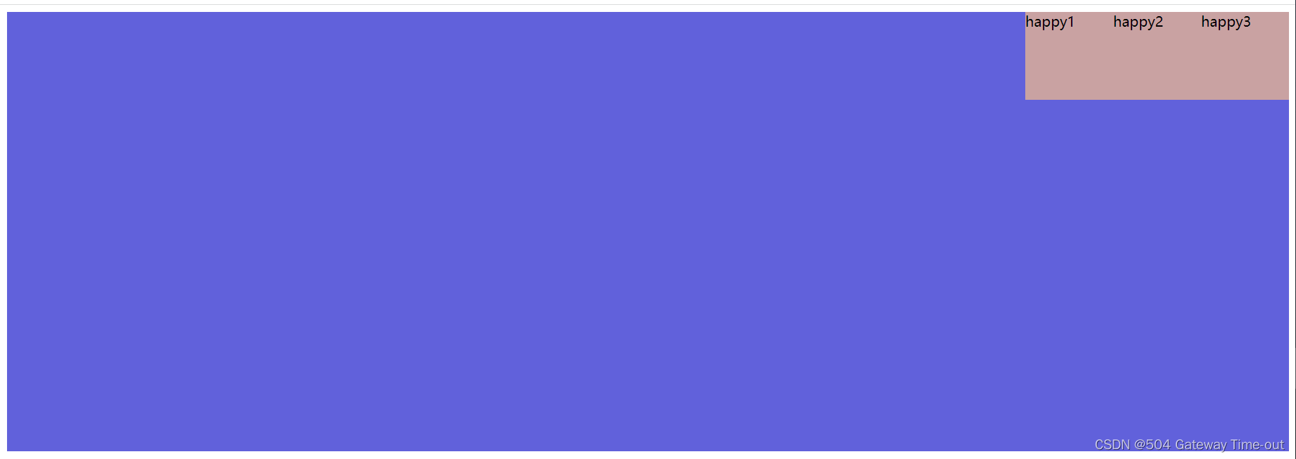
- 横向排列设置:justify-content
<style>
        div {

        width: 100%;
        height: 500px;
        background-color: rgb(97, 97, 219);
        /*使成为弹性盒子*/
        display: flex;
        /*flex-start:位于容器的开头,默认值*/
        justify-content: flex-start;

        }
        div span {
        width: 100px;
        height: 100px;
        background-color: rgb(201, 162, 162);

        }
    </style>
</head>
<body>
    <div>
        <span>happy1</span>
        <span>happy2</span>
        <span>happy3</span>

    </div>
</body>
		/*center:位于容器的中央*/
        justify-content: center;
 /*center:位于容器的末尾*/
 justify-content: flex-end;
/*center:在行与行之间留有间隔*/
 justify-content: space-between;
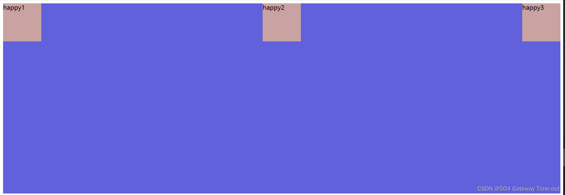
/*center:在行与行之前,之间,之后留有间隔*/
justify-content: space-around;
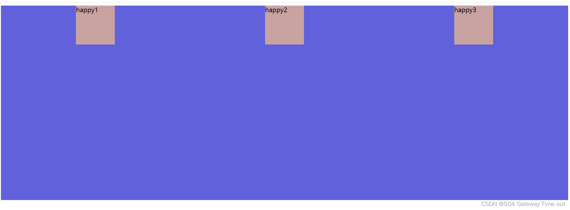
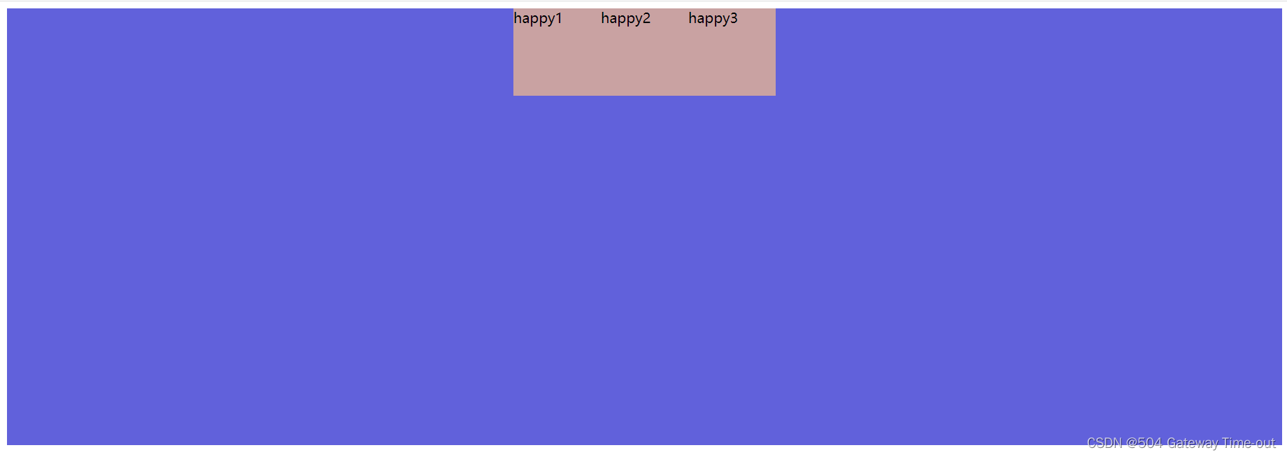
- 纵向排列设置:align-content
<style>
        div {

        width: 100%;
        height: 500px;
        background-color: rgb(97, 97, 219);
        /*使成为弹性盒子*/
        display: flex;
        /*stretch:纵向拉伸占据剩余空间*/
        align-content: stretch;

        }
        div span {
        width: 100px;
        background-color: rgb(201, 162, 162);

        }
    </style>
</head>
<body>
    <div>
        <span>happy1</span>
        <span>happy2</span>
        <span>happy3</span>

    </div>
</body>
更多关于弹性布局纵向设置的知识可以参考官方文档;
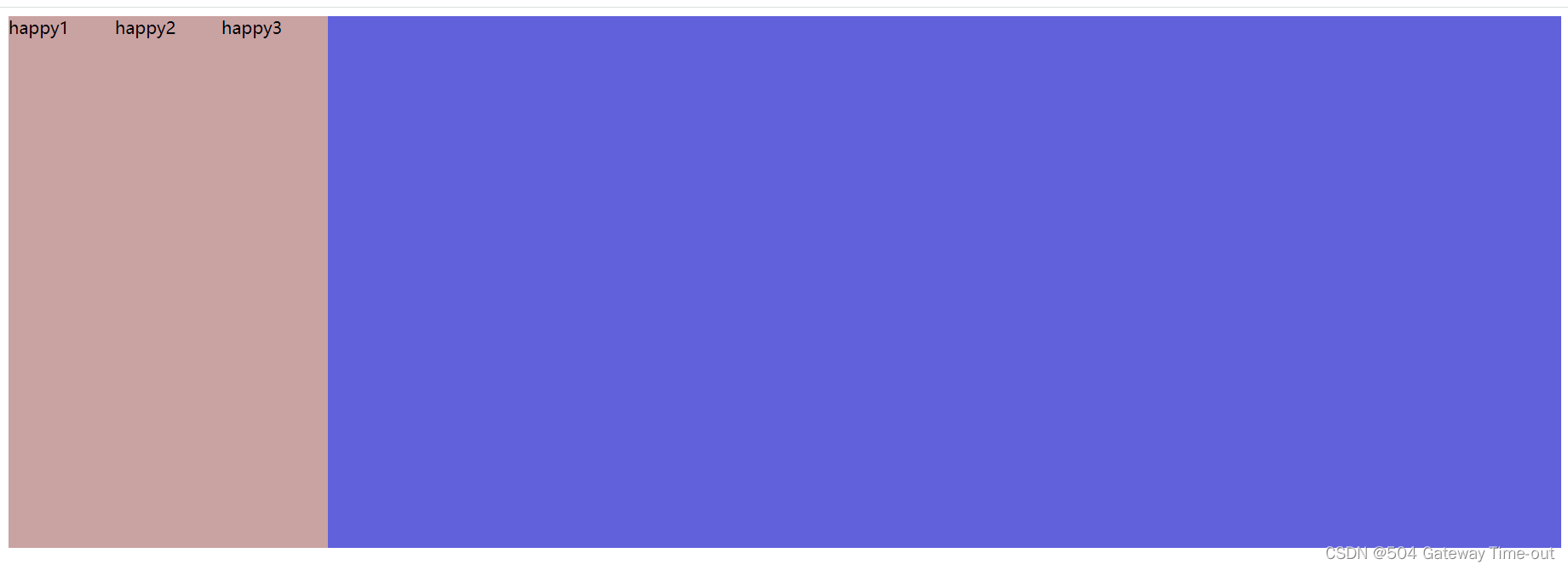
- 垂直居中;
<style>
        div {

        width: 100%;
        height: 500px;
        background-color: rgb(97, 97, 219);
        /*使成为弹性盒子*/
        display: flex;
        justify-content: space-around;
        align-items: center;

        }
        div span {
        width: 100px;
        height: 100px;
        background-color: rgb(201, 162, 162);

        }
    </style>
</head>
<body>
    <div>
        <span>happy1</span>
        <span>happy2</span>
        <span>happy3</span>

    </div>
</body>

align-items 只能针对单行元素来实现. 如果有多行元素, 就需要使用 item-contents;
这里只是对css知识的简单介绍,更多具体有关CSS的知识依然可以参考官方文档MDNCSS官方文档;
over!