Layout 布局组件快速搭建
文章目录
- 设置主题样式变量
- 封装公共布局组件
- 封装 Logo 组件
- 封装 Menu 菜单组件
- 封装 Breadcrumb 面包屑组件
- 封装 TabBar 标签栏组件
- 封装 Main 内容区组件
- 封装 Footer 底部组件
- 封装 Theme 主题组件
- 经典布局
- 水平布局
- 响应式布局
- 搭建 Layout 布局组件
- 添加 Layout 路由配置
- 启动项目
设置主题样式变量
-
创建主题变量文件:
src/assets/styles/theme.scss -
添加页面布局组件用到的变量:
:root {--os-layout-aside-width: 224px; // 侧边栏宽度--os-layout-logo-height: 56px; // 头部高度--os-layout-header-height: 56px; // 头部高度--os-layout-header-menu-width: 300px; // 头部菜单宽度--os-layout-footer-height: 40px; // 底部高度--os-layout-tab-height: 40px; // 底部高度 } -
设置全局滚动条样式:
/* scroll bar */ ::-webkit-scrollbar {width: 6px;height: 6px; }::-webkit-scrollbar-thumb {background-color: var(--el-border-color-darker);border-radius: 20px; } -
在统一管理和维护项目的样式文件
src/assets/styles/index.scss中导入主题样式文件:@import "theme.scss";
注:统一管理和维护项目的样式文件src/assets/styles/index.scss需在mian.ts中导入,注意导入顺序。
封装公共布局组件
封装 Logo 组件
-
创建 Logo 组件:
src/layouts/components/Logo/index.vue -
通过
import.meta.env获取.env文件中定义的环境变量,环境变量使用详情跳转认识和使用 Vite 环境变量配置:<script setup lang="ts"> const app_title = import.meta.env.VITE_APP_TITLE </script> -
Logo 组件内容,添加 Logo 图标和项目标题:
<template><!-- logo 容器 --><div class="logo-container"><!-- logo 图标 --><svg-icon width="32px" height="32px" name="logo" /><!-- 应用标题,只在中等及以上屏幕尺寸上可见 --><span class="logo-title hidden md:block">{{ app_title }}</span></div> </template> -
添加样式:
<style scoped lang="postcss">
.logo-container {@apply flex items-center justify-center;height: var(--os-layout-logo-height);width: var(--os-layout-aside-width);.logo-title {@apply text-lg font-bold subpixel-antialiased;@apply bg-clip-text text-transparent bg-gradient-to-r from-pink-500 to-violet-500;}
}
</style>
封装 Menu 菜单组件
-
创建 Menu 菜单组件:
src/layouts/components/Menu/index.vue -
在
el-menu组件中使用props来控制mode属性,可以实现菜单的不同显示模式(如vertical或horizontal):<script setup lang="ts"> const props = defineProps<{mode?: 'vertical' | 'horizontal' }>() </script> -
使用 ElementPlus 的 el-menu 菜单组件搭建垂直菜单:
<template><!-- 菜单容器 --><div class="menu-container"><!-- Element UI 菜单组件 --><el-menuclass="os-menu":mode="props.mode"><!-- 一级菜单 --><el-sub-menu index="1"><!-- 一级菜单标题 --><template #title><span>Navigator One</span></template><!-- 二级菜单 --><el-menu-item index="1-1">item one</el-menu-item><el-menu-item index="1-2">item two</el-menu-item></el-sub-menu><!-- 一级菜单 --><el-menu-item index="2"><span>Navigator Two</span></el-menu-item></el-menu></div> </template> -
添加样式:
<style scoped lang="postcss">
.menu-container{background-color: var(--el-menu-bg-color);.os-menu{@apply border-0;&.el-menu--horizontal{height: calc(var(--os-layout-logo-height) - 1px);}}
}
</style>
封装 Breadcrumb 面包屑组件
-
创建
src/layouts/components/Breadcrumb/index.vue -
使用 ElementPlus el-breadcrumb 面包屑组件:
<template><el-breadcrumb separator="/" class="breadcrumb-container"><el-breadcrumb-item :to="{ path: '/' }">homepage</el-breadcrumb-item><el-breadcrumb-item>management</el-breadcrumb-item><el-breadcrumb-item>list</el-breadcrumb-item><el-breadcrumb-item>detail</el-breadcrumb-item></el-breadcrumb> </template> -
添加样式:
<style scoped lang="postcss">
.breadcrumb-container {display: flex;flex-wrap: nowrap; /* 防止换行 */overflow: hidden; /* 横向滚动溢出处理 */padding-right: 12px;
}
</style>
封装 TabBar 标签栏组件
-
创建
src/layouts/components/TabBar/index.vue -
生成 TabBar 标签数据:
<script setup lang="ts"> const tabs = Array(1).fill({label: 'About',name: 'about',icon: 'About',path: '/about' }) </script> -
使用 ElementPlus el-tabs 标签组件,Scrollbar 组件替换浏览器原生滚动条:
<template><!-- Tab Bar --><div class="tab-bar-container"><div class="tab-bar-box"><el-scrollbar><el-tabstab-position="top"type="card"closable><el-tab-panev-for="(item, index) in tabs":key="index":name="item.name"><template #label><span class="tab-title"><svg-icon :name="item.icon" /><span>{{ item.label }}</span></span></template></el-tab-pane></el-tabs></el-scrollbar></div><div class="more-button"><el-dropdown trigger="click"><span><svg-icon name="More" /></span><template #dropdown><el-dropdown-menu><el-dropdown-item>关闭</el-dropdown-item></el-dropdown-menu></template></el-dropdown></div></div> </template> -
添加样式:
<style scoped lang="scss">
.tab-bar-container {display: flex;align-items: center;gap: 8px;border-bottom: 1px solid var(--el-border-color-light);.tab-bar-box {display: flex;flex-grow: 1;margin-left: 8px;width: calc(100% - 60px);.tab-title{display: flex;align-items: center;gap: 8px;}}.more-button {display: flex;align-items: center;justify-content: center;width: var(--os-layout-tab-height);height: var(--os-layout-tab-height);border-left: 1px solid var(--el-border-color-light);}
}:deep(.el-tabs) {.el-tabs__header {height: var(--os-layout-tab-height);padding: 0;margin: 0;border-bottom: none;.el-tabs__nav-wrap {.el-tabs__nav-scroll {.el-tabs__nav {border: none;.el-tabs__item {height: calc(var(--os-layout-tab-height) - 2px);line-height: calc(var(--os-layout-tab-height) - 2px);border: none;position: relative; // 确保父元素是相对定位的&::before {content: '';position: absolute;bottom: 0;width: 100%;height: 2px;background-color: transparent;}&.is-active {color: var(--el-color-primary);fill: var(--el-color-primary);&::before {background-color: var(--el-color-primary); // 改变背景色以显示下划线}}}}}}}
}
</style>
封装 Main 内容区组件
-
创建
src/layouts/components/Main/index.vue:<script setup lang="ts"></script><template><div>Main</div> </template><style scoped lang="scss"></style> -
后续补充内容…
封装 Footer 底部组件
-
创建
src/layouts/components/Footer/index.vue -
通过
import.meta.env获取.env文件中定义的环境变量<script setup lang="ts"> const app_title = import.meta.env.VITE_APP_TITLE </script> -
添加内容:
<template><div class="footer-container"><!-- 左侧:公司名称或标志 --><div class="flex-content"><svg-icon name="logo" /><span class="logo-title">{{ app_title }}</span></div><!-- 中间:导航链接 --><div class="flex-content"><a href="about">关于我们</a><a href="#contact">联系我们</a><a href="#privacy-policy">隐私政策</a><a href="#terms-of-service">服务条款</a></div><!-- 右侧:版权信息 --><div class="text-right">© 2024 Octopus. 保留所有权利.</div></div> </template> -
添加样式:
<style scoped lang="postcss">
.footer-container{@apply flex items-center w-full;@apply select-none text-xs;height: var(--os-layout-footer-height);@apply justify-center lg:justify-between;.flex-content{@apply items-center gap-2;@apply flex justify-center gap-1 text-gray-400;@apply hidden lg:flex;.logo-title {@apply font-bold subpixel-antialiased text-sm;@apply bg-clip-text text-transparent bg-gradient-to-r from-pink-500 to-violet-500;}}
}
</style>
封装 Theme 主题组件
-
创建
src/stores/modules/theme/types.ts定义主题类型:export type LayoutMode = 'classic' | 'horizontal' | 'responsive' // 主题配置 export interface ThemeConfig {showThemeConfig: boolean,darkThemeEnabled: boolean,grayThemeEnabled: boolean,layoutMode: LayoutMode,themePrimaryColor: string,predefineColors: string[] } -
创建
src/stores/modules/theme/index.ts仓库存储主题状态:import { defineStore } from 'pinia' import { reactive, watch } from 'vue' import { ThemeConfig } from './types' import { ElMessage } from 'element-plus' import { getDarkColor, getLightColor } from '@/utils/Color'// theme store export const useThemeStore = defineStore('theme',() => {const themeConfig = reactive<ThemeConfig>({showThemeConfig: false,darkThemeEnabled: false,grayThemeEnabled: false,layoutMode: 'classic',themePrimaryColor: '#409eff',predefineColors: ['#409eff']})// 切换显示状态的方法const toggleThemeConfig = () => {themeConfig.showThemeConfig = !themeConfig.showThemeConfig}// 黑暗主题切换watch(() => themeConfig.darkThemeEnabled, () => {const html = document.documentElement as HTMLElementif (themeConfig.darkThemeEnabled) {html.setAttribute('class', 'dark')} else {html.removeAttribute('class')}changeThemeColor(themeConfig.themePrimaryColor)})watch(() => themeConfig.grayThemeEnabled,() => {if (themeConfig.grayThemeEnabled) {document.documentElement.dataset.theme = 'gray'} else {document.documentElement.dataset.theme = ''}})// 添加预定义颜色function addPredefineColor(color:string) {console.log('color', color)const predefineColors = themeConfig.predefineColors// 查找元素的索引const index = predefineColors.indexOf(color)if (index !== -1) {// 使用 splice 方法删除该元素predefineColors.splice(index, 1)}if (themeConfig.predefineColors.length === 10) {themeConfig.predefineColors.pop() // 删除队列中的第一个元素}themeConfig.predefineColors.unshift(color)}// 修改主题颜色const changeThemeColor = (color:string ) => {if (!color) {color = '#409eff'ElMessage({ type: 'success', message: '主题颜色已重置' })}addPredefineColor(color)// 计算主题颜色变化document.documentElement.style.setProperty('--el-color-primary', color)document.documentElement.style.setProperty('--el-color-primary-dark-2',themeConfig.darkThemeEnabled ? `${getLightColor(color, 0.2)}` : `${getDarkColor(color, 0.3)}`)for (let i = 1; i <= 9; i++) {const primaryColor = themeConfig.darkThemeEnabled ? `${getDarkColor(color, i / 10)}` : `${getLightColor(color, i / 10)}`document.documentElement.style.setProperty(`--el-color-primary-light-${i}`, primaryColor)}}return {themeConfig,toggleThemeConfig,changeThemeColor}},{persist: true}) -
创建
src/layouts/components/Theme/index.vue主题组件并引入主题仓库:<script setup lang="ts"> import { useThemeStore } from '@/stores/modules/theme' import { onMounted } from 'vue'const { themeConfig, changeThemeColor } = useThemeStore()onMounted(() => {// 在组件挂载到 DOM 后更新主题颜色changeThemeColor(themeConfig.themePrimaryColor) }) </script> -
使用
el-drawer抽屉组件进行主题布局:<template><div><el-drawer v-model="themeConfig.showThemeConfig" size="300"><template #header="{ titleId }"><span :id="titleId" class="theme-header"> 主题配置 </span></template><el-scrollbar><div class="mr-4"><el-divider>布局样式</el-divider><div class="layout-box"><el-tooltip effect="dark" content="经典布局" placement="top" :show-after="200"><div:class="['layout-item layout-classic', { 'is-active': themeConfig.layoutMode == 'classic' }]"@click="themeConfig.layoutMode='classic'"><div class="layout-dark"></div><div class="layout-container"><div class="layout-light"></div><div class="layout-content"></div></div><svg-icon class="select-layout" name="About" v-if="themeConfig.layoutMode == 'classic'" /></div></el-tooltip><el-tooltipeffect="dark"content="横向布局"placement="top":show-after="200"><div:class="['layout-item layout-transverse', { 'is-active': themeConfig.layoutMode == 'horizontal' }]"@click="themeConfig.layoutMode='horizontal'"><div class="layout-dark"></div><div class="layout-content"></div><svg-icon class="select-layout" name="About" v-if=" themeConfig.layoutMode == 'horizontal'" /></div></el-tooltip></div><el-divider>主题风格</el-divider><div class="switch-container"><div class="switch-box"><div class="switch-title"><span>主题颜色</span><el-tooltip content="主题颜色" placement="top"><svg-icon class="size-4" name="About"></svg-icon></el-tooltip></div><el-color-pickercolor-format="hex"v-model="themeConfig.themePrimaryColor":predefine="themeConfig.predefineColors"@change="changeThemeColor"/></div><div class="switch-box"><div class="switch-title"><span>暗黑主题</span><el-tooltip content="暗黑主题" placement="top"><svg-icon class="size-4" name="About"></svg-icon></el-tooltip></div><el-switch v-model="themeConfig.darkThemeEnabled" /></div><div class="switch-box"><div class="switch-title"><span>灰色模式</span><el-tooltip content="灰色模式" placement="top"><svg-icon class="size-4" name="About"></svg-icon></el-tooltip></div><el-switch v-model="themeConfig.grayThemeEnabled" /></div></div><el-divider>界面设置</el-divider><div class="switch-container"><div class="switch-box"><div class="switch-title"><span>theme</span></div><el-switch inline-prompt /></div></div></div></el-scrollbar></el-drawer></div> </template> -
为组件添加样式:
<style scoped lang="postcss">
.theme-header {@apply text-base font-bold flex items-center;
}.switch-container {@apply flex-grow space-y-2;
}.switch-box {@apply flex justify-between items-center w-full;
}.switch-title {@apply flex gap-2 items-center;
}:deep(.el-drawer__header) {@apply px-5 py-0 h-12 border-b-2 border-solid m-0;color: var(--el-text-color-regular);border-color: var(--el-border-color-light);
}:deep(.el-drawer__title) {font-size: 20px;
}:deep(.el-drawer__body) {@apply py-0 pr-0;
}.layout-box {position: relative;display: flex;flex-wrap: wrap;justify-content: space-between;padding: 15px 15px 0;.layout-item {position: relative;box-sizing: border-box;width: 100px;height: 70px;padding: 6px;cursor: pointer;border-radius: 5px;box-shadow: 0 0 5px 1px var(--el-border-color-dark);transition: all 0.2s;.layout-dark {background-color: var(--el-color-primary);border-radius: 3px;}.layout-light {background-color: var(--el-color-primary-light-5);border-radius: 3px;}.layout-content {background-color: var(--el-color-primary-light-8);border: 1px dashed var(--el-color-primary);border-radius: 3px;}.select-layout {position: absolute;right: 10px;bottom: 10px;fill: var(--el-color-primary);transition: all 0.2s;}&:hover {box-shadow: 0 0 5px 1px var(--el-text-color-secondary);}}.is-active {box-shadow: 0 0 0 2px var(--el-color-primary) !important;}.layout-classic {display: flex;justify-content: space-between;margin-bottom: 20px;.layout-dark {width: 20%;}.layout-container {display: flex;flex-direction: column;justify-content: space-between;width: 72%;.layout-light {height: 20%;}.layout-content {height: 67%;}}}.layout-transverse {display: flex;flex-direction: column;justify-content: space-between;margin-bottom: 15px;.layout-dark {height: 20%;}.layout-content {height: 67%;}}
}
</style>
经典布局
-
创建经典页面布局组件:
src/layouts/LayoutClassic/index.vue: -
导入布局组件:
<script setup lang="ts"> import Footer from '@/layouts/components/Footer/index.vue'; // 引入页脚组件 import Menu from '@/layouts/components/Menu/index.vue'; // 引入菜单组件 import Logo from '@/layouts/components/Logo/index.vue'; // 引入Logo组件 import Main from '@/layouts/components/Main/index.vue'; // 引入主要内容组件 import TabBar from '@/layouts/components/TabBar/index.vue'; // 引入标签栏组件 import Breadcrumb from '@/layouts/components/Breadcrumb/index.vue'; // 引入面包屑导航组件import { useThemeStore } from '@/stores/modules/theme' // 引入主题仓库 const { toggleThemeConfig } = useThemeStore() -
使用 ElementPlus 提供的 Container 布局容器快速搭建页面的基本结构:
-
在组件中使用布局组件划分出页面结构:侧边菜单栏、顶部、Tab 标签栏、主体和底部:
<el-container>:外层容器。 当子元素中包含<el-header>或<el-footer>时,全部子元素会垂直上下排列, 否则会水平左右排列。<el-header>:顶栏容器。<el-aside>:侧边栏容器。<el-main>:主要区域容器。<el-footer>:底栏容器。<template><div class="layout-container"><el-container><!-- 左侧边栏 --><el-aside><!-- Logo 组件 --><Logo class="os-logo"/><!-- 菜单组件 --><Menu class="menu-classic" /></el-aside><el-container><!-- 页面顶部区域 --><el-header><!-- 头部内容区域 --><div class="header-content"><!-- 折叠按钮 --><svg-icon class="fold-expand-button" name="Fold" /><!-- 面包屑导航 --><Breadcrumb /></div><!-- 头部菜单区域 --><div class="header-menu"><!-- 语言切换下拉菜单 --><el-dropdown :hide-on-click="false"><svg-icon name="Earth" /><template #dropdown><el-dropdown-menu><el-dropdown-item>简体中文</el-dropdown-item></el-dropdown-menu></template></el-dropdown><!-- 搜索按钮 --><svg-icon class="cursor-pointer" name="Search" /><!-- 主题配置按钮 --><el-tooltip content="主题配置" placement="bottom"><svg-icon class="cursor-pointer" name="Theme" @click="toggleThemeConfig" /></el-tooltip><!-- 锁屏按钮 --><el-tooltip content="锁屏" placement="bottom"><svg-icon class="cursor-pointer" name="Lock" /></el-tooltip><!-- 全屏按钮 --><el-tooltip content="全屏" placement="bottom"><svg-icon class="cursor-pointer" name="FullScreen" /></el-tooltip><!-- 用户信息下拉菜单 --><el-dropdown><div class="flex items-center gap-1"><el-tag type="primary">Admin</el-tag><el-avatar src="https://cube.elemecdn.com/0/88/03b0d39583f48206768a7534e55bcpng.png" /></div><template #dropdown><el-dropdown-menu><el-dropdown-item command="profile"><template #default><div class="flex items-center gap-1"><svg-icon name="User" /><span>个人中心</span></div></template></el-dropdown-item><el-dropdown-item command="logout"><template #default><div class="flex items-center gap-1"><svg-icon name="Logout" /><span>退出登录</span></div></template></el-dropdown-item></el-dropdown-menu></template></el-dropdown></div></el-header><!-- 标签栏 --><tab-bar class="tab-container" /><!-- 主内容区域 --><el-main><Main /></el-main><!-- 底部页脚 --><el-footer><Footer /></el-footer></el-container></el-container></div> </template> -
为组件添加样式:
<style scoped lang="postcss">
.layout-container {@apply w-screen h-screen;.el-aside {@apply h-full;@apply border-r border-solid overflow-hidden;border-color: var(--el-border-color-light);width: var(--os-layout-aside-width);.os-logo {@apply overflow-hidden pl-2;}.menu-classic {height: calc(100vh - var(--os-layout-logo-height));}}.el-container {@apply h-full w-full;.tab-container {height: var(--os-layout-tab-height);}.el-header {@apply flex items-center justify-between;@apply border-b border-solid overflow-hidden;border-color: var(--el-border-color-light);height: var(--os-layout-header-height);.header-content {@apply flex items-center gap-5;.fold-expand-button {@apply cursor-pointer;@apply size-6;}}.header-menu {@apply flex items-center justify-between gap-3;}}.el-main {@apply h-full p-3;background-color: var(--el-bg-color-page);}.el-footer {height: var(--os-layout-footer-height);}}
}
</style>
水平布局
-
创建经典页面布局组件:
src/layouts/LayoutClassic/index.vue: -
导入布局组件:
<script setup lang="ts"> import Footer from '@/layouts/components/Footer/index.vue'; // 引入页脚组件 import Menu from '@/layouts/components/Menu/index.vue'; // 引入菜单组件 import Logo from '@/layouts/components/Logo/index.vue'; // 引入Logo组件 import Main from '@/layouts/components/Main/index.vue'; // 引入主要内容组件 import TabBar from '@/layouts/components/TabBar/index.vue'; // 引入标签栏组件import { useThemeStore } from '@/stores/modules/theme' // 引入主题仓库 const { toggleThemeConfig } = useThemeStore() </script> -
在组件中使用 Element UI 的布局组件划分出页面结构:顶部、Tab 标签栏、主体和底部:
<template><div class="layout-container"><el-container><el-container><el-header><div class="flex"><Logo class="os-logo" /><Menu mode="horizontal" class="menu-horizontal " /></div><div class="header-menu"><!-- 语言转换 --><el-dropdown :hide-on-click="false"><svg-icon name="Earth" /><template #dropdown><el-dropdown-menu><el-dropdown-item>简体中文</el-dropdown-item></el-dropdown-menu></template></el-dropdown><!-- 搜索按钮 --><svg-icon class="cursor-pointer" name="Search" /><!-- 皮肤按钮 --><el-tooltip content="主题配置" placement="bottom"><svg-icon class="cursor-pointer" name="Theme" @click="toggleThemeConfig"/></el-tooltip><!-- 锁屏按钮 --><el-tooltip content="锁屏" placement="bottom"><svg-icon class="cursor-pointer" name="Lock" /></el-tooltip><!-- 全屏按钮 --><el-tooltip content="全屏" placement="bottom"><svg-icon class="cursor-pointer" name="FullScreen" /></el-tooltip><!-- 用户信息 --><el-dropdown><div class="flex items-center gap-1"><el-tag type="primary">Admin</el-tag><el-avatar src="https://cube.elemecdn.com/0/88/03b0d39583f48206768a7534e55bcpng.png" /></div><template #dropdown><el-dropdown-menu><el-dropdown-item command="profile"><template #default><div class="flex items-center gap-1"><svg-icon name="User" /><span>个人中心</span></div></template></el-dropdown-item><el-dropdown-item command="logout"><template #default><div class="flex items-center gap-1"><svg-icon name="Logout" /><span>退出登录</span></div></template></el-dropdown-item></el-dropdown-menu></template></el-dropdown></div></el-header><tab-bar class="tab-container" /><el-main><Main /></el-main><el-footer><Footer /></el-footer></el-container></el-container></div> </template> -
添加样式:
<style scoped lang="postcss">
.layout-container {@apply w-screen h-screen;.el-aside {@apply bg-amber-300 h-full;width: var(--os-layout-aside-width);}.el-container {@apply h-full w-full;.tab-container {height: var(--os-layout-tab-height);}.el-header {@apply w-full pl-2 pr-2 flex justify-between;height: var(--os-layout-header-height);@apply border-b border-solid overflow-hidden;border-color: var(--el-border-color-light);.menu-horizontal{width: calc(100vw - var(--os-layout-aside-width) - var(--os-layout-header-menu-width));}.header-menu{@apply flex items-center justify-between gap-3;}}.el-main {@apply h-full p-3;background-color:var(--el-bg-color-page);}.el-footer {height: var(--os-layout-footer-height);}}
}
</style>
响应式布局
-
创建
src/layouts/LayoutResponsive/index.vue响应式布局组件 -
添加公共组件:
<script setup lang="ts"> import Logo from '@/layouts/components/Logo/index.vue' import Main from '@/layouts/components/Main/index.vue' import Menu from '@/layouts/components/Menu/index.vue' import { ref } from 'vue'import { useThemeStore } from '@/stores/modules/theme' const { themeConfig } = useThemeStore()const navDrawer = ref(false) const menuDrawer = ref(false) const translateShow = ref(false) </script> -
页面布局:
<template><div class="layout-responsive"><el-container><el-header class="flex items-center justify-between"><div class="h-full flex items-center gap-2"><svg-icon width="30px" height="30px" name="menu" @click="menuDrawer = !menuDrawer" /><Logo /></div><div class="header-menu"><!-- 搜索按钮 --><svg-icon width="28px" height="28px" class="cursor-pointer" name="Search" /><!-- 用户信息 --><el-avatar src="https://cube.elemecdn.com/0/88/03b0d39583f48206768a7534e55bcpng.png"@click="navDrawer = !navDrawer" /><!-- 导航信息 --> <el-drawer v-model="navDrawer" size="100%"><template #header><Logo /></template><div class="nav-container "><a href="#">个人中心</a><el-divider /><div><span class="flex items-center justify-between" @click="translateShow = !translateShow">翻译<svg-icon name="Earth"></svg-icon></span><!-- 语言列表 --><transition name="fade"><div v-show="translateShow" id="language-list" class="language-list mt-2"><ul><li class="p-2">英语</li><li class="p-2">中文</li><li class="p-2">西班牙语</li></ul></div></transition></div><el-divider /><div class="nav-theme-switch"><span>暗黑主题</span><el-switch v-model="themeConfig.darkThemeEnabled" size="large" /></div><el-divider /><span>退出登录</span></div></el-drawer></div></el-header><el-main><el-backtop target=".el-main" /><Main /></el-main></el-container><!-- 菜单组件 --><el-drawerv-model="menuDrawer"direction="ltr"size="320px"><Menu /></el-drawer></div> </template> -
添加样式:
<style scoped lang="postcss">
.layout-responsive {@apply w-screen h-screen;.el-container {@apply h-full w-full;.el-header {@apply w-full flex pl-2;height: var(--os-layout-header-height);@apply border-b border-solid overflow-hidden;border-color: var(--el-border-color-light);.header-menu {@apply flex items-center justify-between gap-3;}}.tab-container {background-color: var(--el-bg-color);}.el-main {@apply h-full;background-color: var(--el-bg-color-page);}}
}:deep(.el-drawer__header) {@apply px-3 py-0 h-14 border-solid m-2;color: var(--el-text-color-regular);border-color: var(--el-border-color-light);
}:deep(.el-drawer__title) {font-size: 20px;
}:deep(.el-drawer__body) {@apply py-0 px-8;
}:deep(.el-drawer__close-btn) {@apply text-3xl;
}.nav-container {margin: 0 auto;padding: 24px 0 96px;max-width: 18rem;
}.nav-theme-switch {@apply flex items-center justify-between rounded-md;
}/* 添加动画效果 */
.fade-enter-active {transition: opacity 0.5s ease;
}.fade-leave-active {transition: opacity 0.2s ease;
}.fade-enter-from, .fade-leave-to {opacity: 0;
}.logo-title {@apply text-lg font-bold subpixel-antialiased;@apply bg-clip-text text-transparent bg-gradient-to-r from-pink-500 to-violet-500;
}
</style>
搭建 Layout 布局组件
-
创建 Layout 布局组件
src/layouts/index.vue -
导入经典布局组件
LayoutClassic和水平布局组件LayoutHorizontal,创建一个layoutMode对象来将布局模式字符串映射到相应的组件,使用computed函数根据mode动态选择布局模式。<script setup lang="ts"> import { type Component, computed, onMounted, onUnmounted, ref, watch } from 'vue' import LayoutClassic from '@/layouts/LayoutClassic/index.vue' import LayoutHorizontal from '@/layouts/LayoutHorizontal/index.vue' import LayoutResponsive from '@/layouts/LayoutResponsive/index.vue' import Theme from '@/layouts/components/Theme/index.vue'import { useThemeStore } from '@/stores/modules/theme' const { themeConfig } = useThemeStore()// 定义布局模式与对应的组件类型 const layoutMode: Record<string, Component> = {classic: LayoutClassic, // 经典布局horizontal: LayoutHorizontal, // 横向布局responsive: LayoutResponsive // 响应式布局 }// 布局模式 const layMode = ref(themeConfig.layoutMode)// 监听主题配置模式 watch(() => themeConfig.layoutMode, (newMode) => {layMode.value = newMode })// 计算属性,根据具体逻辑返回所选布局的组件 const mode = computed(() => layoutMode[layMode.value])// 响应式布局,切换布局模式 const updateMode = () => {if (window.innerWidth <= 768) {layMode.value = 'responsive'} else {layMode.value = themeConfig.layoutMode} }onMounted(() => {// 初始更新updateMode()window.addEventListener('resize', updateMode) })onUnmounted(() => {window.removeEventListener('resize', updateMode) }) </script><template><!-- 根据 mode 的值渲染不同的布局样式 --><component :is="mode" /><Theme /> </template><style scoped lang="postcss"> </style>
添加 Layout 路由配置
-
在
src/App.vue中添加代码,当访问路由路径时,Vue Router 会根据路由配置将对应的组件渲染到<router-view>中,实现单页应用的页面切换效果:<template><router-view /> </template> -
在
src/router/index.ts中添加路由:const router = createRouter({routes: [{path: '/',name: 'layout',component: () => import('@/layouts/index.vue')}] })
启动项目
-
终端执行命令启动项目:
pnpm run dev -
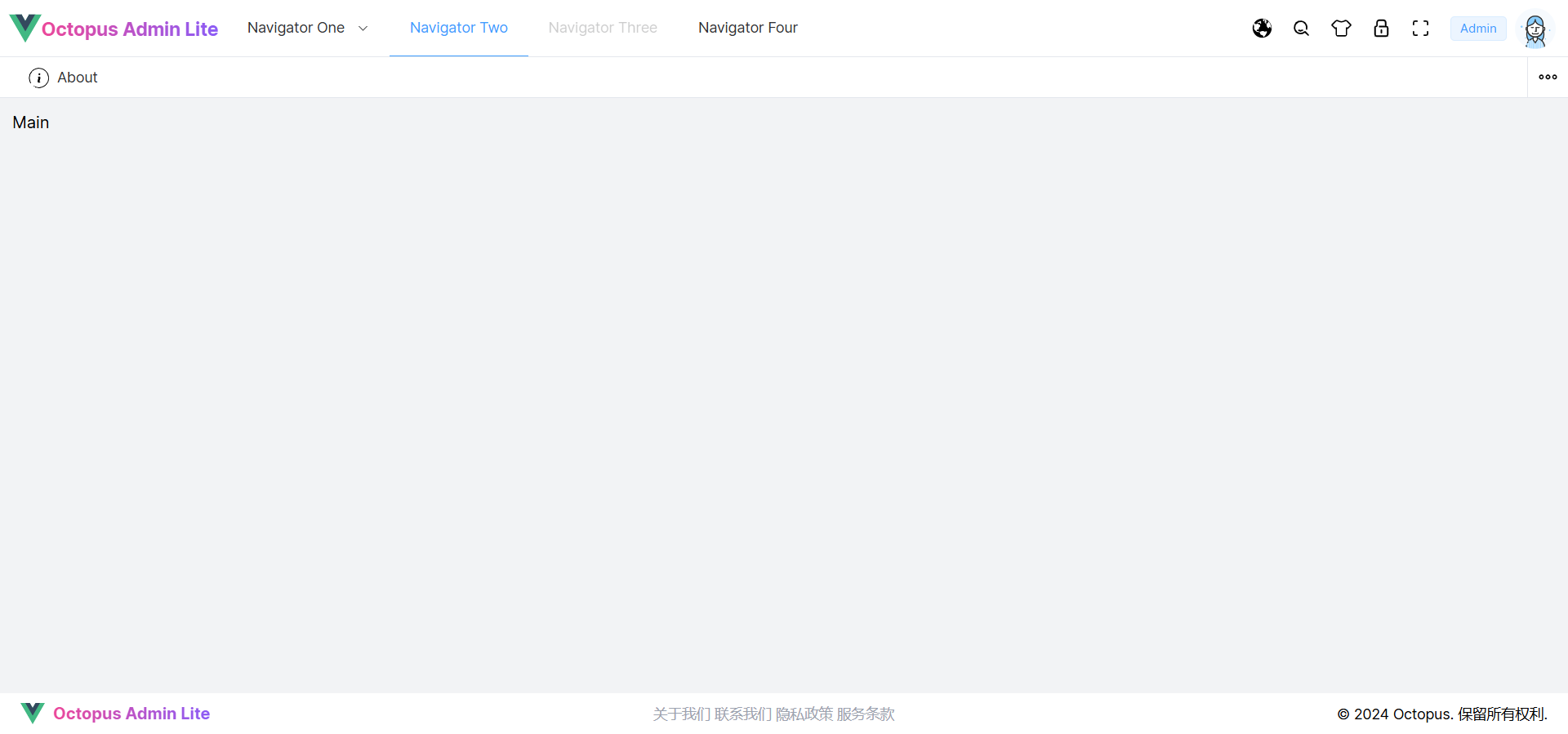
浏览器访问:http://localhost:8080/,默认为经典布局样式:
-
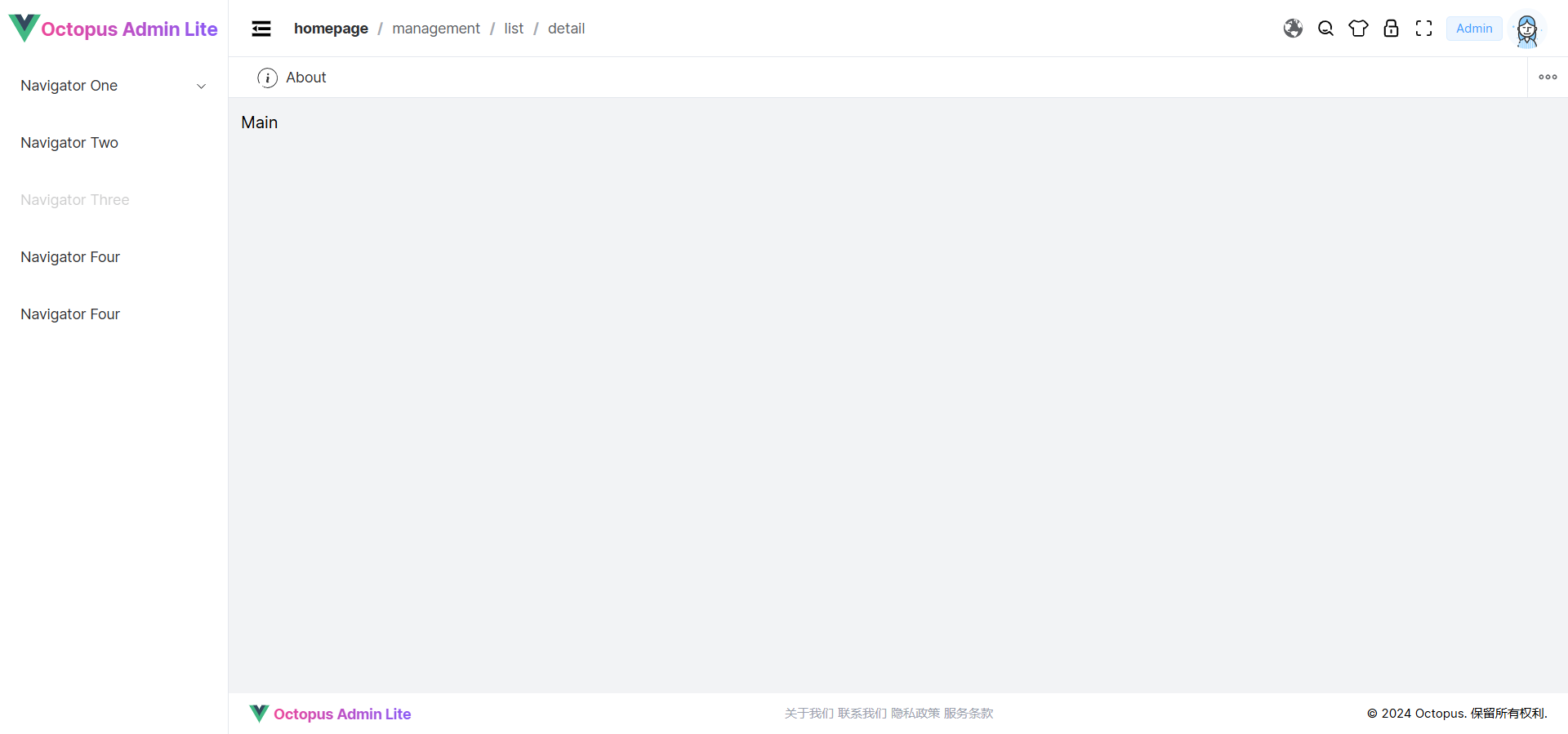
在
src/layouts/index.vue中切换为水平布局样式,查看页面:const mode = computed(() => layoutMode['horizontal'])