2019独角兽企业重金招聘Python工程师标准>>> 
参考:
https://medium.com/@JakobUlbrich/building-a-settings-screen-for-android-part-1-5959aa49337c
android-studio自带的Setting Activity是基于PreferenceActivity的,实际上PreferenceActivity已经被废activity+fragment所取代,使用PreferenceActivity无法使用安卓支持库中新的preference。
第一部分 How to Create and Fix the Overview Screen
Some days ago, I started building a Setting Screen for my Android app. Everything was fine, until I opened it on an older Android version. The overview screen had no material design, a thing I would have accepted, if there weren’t those completely destroyed dialogs: Android’s internal preferences are using Android’s internal app.AlertDialogs. Those dialogs in combination with the AppCompat Dialog Theme, which I had applied to them, resulted in a dialog with two frames on older devices (One system default dialog and a material frame around it).
So I decided to switch to the android.support.v7.preference library, only to face a lot more issues.
This tutorial series should help you, to fix the numerous design issues in the v7.preference library and to build custom preferences.
Including the Library
In order to use the new preferences, we need to import a library. To do so, we add this line to our gradle dependencies (You should change the version number to the latest).
compile 'com.android.support:preference-v7:23.4.0'
Building The Preference Screen
Creating the Preferences
At first, we need to create our preference structure: We create a new XML Android resource file as xml/app_preferences.xml. Now we can add our preference structure to this file. Make sure to add a unique android:key attribute for each preference. More information: How to build the XML
<android.support.v7.preference.PreferenceScreen
    xmlns:android="http://schemas.android.com/apk/res/android">

    <android.support.v7.preference.PreferenceCategory
        android:title="Category 1">

        <android.support.v7.preference.SwitchPreferenceCompat
            android:key="key1"
            android:title="Switch Preference"
            android:summary="Switch Summary"
            android:defaultValue="true" />

        <android.support.v7.preference.EditTextPreference
            android:key="key2"
            android:title="EditText Preference"
            android:summary="EditText Summary"
            android:dialogMessage="Dialog Message"
            android:defaultValue="Default value" />
<android.support.v7.preference.CheckBoxPreference
            android:key="key3"
            android:title="CheckBox Preference"
            android:summary="CheckBox Summary"
            android:defaultValue="true"/>
</android.support.v7.preference.PreferenceCategory>

</android.support.v7.preference.PreferenceScreen>
The v7.preference library provides some preferences we can use: CheckBoxPreference, SwitchPreferenceCompat, EditTextPreference and a ListPreference (and a basic Preference). If we need more than these predefined preferences, we have to build them on our own.
Creating the Preference Fragment
Now we need to create our Preference Fragment, where we can show the preferences from our XML file. We do this by creating a new class, called SettingsFragment, which extends PreferenceFragmentCompat. Since the onCreatePreferences is declared as abstract in the source code of the library, we are forced to include our own implementation to tell the fragment to load our just created app_preferences.xml.
import android.support.v7.preference.PreferenceFragmentCompat;
public class SettingsFragment extends PreferenceFragmentCompat {
@Override
    public void onCreatePreferences(Bundle bundle, String s) {
        // Load the Preferences from the XML file
        addPreferencesFromResource(R.xml.app_preferences);
    }
}
We can add this SettingsFragment (v4.app.Fragment), like any other Fragment (e.g. with a FragmentTransaction) to an Activity.
Applying the Preference Theme
Finally we need to specify a preferenceTheme in our Activity’s theme. If we don’t do so, the App will crash with an IllegalStateException.
The v7.preference library provides only one Theme: PreferenceThemeOverlay (You may have a look at its source code). We add this with the following line in our Activity’s theme:
<item name="preferenceTheme">@style/PreferenceThemeOverlay</item>
After we have done this, our result should now look like this.
(The Activity’s parent theme is Theme.AppCompat and the background is set with android:windowBackground)
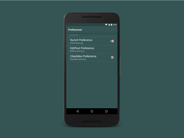
Settings Screen with PreferenceThemeOverlay
As you can see, it has an oversized font and a horizontal line below the category title. This is definitely not material design.
It more looks like a mixture of material design for the CheckBox and Switch widgets on the right and an old design for everything else.
This leads us to the next point: Applying the material theme to our settings.
Applying the Material Design Theme
Since there is no material theme in our current preference library, we need to import the v14.preference library. It is strange that Google splitted up these two libraries, because the v14 version is obviously only an addition to the v7.preference library. However, this means for us, that we have to add one more line to our gradle dependencies (You should change the version number to the latest).
compile 'com.android.support:preference-v14:23.4.0'
Now we have access to two more themes: PreferenceThemeOverlay.v14 and PreferenceThemeOverlay.v14.Material (You may have a look at their source code). To use the material theme, we simply change the preferenceTheme in our Activity’s theme.
<item name="preferenceTheme">
    @style/PreferenceThemeOverlay.v14.Material
</item>
A side effect of including the v14.preference library is that we can use a new preference called MultiSelectListPreference (it requires the v7.preference library to work).
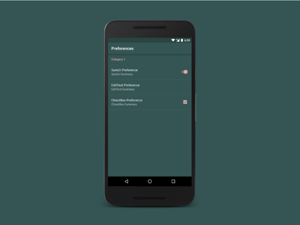
Settings Screen with PreferenceThemeOverlay.v14.Material
Our result should look like this. And this time it is full material design.
The font is not oversized anymore and also the horizontal line below the category title has disappeared.
We can change the color of the CheckBox, the Switch and the PreferenceCategory title by changing the colorAccent in our Activity’s theme.
This was only the first step to create a material design Settings Screen. As soon as you open the Alert Dialog of the EditText preference, you will find more design issues. The next parts of this tutorial will include how to solve the design issues and how to build custom preferences.
第二部分 How to Create and Fix the Dialogs
In the first part of this tutorial we already built and themed our Settings Screen, the next step will be to fix the layout and the theme of the dialogs.
Because, technically, a preference dialog is a v7.app.AlertDialog, we can set their theme to Theme.AppCompat.DayNight.Dialog.Alert with the following entry in our Activity’s theme.
<item name="alertDialogTheme">
    @style/Theme.AppCompat.DayNight.Dialog.Alert
</item>
This allows the dialogs to adapt their colors depending on if it’s day or night (You can find more information on how to use the DayNight theme here).
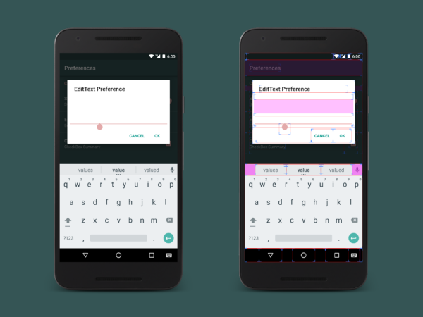
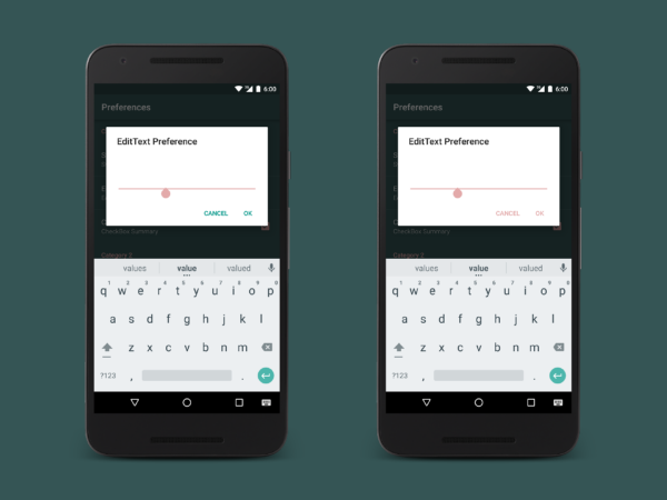
Default look of the preference dialogs
After applying the DayNight theme, our dialog should look like this and, as you can see, there are a lot of issues.
First of all, the text color of the dialog’s content is white on a white background.
The second thing is that the buttons are using the AppCompat’s default accentColor.
And the last issue is that the dialogMessage and the EditText do not have enough padding, so they are really close to the dialog’s edge and the title. Also the dialogMessage is straight below the title, which will definitely not look good, when we make the text visible.
I have enabled Show layout bounds in the developer options, so we can see the layout of all elements.
Fixing the Layout of the Dialog
When you take a look at the layout source code of the EditTextPreference’s dialog (You can find it here), you can see that the simply set the wrong padding for the content’s LinearLayout. They use android:padding=”5dip" which is not enough. Also the space between the dialogMessage and the EditText is set to 48dp which seems a lot to me. We better change this to another value.
We can find the proper values by looking at the v7.app.AlertDialog’s layout source code here. We can see that they use ?attr/dialogPreferredPadding as the left and right padding and a dimension abc_dialog_padding_top_material (18dp) as the top padding of the dialog.
Now we can create a new dimension resource with the currently discovered value of 18dp, because we will need this more than one time.
<dimen name="alert_def_padding">18dp</dimen>
After that, we copy us the whole dialog layout source code of the EditText preference from here to a new layout file called pref_dialog_edittext_fix.xml and change the paddings and margins.
<ScrollView
    xmlns:android="http://schemas.android.com/apk/res/android"
    android:layout_width="match_parent"
    android:layout_height="match_parent"
    android:layout_marginTop="48dp"
    android:layout_marginBottom="48dp"
    android:overScrollMode="ifContentScrolls">

    <LinearLayout
        android:layout_width="match_parent"
        android:layout_height="wrap_content"
        android:paddingTop="@dimen/alert_def_padding"
        android:paddingBottom="@dimen/alert_def_padding"
        android:paddingStart="?dialogPreferredPadding"
        android:paddingLeft="?dialogPreferredPadding"
        android:paddingEnd="?dialogPreferredPadding"
        android:paddingRight="?dialogPreferredPadding"
        android:orientation="vertical">

        <TextView
            android:id="@android:id/message"
            style="?android:attr/textAppearanceSmall"
            android:layout_marginBottom="@dimen/alert_def_padding"
            android:layout_width="match_parent"
            android:layout_height="wrap_content"
            android:textColor="?android:attr/textColorSecondary" />

        <EditText
            android:id="@android:id/edit"
            android:layout_width="match_parent"
            android:layout_height="wrap_content" />

    </LinearLayout>
</ScrollView>
We can apply the modified layout to our EditTextPreference in the xml/app_preferences.xml by adding the android:dialogLayout attribute.
<android.support.v7.preference.EditTextPreference
    android:key="key2"
    android:title="EditText Preference"
    android:summary="EditText Summary"
    android:dialogMessage="Dialog Message"
    android:defaultValue="Default value"
    android:dialogLayout="@layout/pref_dialog_edittext_fix" />
You can also add an remove Views from this custom layout, but always keep the EditText with the id @android:id/edit, because the v7.preference library will crash your App with an IllegalStateException if it can not find it. Also, fixing the layout for the ListPreference should be very similar.
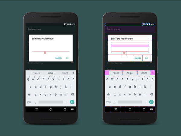
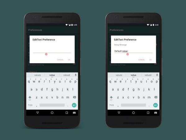
The dialog after applying the layout fix
After digging through the layout source code, discovering the right dimensions and applying them to our EditTextPreference, everything in our dialog should now look perfectly aligned.
The title, the dialogMessage and EditText now have the same padding on the left and right. And we even increased the space between the title and the dialogMessage.
Fixing the Theme and Colors
We still have the wrong colors for the buttons and for the text in our dialog, which we are now going to fix. If you want to look at the AppCompat theme inheritance, you can find the source here.
Fixing the Color of the Buttons
The dialog before and after changing colorAccent in the dialogs’s theme
Our dialog’s theme does override colorAccent from our Acivity’s theme with the default greenish color which is provided in the DayNight.Dialog.Alert theme.
This is the reason why the dialog buttons do not use colorAccent from our Activity’s theme.
If we want to change the button color, we need to modify our dialog’s theme.
We do this with the following in our styles.xml. First we create a new style called AppAlertDialog, which inherits from our previous dialog’s theme. In this new style, we can modify our colorAccent as we want to. After that, we say our Activity’s theme to use our newly created style as the alertDialogTheme.
<style name="AppTheme" parent="Theme.AppCompat">
    <!-- ... other stuff ... -->
    <item name="preferenceTheme">
        @style/PreferenceThemeOverlay.v14.Material
    </item>
    <item name="alertDialogTheme">@style/AppAlertDialog</item>
</style>
<style name="AppAlertDialog"
        parent="Theme.AppCompat.DayNight.Dialog.Alert">
    <item name="colorAccent">@color/colorAccent</item>
</style>
Fixing the Color of the Text
The dialog before and after changing the theme of the content
Since our Activity’s theme is Theme.AppCompat, which provides white text, and our our dialog’s theme does not override this, we also get white text in our dialog.
We could override all text colors in our dialog’s theme by our own, but this would require a lot of work. And if we are using the DayNight theme, it is even harder.
So the easiest way is to apply the theme to a Layout that includes the content elements of our dialog.
First we create a new style, which inherits from a theme that we want to use. In this case it is Theme.AppCompat.DayNight, because we want that the color of the text also adapts depending on if it is day or night. If we would not use the DayNight theme, it could result in dark text on a dark background at night. When we later apply this style as our dialog’s content theme, it does not inherit the colorAccent from our Activity’s theme anymore. That’s why we have to add it to this style again, to keep the current color of the EditText.
<style name="AppAlertDialogContent"
        parent="Theme.AppCompat.DayNight">
    <!-- To keep the color of EditText -->
    <item name="colorAccent">@color/colorAccent</item>
</style>
Now we go back to the pref_dialog_edittext_fix.xml file, which we created to fix the layout issues of the EditTextPreference, search for the root Layout and add our theme there.
<ScrollView
    xmlns:android="http://schemas.android.com/apk/res/android"
    android:layout_width="match_parent"
    android:layout_height="match_parent"
    android:layout_marginTop="48dp"
    android:layout_marginBottom="48dp"
    android:overScrollMode="ifContentScrolls"
    android:theme="@style/AppAlertDialogContent">
You can change your dialog’s content theme as you want.
When we now open our dialog, you should not be able to find any layout or theme issues anymore. But if you do, you should be able to solve them by modifying the layout file or one of our recently created styles.
This was the second step to create a material design Settings Screen. The next part of this tutorial will be about how to build custom preferences and how to solve the design issues which occur during this process.
第三部分 How to Create Custom Preferences
In the first part of this tutorial we already built and themed our Settings Screen and in the second part we fixed the layout and the theme of the dialogs. Now is the time to extend the the v7.preference library to build a custom preference. So let’s get started.
Understanding How the Library Works
Since the v7.preference library only provides four basic preferences (five when you include the v14.preference library), you are likely to need a custom preference. But you should not start coding without knowing what you have to do. So let’s take a look at the structure of the v7.preference library to understand how it works. Because the following explains the basics of what we do later, you should read this carefully. (If you are crazy and want to discover this by your own, you can find the source code right here). I will only focus on the important things.
How the Library Is Structured
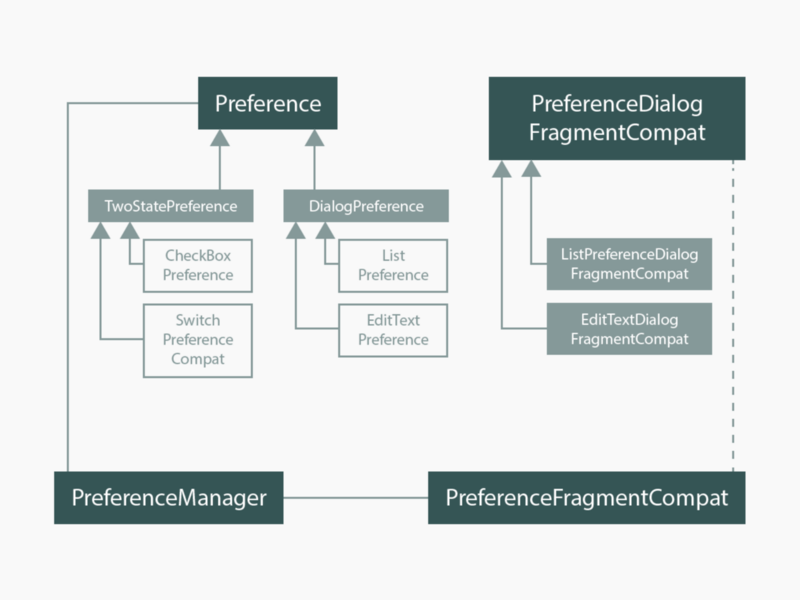
The library structure (simplified)
As you can see in the image, there are four important main classes we should know:
- PreferenceFragmentCompat: This is the fragment for our main Settings Screen. (Notice that this is abstract class, which means we can not instantiate it directly, but we can extend it).
- Preference: This is a basic preference which can appear on our Settings Screen. All predefined preferences inherit (indirectly) from this class.
- PreferenceDialogFragmentCompat: This is a basic dialog for a preference. All dialogs of the preferences inherit from this class. (Notice that this is abstract class, which means we can not instantiate it directly, but we can extend it. And yes, this must be the longest class name ever.)
- PreferenceManager: This provides the access to the SharedPreferences. The PreferenceFragmentCompat and all Preferences that belong to it, share the same PreferenceManger.
Preferences are separated in two different types: The TwoStatePreferences which can only toggle and store a boolean value and the DialogPreferences which provide a dialog, the user can interact with. (Notice that these two classes are abstract).
How the Dialogs Are Opened
The dialog classes are separated from their related DialogPreference classes. For example, we have the EditTextPreference and its related dialog EditTextDialogFragmentCompat in two separated classes. This means, that the dialog must explicitly be opened somewhere. When we read through the source of the DialogPreference (You can find it here) we can discover the following piece of code.
@Override
protected void onClick() {
    getPreferenceManager().showDialog(this);
}
And in the PreferenceManager we can find the following pieces of code.
public void showDialog(Preference preference) {
    if (mOnDisplayPreferenceDialogListener != null) {
        mOnDisplayPreferenceDialogListener
            .onDisplayPreferenceDialog(preference);
    }
}
...
public interface OnDisplayPreferenceDialogListener {
    void onDisplayPreferenceDialog(Preference preference);
}
It says us, that if we click on a DialogPreference, it calls a method in the PreferenceManger to show the dialog for this preference. The PreferenceManager then redirects the call to a registered Listener. The PreferenceFragmentCompat implements the interface provided by the PreferenceManager, so it can register itself as the Listener for the dialogs.
In summary, when we click on a DialogPreference, we end up in the onDisplayPreferenceDialog(Preference preference) method of the PreferenceFragmentCompat, which we need to override to open a custom dialog.
Building a Custom Preference
I have decided to create a custom TimePreference as an example here. It will open a dialog and let the user select a specific time.
When you want to create a preference that is very similar to an existing one, you can perhaps extend and modify the existing preference. For example when you want a NumberPreference, you can extend the EditTextPreference and modify it, that it only allows the user to type numbers. I will directly extend the class DialogPreference.
Warning, the following will contain a lot of code and nearly no images.
Building Our Dialog’s Layout
To create our dialogs layout, we create a new layout resource file called pref_dialog_time.xml. The only thing we need for our dialog, is a TimePicker. So we add it as the root view to our layout file. We then apply the theme modifications from the second part of this tutorial (I have highlighted them).
<?xml version="1.0" encoding="utf-8"?>
<TimePicker
    xmlns:android="http://schemas.android.com/apk/res/android"
    android:id="@+id/edit"
    android:layout_width="match_parent"
    android:layout_height="match_parent"
    android:paddingTop="@dimen/alert_def_padding"
    android:paddingBottom="@dimen/alert_def_padding"
    android:theme="@style/AppAlertDialogContent" />
Don’t forget to add the id edit. If you do, your App will crash later.
Building Our Preference
Now we can create our custom preference. Because we want that our preference opens a dialog with the TimePicker, we need to create a new class called TimePreference which extend DialogPreference.
import android.support.v7.preference.DialogPreference;
public class TimePreference extends DialogPreference {
    ...
}
When we have done this, we can add our preference’s logic. We start with the global variables which we need in our TimePreference: The TimePicker in our dialog can give us the selected hour and the selected minute as integers. To store this values in a single SharedPreference I decided to convert the time to minutes. I also decided to store the reference to the dialog’s layout in a global variable. That makes it easier to use. Add this to your TimePreference class:
private int mTime;
private int mDialogLayoutResId = R.layout.pref_dialog_time;
Now let’s move to the constructors. We start with the one with the fewest parameters and call the next higher constructor with a default value for the missing attribute. We do this until we reach the last constructor. There we can process all the things we want to do. We can for example read attributes from the AttributeSet. Add this to your TimePreference class:
public TimePreference(Context context) {
    this(context, null);
}
public TimePreference(Context context, AttributeSet attrs) {
    this(context, attrs, 0);
}
public TimePreference(Context context, AttributeSet attrs,
        int defStyleAttr) {
    this(context, attrs, defStyleAttr, defStyleAttr);
}
public TimePreference(Context context, AttributeSet attrs,
        int defStyleAttr, int defStyleRes) {
    super(context, attrs, defStyleAttr, defStyleRes);

    // Do custom stuff here
    // ...
    // read attributes etc.
}
Quick note: When you replace the 0 in the second constructor with R.attr.dialogPreferenceStyle (For a DialogPreference) or R.attr.preferenceStyle (For any other preference) you won’t face any design issues later. Thanks Ivan Soriano
Next, we need two methods. One to save the time to the SharedPreferences and one read the current value. We later call these methods from our dialog. Add this to your TimePreference class:
public int getTime() {
    return mTime;
}
public void setTime(int time) {
    mTime = time;
    // Save to Shared Preferences
    persistInt(time);
}
Now we need to override some other methods. First we need one to read the default value (we can define one with the android:defaultValue attribute when we use our Preference in our xml/app_preferences.xml). The second method reads our stored value from the SharedPreferences and saves it to the mTime variable. Add this to your TimePreference class:
@Override
protected Object onGetDefaultValue(TypedArray a, int index) {
    // Default value from attribute. Fallback value is set to 0.
    return a.getInt(index, 0);
}
@Override
protected void onSetInitialValue(boolean restorePersistedValue,
        Object defaultValue) {
    // Read the value. Use the default value if it is not possible.
    setTime(restorePersistedValue ?
        getPersistedInt(mTime) : (int) defaultValue);
}
The last thing we need to do, is to set the layout resource for our dialog. We do this by overriding the getDialogLayoutResource method. Add this to your TimePreference class:
@Override
public int getDialogLayoutResource() {
    return mDialogLayoutResId;
}
Building the Dialog
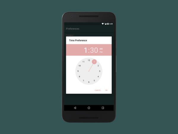
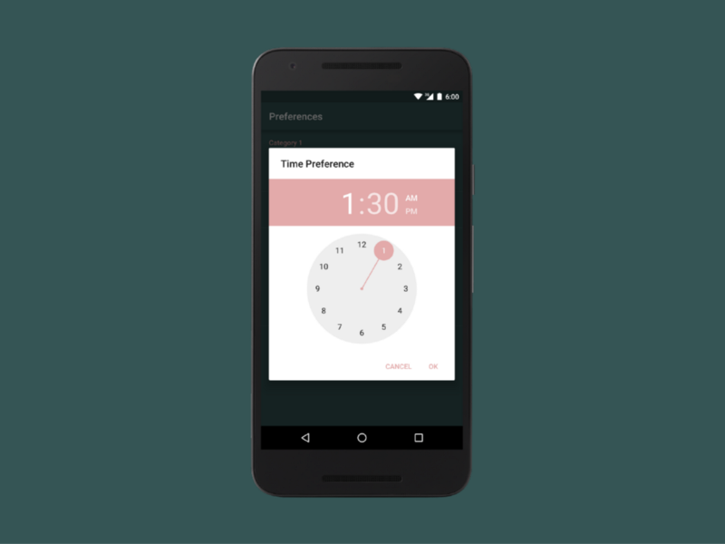
A small picture to remember how our result should look. Only in case you forgot it after this endless explanation of the code.
Now let us create a dialog like in the picture.
If you have read carefully (I can understand you if you haven’t), you should know that all preference dialogs inherit from one abstract class called PreferenceDialogFragmentCompat. So we create a new class called TimePreferenceFragmentCompat which extends this class.
import android.support.v7.preference.PreferenceDialogFragmentCompat;
public class TimePreferenceDialogFragmentCompat
        extends PreferenceDialogFragmentCompat {
...
}
We don’t need a special constructor, but we need a static method that creates a new instance of our TimePreferenceFragmentCompat. To know to which preference this new dialog belongs, we add a String parameter with the key of the preference to our method and pass it (inside a Bundle) to the dialog. We will use this static method later. Add this to your TimePreferenceFragmentCompat class:
public static TimePreferenceDialogFragmentCompat newInstance(
        String key) {
    final TimePreferenceDialogFragmentCompat
            fragment = new TimePreferenceDialogFragmentCompat();
    final Bundle b = new Bundle(1);
    b.putString(ARG_KEY, key);
    fragment.setArguments(b);

    return fragment;
}
Now we need to do something with our TimePicker. We want that it always shows the time that was stored in the SharedPreferences. We can access the TimePicker from our created layout, after it was added to the dialog. We can do this in the onBindDialogView method. The getPreference method returns the preference which opened the dialog. Add this to your TimePreferenceFragmentCompat class:
@Override
protected void onBindDialogView(View view) {
    super.onBindDialogView(view);

    mTimePicker = (TimePicker) view.findViewById(R.id.edit);

    // Exception when there is no TimePicker
    if (mTimePicker == null) {
        throw new IllegalStateException("Dialog view must contain" +
                " a TimePicker with id 'edit'");
    }

    // Get the time from the related Preference
    Integer minutesAfterMidnight = null;
    DialogPreference preference = getPreference();
    if (preference instanceof TimePreference) {
        minutesAfterMidnight =
                ((TimePreference) preference).getTime();
    }

    // Set the time to the TimePicker
    if (minutesAfterMidnight != null) {
        int hours = minutesAfterMidnight / 60;
        int minutes = minutesAfterMidnight % 60;
        boolean is24hour = DateFormat.is24HourFormat(getContext());

        mTimePicker.setIs24HourView(is24hour);
        mTimePicker.setCurrentHour(hours);
        mTimePicker.setCurrentMinute(minutes);
    }
}
Every time we open the dialog, it now displays the time which is stored in the SharedPreferences (We still have to do something before we can actually open the dialog).
The last thing for our dialog is, that it should save the selected time when we click the OK button (positive result). For this, we override the onDialogClosed method. First we calculate the minutes we want to save, and after that, we get our related preference and call the setTime method we have defined there. Add this to your TimePreferenceFragmentCompat class:
@Override
public void onDialogClosed(boolean positiveResult) {
    if (positiveResult) {
        // generate value to save
        int hours = mTimePicker.getCurrentHour();
        int minutes = mTimePicker.getCurrentMinute();
        int minutesAfterMidnight = (hours * 60) + minutes;

        // Get the related Preference and save the value
        DialogPreference preference = getPreference();
        if (preference instanceof TimePreference) {
            TimePreference timePreference =
                    ((TimePreference) preference);
            // This allows the client to ignore the user value.
            if (timePreference.callChangeListener(
                    minutesAfterMidnight)) {
                // Save the value
                timePreference.setTime(minutesAfterMidnight);
            }
        }
    }
}
FINALLY, we are done with the dialog.
Let it Open the Dialog
There is only one thing left to make it work. If you have read the first part, you know that the dialog must explicitly be opened somewhere. The onDisplayPreferenceDialog method in the PreferenceFragmentCompat is this place. Now go to your SettingsFragment class (it extends PreferenceFragmentCompat) and add the following method. We first try if the Preference that wants to open a dialog is one of our custom preferences. If it is one, we create a new instance of the related dialog (and pass the preference key to it) and open it. If it is not one of our custom preferences, we call the method of the super class which handles everything for the predefined DialogPreferences.
@Override
public void onDisplayPreferenceDialog(Preference preference) {
    // Try if the preference is one of our custom Preferences
    DialogFragment dialogFragment = null;
    if (preference instanceof TimePreference) {
        // Create a new instance of TimePreferenceDialogFragment with the key of the related
        // Preference
        dialogFragment = TimePreferenceDialogFragmentCompat
                .newInstance(preference.getKey());
    }

    // If it was one of our cutom Preferences, show its dialog
    if (dialogFragment != null) {
        dialogFragment.setTargetFragment(this, 0);
        dialogFragment.show(this.getFragmentManager(),
                "android.support.v7.preference" +
                ".PreferenceFragment.DIALOG");
    }
    // Could not be handled here. Try with the super method.
    else {
        super.onDisplayPreferenceDialog(preference);
    }
}
Adding it to the Settings Screen
And now, after a lot of coding, we finally have our own preference. We can add it to our xml/app_preferences.xml like this (replace your.package and the key):
<your.package.TimePreference
    android:key="key4"
    android:title="Time Preference"
    android:summary="Time Summary"
    android:defaultValue="90" />
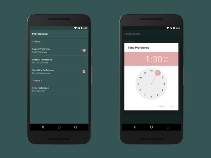
And when we open it, it looks like this… (If you have changed the constructors according to the note, you can skip this part)
TimePreference with layout and design issues
Wait, WHAT? There are still layout and design issues? Even after applying all the fixes from part 1 and part 2 of this tutorial? YES…
Fixing the Layout and Design
Fortunately, the solution is relatively simple, when someone tells you how it works. I had to find it out by myself, but you are lucky and I will tell you.
Go to your your styles.xml and add two new styles. The first AppPreference will change the layout of the preference on the Settings Screen to material design. The second one, AppPreference.DialogPreference, inherits from the first and defines the text for the dialog buttons.
<!-- Style for an Preference Entry -->
<style name="AppPreference">
    <item name="android:layout">@layout/preference_material</item>
</style>

<!-- Style for a DialogPreference Entry -->
<style name="AppPreference.DialogPreference">
    <item name="positiveButtonText">@android:string/ok</item>
    <item name="negativeButtonText">@android:string/cancel</item>
</style>
After doing this, you can add the style to your custom preference in xml/app_preferences.xml. For every custom preference which extends DialogPreference you can set AppPreference.DialogPreference as the style. For all others you can use AppPreference. Everything should then automatically be fixed.
<your.package.TimePreference
    android:key="key4"
    android:title="Time Preference"
    android:summary="Time Summary"
    android:defaultValue="90"
    style="@style/AppPreference.DialogPreference" />
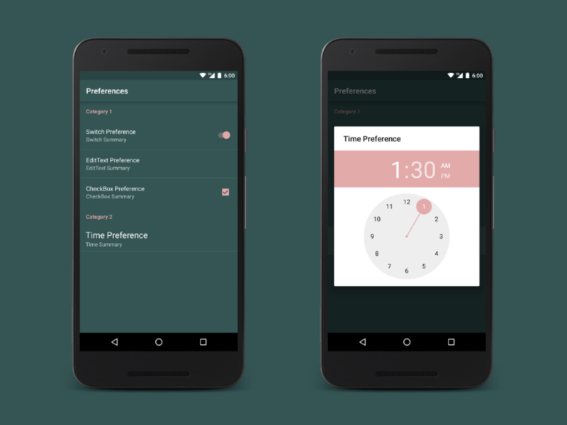
And now, our result looks like this.
Our final custom TimePreference
Wow, this was a long and hard way to build a Settings Screen. You should now know, how to apply material design everywhere and how to build custom preferences. I hope I haven’t done mistakes in this part of the tutorial.
I recommend you to always have a look at the Android Developers site here, and the site with the source code of the v7.preference library here. When you need to build your own preference, just look how they have build the predefined ones and which methods you can use.
第四部分 How to Use a Custom Layout for the Preference Fragment
This part of the tutorial was originally published as an answer to a question in third Part of my tutorial series. (You may want to go back to the first Partor the second Part.) It will tell you how you can use a custom layout for the PreferenceFragmentCompat from the v7 preferences support library. Just follow the simple steps below.
First, go to your style.xml file and search for your App’s Theme (The Theme which is used for the Activity where your PreferenceFragment belongs to). It should look like this at the moment:
<style name="AppTheme" parent="Theme.AppCompat">
    ...
    <item name="preferenceTheme">
        @style/PreferenceThemeOverlay.v14.Material
    </item>
    ...
</style>
Found it?
Then change it to this:
<style name="AppTheme" parent="Theme.AppCompat">
    ...
    <item name="preferenceTheme">
        @style/AppPreferenceTheme
    </item>
    ...
</style>
and add the following two styles:
<!-- Custom Preference Theme -->
<style name="AppPreferenceTheme"
        parent="@style/PreferenceThemeOverlay.v14.Material">
    <item name="preferenceFragmentCompatStyle">
        @style/AppPreferenceFragmentCompatStyle
    </item>
</style>
<!-- Custom Style for PreferenceFragmentCompat -->
<style name="AppPreferenceFragmentCompatStyle"
        parent="@style/PreferenceFragment.Material">
    <item name="android:layout">@layout/pref_screen</item>
</style>
In our custom AppPreferenceTheme (which inherits from the v14 Material Theme) we override the style for PreferenceFragmentCompat.
In AppPreferenceFragmentCompatStyle (which inherits from the default Material one to keep the other predefined attributes) we finally change the layout for it.
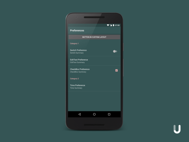
In your layout file (in this case pref_screen.xml) you must include a ViewGroup with the id @+id/list_container (support library version 23.4.0) or @android:id/list_container (support library version 24.2.0).
Note that Google changed the needed id from R.id.list_container (in revision 23.4.0) to android.R.id.list_container (in revision 24.0.0). Android Studio says the new id requires API 24, but it also works on older APIs.
It should look like this:
<?xml version="1.0" encoding="utf-8"?>
<LinearLayout
    xmlns:android="http://schemas.android.com/apk/res/android"
    android:orientation="vertical"
    android:layout_width="match_parent"
    android:layout_height="match_parent">
<Button
        android:layout_width="match_parent"
        android:layout_height="wrap_content"
        android:text="Button in custom layout"/>

    <FrameLayout
        android:layout_width="match_parent"
        android:layout_height="match_parent"
        android:id="@android:id/list_container"/>
</LinearLayout>
Your App should now look similar to this:
I think you can access the Views from your layout in the onCreateView method of the PreferenceFragmentCompat.
You can have a look at the project files on GitHub.
https://github.com/jakobulbrich/preferences-demo