WPF 应用完全模拟 UWP 的标题栏按钮
WPF 自定义窗口样式有多种方式,不过基本核心实现都是在修改 Win32 窗口样式。然而,Windows 上的应用就应该有 Windows 应用的样子嘛,在保证自定义的同时也能与其他窗口样式保持一致当然能最大程度保证 Windows 操作系统上的体验一致性。
本文将分享一个我自制的标题栏按钮样式,使其与 UWP 原生应用一模一样(同时支持自定义)。
在 WPF 使用 WindowChrome,在自定义窗口标题栏的同时最大程度保留原生窗口样式(类似 UWP/Chrome) 一文中,我使用 WindowChrome 尽可能将 Windows 原生的窗口机制都用上了,试图完全模拟原生窗口的样式。不过,如果自定义了窗口的背景色,那么标题栏那三大金刚键的背景就显得很突兀。
由于 Win32 原生的方法顶多只支持修改标题栏按钮的背景色,而不支持让标题栏按钮全透明,所以我们只能完全由自己来实现这三个按钮的功能了。
标题栏的四个按钮
一开始我说三个按钮,是因为大家一般都只能看得见三个。但这里说四个按钮,是因为实际实现的时候我们是四个按钮。事实上,Windows 的原生实现也是四颗按钮。
- 最小化
- 还原
- 最大化
- 关闭
当窗口最小化时,显示还原、最大化和关闭按钮。当窗口普通显示时,显示最小化、最大化和关闭按钮,这也是我们见的最多的情况。当窗口最大化时,显示最小化、还原和关闭按钮。
自绘标题栏按钮
标题栏按钮并不单独存在,所以我直接做了一整个窗口样式。使用此窗口样式,窗口能够模拟得跟 UWP 一模一样。
以下是模拟的效果:
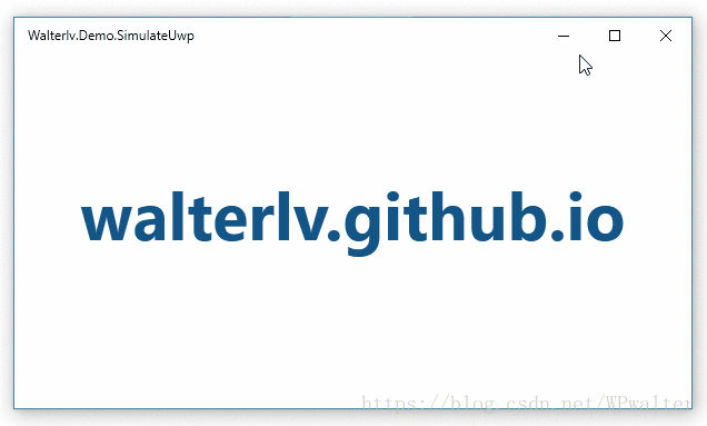
▲ WPF 模拟版本
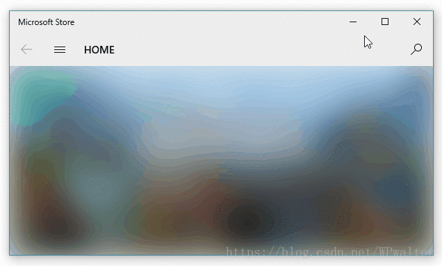
▲ UWP 原生版本(为避免说我拿同一个应用附图,我选了微软商店应用对比)
为了使用到这样近乎原生的窗口样式,我们需要两个文件。一个放 XAML 样式,一个放样式所需的逻辑代码。
因为代码很长,所以我把它们放到了最后。
如何使用我制作的原生窗口样式
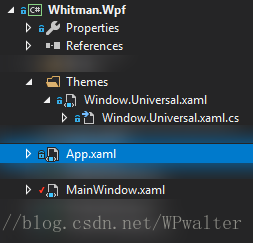
当你把我的两份代码文件放入到你的项目中之后,在 App.xaml 中将资源引用即可:
<Application.Resources>
    <ResourceDictionary>
        <ResourceDictionary.MergedDictionaries>
            <ResourceDictionary Source="Themes/Window.Universal.xaml" />
        </ResourceDictionary.MergedDictionaries>
    </ResourceDictionary>
</Application.Resources>
随后,在 MainWindow 中就可以通过 Style="{StaticResource Style.Window.Universal}" 使用这份样式。
<Window x:Class="Walterlv.Demo.MainWindow"
        xmlns="http://schemas.microsoft.com/winfx/2006/xaml/presentation"
        xmlns:x="http://schemas.microsoft.com/winfx/2006/xaml"
        xmlns:themes="clr-namespace:Walterlv.Themes"
        Title="Walterlv.Demo.SimulateUwp" Width="800" Height="450"
        Background="#279EDA" Style="{StaticResource Style.Window.Universal}">
    <themes:UniversalWindowStyle.TitleBar>
        <themes:UniversalTitleBar ForegroundColor="White" InactiveForegroundColor="#7FFFFFFF"
                                  ButtonHoverForeground="White" ButtonHoverBackground="#3FFFFFFF"
                                  ButtonPressedForeground="#7FFFFFFF" ButtonPressedBackground="#3F000000" />
    </themes:UniversalWindowStyle.TitleBar>
    <Grid>
        <!-- 在这里添加你的正常窗口内容 -->
    </Grid>
</Window>
当然,我额外提供了 UniversalWindowStyle.TitleBar 附加属性,用于像 UWP 那样定制标题栏按钮的颜色。如果不设置,效果跟 UWP 默认情况下的效果完全一样。
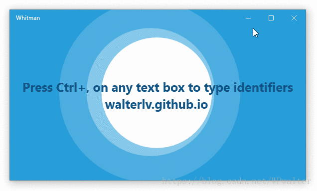
下面是这份样式在 Whitman - Microsoft Store 应用中实际使用的效果,其中的颜色设置就是上面代码中所指定的颜色:
附样式代码文件
样式文件 Window.Universal.xaml:
<!-- Window.Universal.xaml -->
<ResourceDictionary xmlns="http://schemas.microsoft.com/winfx/2006/xaml/presentation"
xmlns:x="http://schemas.microsoft.com/winfx/2006/xaml"
xmlns:themes="clr-namespace:Walterlv.Themes">
<Style x:Key="Style.Window.Universal" TargetType="Window">
<Style.Resources>
<SolidColorBrush x:Key="Brush.TitleBar.Foreground" Color="{Binding Path=(themes:UniversalWindowStyle.TitleBar).ForegroundColor, RelativeSource={RelativeSource TemplatedParent}, Mode=OneWay}" />
<SolidColorBrush x:Key="Brush.TitleBar.InactiveForeground" Color="{Binding Path=(themes:UniversalWindowStyle.TitleBar).InactiveForegroundColor, RelativeSource={RelativeSource TemplatedParent}, Mode=OneWay}" />
<SolidColorBrush x:Key="Brush.TitleBar.ButtonHoverForeground" Color="{Binding Path=(themes:UniversalWindowStyle.TitleBar).ButtonHoverForeground, RelativeSource={RelativeSource TemplatedParent}, Mode=OneWay}" />
<SolidColorBrush x:Key="Brush.TitleBar.ButtonHoverBackground" Color="{Binding Path=(themes:UniversalWindowStyle.TitleBar).ButtonHoverBackground, RelativeSource={RelativeSource TemplatedParent}, Mode=OneWay}" />
<SolidColorBrush x:Key="Brush.TitleBar.ButtonPressedForeground" Color="{Binding Path=(themes:UniversalWindowStyle.TitleBar).ButtonPressedForeground, RelativeSource={RelativeSource TemplatedParent}, Mode=OneWay}" />
<SolidColorBrush x:Key="Brush.TitleBar.ButtonPressedBackground" Color="{Binding Path=(themes:UniversalWindowStyle.TitleBar).ButtonPressedBackground, RelativeSource={RelativeSource TemplatedParent}, Mode=OneWay}" />
</Style.Resources>
<Setter Property="themes:UniversalWindowStyle.TitleBar">
<Setter.Value>
<themes:UniversalTitleBar />
</Setter.Value>
</Setter>
<Setter Property="WindowChrome.WindowChrome">
<Setter.Value>
<WindowChrome GlassFrameThickness="0 64 0 0" NonClientFrameEdges="Left,Bottom,Right" UseAeroCaptionButtons="False" />
</Setter.Value>
</Setter>
<Setter Property="Template">
<Setter.Value>
<ControlTemplate TargetType="Window">
<Border Padding="4 1 4 4">
<Grid x:Name="RootGrid" Background="{TemplateBinding Background}">
<Grid x:Name="TitleBarPanel" VerticalAlignment="Top" Height="31">
<FrameworkElement.Resources>
<Style TargetType="{x:Type Button}">
<Setter Property="Width" Value="46"/>
<Setter Property="BorderThickness" Value="0" />
<Setter Property="Foreground" Value="{StaticResource Brush.TitleBar.Foreground}" />
<Setter Property="Background" Value="Transparent"/>
<Setter Property="Stylus.IsPressAndHoldEnabled" Value="False" />
<Setter Property="Stylus.IsFlicksEnabled" Value="False" />
<Setter Property="Stylus.IsTapFeedbackEnabled" Value="False" />
<Setter Property="Stylus.IsTouchFeedbackEnabled" Value="False" />
<Setter Property="WindowChrome.IsHitTestVisibleInChrome" Value="True"/>
<Setter Property="Template">
<Setter.Value>
<ControlTemplate TargetType="Button">
<Border Name="OverBorder" BorderThickness="0 1 0 0" Background="{TemplateBinding Background}">
<TextBlock x:Name="MinimizeIcon"
Foreground="{TemplateBinding Foreground}" Text="{TemplateBinding Content}"
FontSize="10" FontFamily="Segoe MDL2 Assets"
HorizontalAlignment="Center" VerticalAlignment="Center"/>
</Border>
</ControlTemplate>
</Setter.Value>
</Setter>
<Style.Triggers>
<MultiTrigger>
<!-- When the pointer is over the button. -->
<MultiTrigger.Conditions>
<Condition Property="IsMouseOver" Value="True" />
<Condition Property="IsStylusOver" Value="False" />
</MultiTrigger.Conditions>
<Setter Property="Foreground" Value="{StaticResource Brush.TitleBar.ButtonHoverForeground}" />
<Setter Property="Background" Value="{StaticResource Brush.TitleBar.ButtonHoverBackground}" />
</MultiTrigger>
<!-- When the pointer is pressed. -->
<MultiTrigger>
<MultiTrigger.Conditions>
<Condition Property="IsPressed" Value="True" />
<Condition Property="AreAnyTouchesOver" Value="False" />
</MultiTrigger.Conditions>
<Setter Property="Foreground" Value="{StaticResource Brush.TitleBar.ButtonPressedForeground}" />
<Setter Property="Background" Value="{StaticResource Brush.TitleBar.ButtonPressedBackground}" />
</MultiTrigger>
<!-- When the touch device is pressed. -->
<MultiTrigger>
<MultiTrigger.Conditions>
<Condition Property="IsPressed" Value="True" />
<Condition Property="AreAnyTouchesOver" Value="True" />
</MultiTrigger.Conditions>
<Setter Property="Foreground" Value="{StaticResource Brush.TitleBar.ButtonPressedForeground}" />
<Setter Property="Background" Value="{StaticResource Brush.TitleBar.ButtonPressedBackground}" />
</MultiTrigger>
</Style.Triggers>
</Style>
<Style x:Key="Style.Button.Close" TargetType="Button" BasedOn="{StaticResource {x:Type Button}}">
<Style.Triggers>
<MultiTrigger>
<!-- When the pointer is over the button. -->
<MultiTrigger.Conditions>
<Condition Property="IsMouseOver" Value="True" />
<Condition Property="IsStylusOver" Value="False" />
</MultiTrigger.Conditions>
<Setter Property="Foreground" Value="White" />
<Setter Property="Background" Value="#E81123" />
</MultiTrigger>
<!-- When the pointer is pressed. -->
<MultiTrigger>
<MultiTrigger.Conditions>
<Condition Property="IsPressed" Value="True" />
<Condition Property="AreAnyTouchesOver" Value="False" />
</MultiTrigger.Conditions>
<Setter Property="Foreground" Value="Black" />
<Setter Property="Background" Value="#F1707A" />
</MultiTrigger>
<!-- When the touch device is pressed. -->
<MultiTrigger>
<MultiTrigger.Conditions>
<Condition Property="IsPressed" Value="True" />
<Condition Property="AreAnyTouchesOver" Value="True" />
</MultiTrigger.Conditions>
<Setter Property="Foreground" Value="Black" />
<Setter Property="Background" Value="#F1707A" />
</MultiTrigger>
</Style.Triggers>
</Style>
</FrameworkElement.Resources>
<TextBlock x:Name="TitleTextBlock" FontSize="12" Text="{TemplateBinding Title}"
Margin="12 0 156 0" VerticalAlignment="Center" Foreground="{StaticResource Brush.TitleBar.Foreground}" />
<StackPanel x:Name="TitleBarButtonPanel" Orientation="Horizontal"
Margin="0 -1 0 0" HorizontalAlignment="Right">
<Button x:Name="MinimizeButton" Content="" themes:UniversalWindowStyle.TitleBarButtonState="Minimized" />
<Button x:Name="RestoreButton" Content="" themes:UniversalWindowStyle.TitleBarButtonState="Normal" />
<Button x:Name="MaximizeButton" Content="" themes:UniversalWindowStyle.TitleBarButtonState="Maximized" />
<Button x:Name="CloseButton" Content="" Style="{StaticResource Style.Button.Close}" themes:UniversalWindowStyle.IsTitleBarCloseButton="True" />
</StackPanel>
</Grid>
<AdornerDecorator>
<ContentPresenter />
</AdornerDecorator>
</Grid>
</Border>
<ControlTemplate.Triggers>
<Trigger Property="WindowState" Value="Maximized">
<Setter TargetName="RootGrid" Property="Margin" Value="4 7 4 4" />
<Setter TargetName="TitleBarPanel" Property="Height" Value="32" />
<Setter TargetName="MaximizeButton" Property="Visibility" Value="Collapsed" />
</Trigger>
<Trigger Property="WindowState" Value="Normal">
<Setter TargetName="RestoreButton" Property="Visibility" Value="Collapsed" />
</Trigger>
<Trigger Property="WindowState" Value="Minimized">
<Setter TargetName="MinimizeButton" Property="Visibility" Value="Collapsed" />
</Trigger>
<Trigger Property="IsActive" Value="False">
<Setter TargetName="TitleTextBlock" Property="Foreground" Value="{StaticResource Brush.TitleBar.InactiveForeground}" />
<Setter TargetName="MinimizeButton" Property="Foreground" Value="{StaticResource Brush.TitleBar.InactiveForeground}" />
<Setter TargetName="RestoreButton" Property="Foreground" Value="{StaticResource Brush.TitleBar.InactiveForeground}" />
<Setter TargetName="MaximizeButton" Property="Foreground" Value="{StaticResource Brush.TitleBar.InactiveForeground}" />
<Setter TargetName="CloseButton" Property="Foreground" Value="{StaticResource Brush.TitleBar.InactiveForeground}" />
</Trigger>
</ControlTemplate.Triggers>
</ControlTemplate>
</Setter.Value>
</Setter>
</Style>
</ResourceDictionary>逻辑代码文件 Window.Universal.xaml.cs(当然,名字可以随意):
// Window.Universal.xaml.cs
using System;
using System.Windows;
using System.Windows.Controls;
using System.Windows.Media;

namespace Walterlv.Themes
{
    public class UniversalWindowStyle
    {
        public static readonly DependencyProperty TitleBarProperty = DependencyProperty.RegisterAttached(
            "TitleBar", typeof(UniversalTitleBar), typeof(UniversalWindowStyle),
            new PropertyMetadata(new UniversalTitleBar(), OnTitleBarChanged));

        public static UniversalTitleBar GetTitleBar(DependencyObject element)
            => (UniversalTitleBar) element.GetValue(TitleBarProperty);

        public static void SetTitleBar(DependencyObject element, UniversalTitleBar value)
            => element.SetValue(TitleBarProperty, value);

        public static readonly DependencyProperty TitleBarButtonStateProperty = DependencyProperty.RegisterAttached(
            "TitleBarButtonState", typeof(WindowState?), typeof(UniversalWindowStyle),
            new PropertyMetadata(null, OnButtonStateChanged));

        public static WindowState? GetTitleBarButtonState(DependencyObject element)
            => (WindowState?) element.GetValue(TitleBarButtonStateProperty);

        public static void SetTitleBarButtonState(DependencyObject element, WindowState? value)
            => element.SetValue(TitleBarButtonStateProperty, value);

        public static readonly DependencyProperty IsTitleBarCloseButtonProperty = DependencyProperty.RegisterAttached(
            "IsTitleBarCloseButton", typeof(bool), typeof(UniversalWindowStyle),
            new PropertyMetadata(false, OnIsCloseButtonChanged));

        public static bool GetIsTitleBarCloseButton(DependencyObject element)
            => (bool) element.GetValue(IsTitleBarCloseButtonProperty);

        public static void SetIsTitleBarCloseButton(DependencyObject element, bool value)
            => element.SetValue(IsTitleBarCloseButtonProperty, value);

        private static void OnTitleBarChanged(DependencyObject d, DependencyPropertyChangedEventArgs e)
        {
            if (e.NewValue is null) throw new NotSupportedException("TitleBar property should not be null.");
        }

        private static void OnButtonStateChanged(DependencyObject d, DependencyPropertyChangedEventArgs e)
        {
            var button = (Button) d;

            if (e.OldValue is WindowState)
            {
                button.Click -= StateButton_Click;
            }

            if (e.NewValue is WindowState)
            {
                button.Click -= StateButton_Click;
                button.Click += StateButton_Click;
            }
        }

        private static void OnIsCloseButtonChanged(DependencyObject d, DependencyPropertyChangedEventArgs e)
        {
            var button = (Button) d;

            if (e.OldValue is true)
            {
                button.Click -= CloseButton_Click;
            }

            if (e.NewValue is true)
            {
                button.Click -= CloseButton_Click;
                button.Click += CloseButton_Click;
            }
        }

        private static void StateButton_Click(object sender, RoutedEventArgs e)
        {
            var button = (DependencyObject) sender;
            var window = Window.GetWindow(button);
            var state = GetTitleBarButtonState(button);
            if (window != null && state != null)
            {
                window.WindowState = state.Value;
            }
        }

        private static void CloseButton_Click(object sender, RoutedEventArgs e)
            => Window.GetWindow((DependencyObject) sender)?.Close();
    }

    public class UniversalTitleBar
    {
        public Color ForegroundColor { get; set; } = Colors.Black;
        public Color InactiveForegroundColor { get; set; } = Color.FromRgb(0x99, 0x99, 0x99);
        public Color ButtonHoverForeground { get; set; } = Colors.Black;
        public Color ButtonHoverBackground { get; set; } = Color.FromRgb(0xE6, 0xE6, 0xE6);
        public Color ButtonPressedForeground { get; set; } = Colors.Black;
        public Color ButtonPressedBackground { get; set; } = Color.FromRgb(0xCC, 0xCC, 0xCC);
    }
}
兼容 Windows 10 之前的系统
上面的样式中我们使用了 Segoe MDL2 Assets 字体,而这款字体仅 Windows 10 上才有。于是如果我们的应用还要兼容 Windows 10 之前的系统怎么办呢?
需要改动两个地方:
- 按钮模板中图标的显示方式(从
TextBlock改成Path; - 按钮图标的指定方式(从字符串改成
StreamGeometry)。
<ControlTemplate TargetType="Button">
    <Border Name="OverBorder" BorderThickness="0 1 0 0" Background="{TemplateBinding Background}">
        <Path x:Name="MinimizeIcon"
                Fill="{TemplateBinding Foreground}" Data="{TemplateBinding Content}"
                Width="16" Height="16" SnapsToDevicePixels="True"
                HorizontalAlignment="Center" VerticalAlignment="Center"/>
    </Border>
</ControlTemplate><Button x:Name="MinimizeButton" themes:UniversalWindowStyle.TitleBarButtonState="Minimized">
<StreamGeometry>M 3,8 L 3,9 L 13,9 L 13,8 Z</StreamGeometry>
</Button>
<Button x:Name="RestoreButton" themes:UniversalWindowStyle.TitleBarButtonState="Normal">
<StreamGeometry>M 3,3 L 3,4 L 13,4 L 13,3 Z M 3,12 L 3,13 L 13,13 L 13,12 Z M 3,4 L 3,12 L 4,12 L 4,4 Z M 12,4 L 12,12 L 13,12 L 13,4 Z</StreamGeometry>
</Button>
<Button x:Name="MaximizeButton" themes:UniversalWindowStyle.TitleBarButtonState="Maximized">
<StreamGeometry>M 3,3 L 3,4 L 13,4 L 13,3 Z M 3,12 L 3,13 L 13,13 L 13,12 Z M 3,4 L 3,12 L 4,12 L 4,4 Z M 12,4 L 12,12 L 13,12 L 13,4 Z</StreamGeometry>
</Button>
<Button x:Name="CloseButton" Style="{StaticResource Style.Button.Close}" themes:UniversalWindowStyle.IsTitleBarCloseButton="True">
<StreamGeometry>M 3,3 L 3,4 L 4,4 L 4,3 Z M 5,5 L 5,6 L 6,6 L 6,5 Z M 7,7 L 7,9 L 9,9 L 9,7 Z M 9,9 L 9,10 L 10,10 L 10,9 Z M 11,11 L 11,12 L 12,12 L 12,11 Z M 4,4 L 4,5 L 5,5 L 5,4 Z M 6,6 L 6,7 L 7,7 L 7,6 Z M 12,3 L 12,4 L 13,4 L 13,3 Z M 10,10 L 10,11 L 11,11 L 11,10 Z M 12,12 L 12,13 L 13,13 L 13,12 Z M 11,4 L 11,5 L 12,5 L 12,4 Z M 10,5 L 10,6 L 11,6 L 11,5 Z M 9,6 L 9,7 L 10,7 L 10,6 Z M 6,9 L 6,10 L 7,10 L 7,9 Z M 5,10 L 5,11 L 6,11 L 6,10 Z M 4,11 L 4,12 L 5,12 L 5,11 Z M 3,12 L 3,13 L 4,13 L 4,12 Z</StreamGeometry>
</Button>