为什么80%的码农都做不了架构师?>>> 
因为每次使用配置太麻烦,所以记录一下,下次如有相同图,就可以拿过来用,哈哈
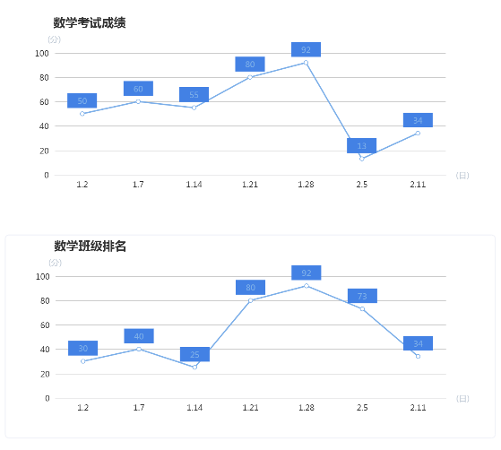
1、line折线图
效果图
setPieCharts (id, name, xName, yName, x, y, data) {
      let $echartsDOM = document.getElementById(id)
      let myEcharts = echarts.init($echartsDOM)
      let option = {
        title: {
          text: name,
          left: '9.1%'
        },
        xAxis: {
          type: 'category',
          data: x,
          show: true, // 是否显示坐标轴
          axisTick: { // x轴刻度
            show: false
          },
          axisLine: { // 线配置
            show: true,
            lineStyle: {
              color: '#d8d8da'
            }
          },
          axisLabel: { // 标识样式
            color: '#333'
          },
          name: '('+ xName +')', // 配置x轴name
          nameLocation: 'end',
          nameTextStyle: {
            fontFamily: 'PingFangSC-Regular',
            color: '#C4CDD8',
            fontSize: 12
          }
        },
        yAxis: {
          type: 'value',
          data: y,
          name: '('+ yName +')', // name相关配置
          nameLocation: 'end',
          nameTextStyle: {
            fontFamily: 'PingFangSC-Regular',
            color: '#C4CDD8',
            fontSize: 12
          },
          axisLine: { // 线配置
            show: true,
            lineStyle: {
              color: '#FFF'
            }
          },
          axisLabel: { // 标识样式
            color: '#333'
          },
        },
        series: [{
          data: data,
          type: 'line',
          symbolSize: 6, // 标记大小
          color: '#7EB0E9',
          lineStyle: {
              color: '#7EB0E9'
          },
          label: {
            show: true,
            backgroundColor: '#4381E4',
            position: 'top',
            width: '200',
            padding: [5,15,5,15],
            width: 80,
            height: 40
            /* backgroundColor: {
              image: 'images/Rectangle@2x.png'
            }*/
          }
        }]
      }
      myEcharts.setOption(option)
      //window.addEventListener('resize', myEcharts.resize())
    }
模拟数据
lineData: [
        {
          'subject': '数学成绩',
          'id': 'math',
          'xName': '日',
          'yName': '分',
          'x': ['1.2', '1.7', '1.14', '1.21', '1.28', '2.5', '2.11'],
          'y': ['10', '20', '30', '40', '50', '60', '70', '80', '90', '100'],
          'data': ['50', '60', '55', '80', '92', '13', '34', '12', '30', '89']
        },
        {
          'subject': '数学班级排名',
          'id': 'chinese',
          'xName': '日',
          'yName': '分',
          'x': ['1.2', '1.7', '1.14', '1.21', '1.28', '2.5', '2.11'],
          'y': ['10', '20', '30', '40', '50', '60', '70', '80', '90', '100'],
          'data': ['30', '40', '25', '80', '92', '73', '34', '52', '30', '89']
        },
        {
          'subject': '语文成绩',
          'id': 'math1',
          'xName': '日',
          'yName': '分',
          'x': ['1.2', '1.7', '1.14', '1.21', '1.28', '2.5', '2.11'],
          'y': ['10', '20', '30', '40', '50', '60', '70', '80', '90', '100'],
          'data': ['50', '60', '55', '80', '92', '13', '34', '12', '30', '89']
        },
        {
          'subject': '语文班级排名',
          'id': 'chinese1',
          'xName': '日',
          'yName': '分',
          'x': ['1.2', '1.7', '1.14', '1.21', '1.28', '2.5', '2.11'],
          'y': ['10', '20', '30', '40', '50', '60', '70', '80', '90', '100'],
          'data': ['30', '40', '25', '80', '92', '73', '34', '52', '30', '89']
        }
      ]
初始化
mounted () {
    this.lineData.map((v, index) => {
      this.setPieCharts(v.id, v.subject, v.xName, v.yName, v.x, v.y, v.data)
    })
  }
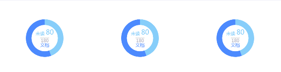
2、圆环占比图
效果图
option配置
setPieCharts (id) {
      let $echartsDOM = document.getElementById(id)
      let myEcharts = echarts.init($echartsDOM)
      let num = 180
      let option = {
        series: [{
          type: 'pie',  // 图类型
          radius: ['50%', '35%'], // 设置半径,外占比,内占比
          data: [
            {
              value: 80,
              name: '未读', // 图名称
              type: 'pie',  // 图类型
              label: {
                normal: { // label标准
                  position: 'center', //文字位置
                  formatter: '{one|{b}} {two|{c}}\n{br|}',
                  //lineHeight: 25,
                  rich: {
                    one: {
                      color: '#87CEFA',
                      fontSize: 10,
                      lineHeight: 14,
                      verticalAlign: 'middle'
                    },
                    two: {
                      color: '#87CEFA',
                      fontSize: 18,
                      lineHeight: 25,
                      verticalAlign: 'top'
                    },
                    br: {
                      height: 2,
                      borderWdth: 35,
                      width: '100%'
                    }
                  }
                }
              },
              itemStyle: {
                normal: {
                  color: '#87CEFA'
                }
              }
            },
            {
              value: 100,
              name: '文档', // 图名称
              label: {
                normal: { // label标准
                  position: 'center', //文字位置
                  formatter: '{hr|}\n{two|' + num + '}\n{one|{b}}',
                  rich: { // formatter样式配置
                    one: { // 样式名
                      color: '#4C8AFE',
                      fontSize: 12
                    },
                    hr: {
                      borderColor: '#aaa',
                      width: '100%',
                      borderWidth: 0.5,
                      align: '',
                      height: 0
                    },
                    two: {
                      color: '#ADADBD',
                      fontSize: 10
                    }
                  }
                }
              },
              itemStyle: { // 颜色
                normal: {
                  color: '#4C8AFE'
                }
              }
            }
          ]
        }]
      }
      myEcharts.setOption(option)
      // window.addEventListener('resize', myEcharts.resize())
    }
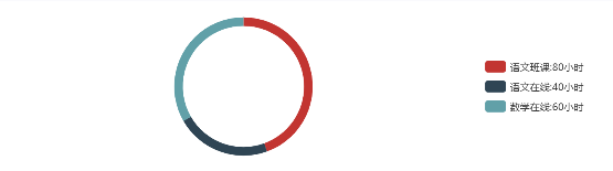
3、圆环图
效果图
option配置
setPieCharts (id, legData, data) {
      let $echartsDOM = document.getElementById(id)
      let myEcharts = echarts.init($echartsDOM)
      let option = {
        legend: {
          orient: 'vertical',
          x: 'right', // 说明列表位置配置
          y: 'middle',
          align: 'left', // 右侧图例位置
          padding: [0, 50, 0, 0], // 边距位置
          data: legData
        },
        series: [
          {
            center: ['40%', '50%'], // 图形位置配置
            name: '圆环图',
            type: 'pie',
            radius: ['80%', '70%'],
            avoidLabelOverlap: false,
            label: {
              normal: {
                show: false,
                position: 'left'
              },
              emphasis: {
                show: true,
                textStyle: {
                  fontSize: '30',
                  fontWeight: 'bold'
                }
              }
            },
            labelLine: {
              normal: {
                show: true
              }
            },
            data: data
          }
        ]
      }
      myEcharts.setOption(option)
      window.addEventListener('resize', myEcharts.resize())
    }
模拟数据
dountChart: [
        {
          'name': '线上线下用时对比',
          'pieData': [
            {value: 80, name: '语文班课:80小时'},
            {value: 40, name: '语文在线:40小时'},
            {value: 60, name: '数学在线:60小时'}
          ]
        },
        {
          'name': '科目学习用时对比',
          'pieData': [
            {value: 30, name: '语文班课:30小时'},
            {value: 20, name: '语文在线:20小时'},
            {value: 30, name: '数学在线:30小时'},
            {value: 40, name: '英语个性化:40小时'},
            {value: 60, name: '英语在线:60小时'}
          ]
        }
      ]
初始化
mounted () {
    this.dountChart.map((val, index) => {
      var legData = []
      val.pieData.map((v, i) => {
        legData.push(v.name)
      })
      this.setPieCharts(index, legData, val.pieData)
    })
  }
4、折线面积图

配置代码:
<template>
  <div class="pcLine"> <!-- 折线面积图 -->
    <p class="title">{{ title }}</p>
    <div class="map" ref="map" style="height: 2.2rem;width: 3.1rem;">
      <!-- <ve-line :data="chartData" height="100%" :extend="extend" :settings="chartSettings"></ve-line> -->
    </div>
  </div>
</template>

<script lang='ts'>
  import { Component, Prop, Vue } from 'vue-property-decorator'

  import echarts from 'echarts'
  require('echarts/lib/chart/line')

  @Component({
    components: {}
  })
  export default class pcLine extends Vue {
    @Prop({}) title!:string // 接收父组件传过来的数据
    @Prop({}) startColor!:string // 渐变颜色
    @Prop({}) endColor!:string // 渐变颜色

    chartData:any = {
      columns: ['time', '收入'],
      rows: [
        { 'time': '15', '收入': 1981 },
        { 'time': '16', '收入': 900 },
        { 'time': '17', '收入': 5291 },
        { 'time': '18', '收入': 1200 },
        { 'time': '19', '收入': 4398 },
        { 'time': '20', '收入': 1981 }
      ]
    }
    mounted () {
      setTimeout(() => {
        this.initEchartsFun()
      },1000)
      // window.onresize = () => { //  根据窗口大小调整曲线大小
		  //   const myChart = echarts.init(this.$refs.map as HTMLDivElement)
		  //   myChart.resize();
		  // }
    }
    initEchartsFun () {
      const myChart = echarts.init(this.$refs.map as HTMLDivElement)
      myChart.setOption({
        tooltip: {
          show: true,
          trigger: 'axis'
        },
        calculable: true,
        grid: {
          top: 10,
          bottom: 20,
          left: 40,
          right: 10
        },
        xAxis: {
          type: 'category',
          boundaryGap: false, // 从0刻度开始
          splitLIne: { show: false }, // 刻度线
          axisTick: { show: false },
          axisLabel: {
            textStyle: {
              color: 'rgba(255, 255, 255, 1)',
              fontSize: 10
            }
          },
          data: ['15', '16', '17', '18', '19', '20']
        },
        yAxis: {
          type: 'value',
          // name: '单位:xxxx',
          splitLine: { show: false }, // 刻度线
          axisLine: { show: false },
          axistick: { show: false },
          axisLabel: {
            formatter: '{value}',
            textStyle: {
              color: 'rgba(255, 255, 255, 1)',
              fontSize: 10
            }
          }
        },
        series: {
          type: 'line',
          label: {
            normal: {
              color: this.startColor,
              show: true // 节点上是否显示数值
            }
          },
          symbol: 'circle', // 设置节点上的标记图形类型
          symbolSize: 4,
          showSymbol: false, // 默认为true,设值为false时,hover有效
          itemStyle: {
            normal: {
              show: true,
              color: this.startColor,
            }
          },
          areaStyle: {
            normal: { // 渐变配置
              color: {
                type: 'linear',
                x: 0,
                y: 0,
                x2: 0,
                y2: 1,
                colorStops: [{
                  offset: 0, color: this.startColor
                }, {
                  offset: 1, color: this.endColor
                }],
                global: false
              }
            }
          },
          data: [ '1981', '900', '5291', '1200', '1981', '2423']
        }
      })
    }
  }
</script>

<style lang='less' scoped>
.pcLine {
  position: absolute;
  height: 2.7rem;
  width: 3.1rem;
  .title {
    height: .44rem;
    line-height: .44rem;
    padding-left: .2rem;
    font-size: .2rem;
    letter-spacing: 0;
    color: #00D3E3;
    background: rgba(0, 54, 115, .3);
  }
  .map {
    height: 2.2rem;
    width: 100%;
  }
}
</style>
5、圆环图
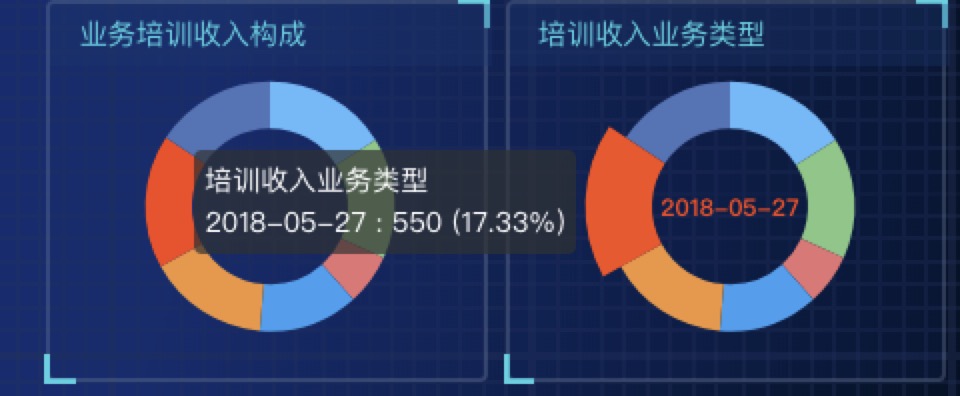
代码配置:
<template>
  <div class="pcRing"> <!-- 圆环图 -->
    <p class="title">{{title}}</p>
    <div class="map" ref="map" style="height: 2.2rem;width: 3.1rem;">
      <!-- <ve-pie :data="chartData" height="100%" :extend="extend" :settings="chartSettings"></ve-pie> -->
    </div>
  </div>
</template>

<script lang='ts'>
  import { Component, Prop, Vue } from 'vue-property-decorator'
  import echarts from 'echarts'
  require('echarts/lib/chart/pie')

  @Component({
    components: {}
  })
  export default class pcPie extends Vue {
    @Prop({}) title!:string // 接收父组件传过来的数据
    // title:string = '月收入业务类型'

    chartData:any = {
      columns: ['name', 'value'],
      rows: [
        { 'name': '2018-05-22', 'value': 510 },
        { 'name': '2018-05-23', 'value': 498 },
        { 'name': '2018-05-24', 'value': 210 },
        { 'name': '2018-05-25', 'value': 410 },
        { 'name': '2018-05-26', 'value': 498 },
        { 'name': '2018-05-27', 'value': 550 },
        { 'name': '2018-05-28', 'value': 498 }
      ]
    }

    mounted () {
      setTimeout(() => {
        this.initEchartsFun()
      }, 1000)
      // window.onresize = () => {//  根据窗口大小调整曲线大小
		  //   const myChart = echarts.init(this.$refs.map as HTMLDivElement)
		  //   myChart.resize();
		  // }
    }
    initEchartsFun () {
      const myChart = echarts.init(this.$refs.map as HTMLDivElement)
      myChart.setOption({
        tooltip: { // 鼠标悬浮时,提示tooltip位置
          trigger: 'item',
          formatter: "{a} <br/> {b} : {c} ({d}%)",
          position:  'left' // ['50%', '50%']
        },
        series: {
          name: this.title,
          type: 'pie',
          radius: ['50%', '80%'],
          // roseType: 'radius', // 'area' 切换模式半径模式or面积模式
          center: ['50%', '45%'],
          avoidLabelOverlap: false,
          label: {
            normal: {
              show: false,
              position: 'center'
            },
            emphasis: {
              show: true,
              textStyle: {
                fontSize: '12',
                fontWeight: 'bold'
              }
            }
          },
          labelLine: {
            normal: {
              show: false
            }
          },
          color: ['#64B9FC', '#81C784', '#E57373', '#369FF1', '#f1963b', '#ff4715', '#5072b8'],
          data: this.chartData.rows
        }
      })
    }
  }
</script>

<style lang='less' scoped>
.pcRing {
  position: absolute;
  height: 2.7rem;
  width: 3.1rem;
  .title {
    height: .44rem;
    line-height: .44rem;
    padding-left: .2rem;
    font-size: .2rem;
    letter-spacing: 0;
    color: #00D3E3;
    background: rgba(0, 54, 115, .3);
  }
  .map {
    height: 2.2rem;
    width: 100%;
  }
}
</style>
6、横向柱形图
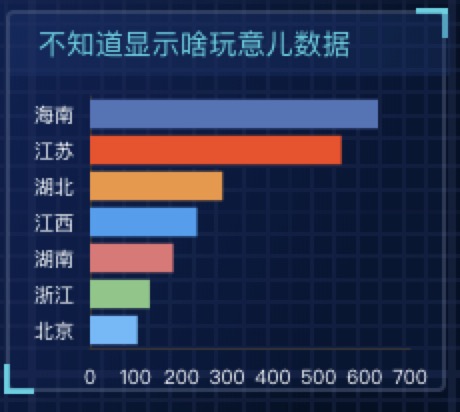
配置代码:
<template>
  <div class="pcBar"> <!-- 柱状图 -->
    <p class="title">{{title}}</p>
    <div class="map" ref="map" style="height: 2.2rem;width: 3.1rem;">
      <!-- <ve-pie :data="chartData" height="100%" :extend="extend" :settings="chartSettings"></ve-pie> -->
    </div>
  </div>
</template>

<script lang='ts'>
  import { Component, Prop, Vue } from 'vue-property-decorator'
  import echarts from 'echarts'
  require('echarts/lib/chart/pie')

  @Component({
    components: {}
  })
  export default class pcBar extends Vue {
    @Prop({}) title!:string // 接收父组件传过来的数据
    chartData:any = {
      columns: ['name', 'value'],
      rows: [
        { 'name': '北京', 'value': 510 },
        { 'name': '浙江', 'value': 498 },
        { 'name': '湖南', 'value': 210 },
        { 'name': '江西', 'value': 410 },
        { 'name': '湖北', 'value': 498 },
        { 'name': '江苏', 'value': 550 },
        { 'name': '海南', 'value': 498 }
      ]
    }
    mounted () {
      setTimeout(() => {
        this.initEchartsFun()
      }, 1000)
      // window.onresize = () => {//  根据窗口大小调整曲线大小
		  //   const myChart = echarts.init(this.$refs.map as HTMLDivElement)
		  //   myChart.resize();
		  // }
    }
    initEchartsFun () {
      const myChart = echarts.init(this.$refs.map as HTMLDivElement)
      myChart.setOption({
        tooltip: { // 鼠标悬浮时,提示tooltip位置
          trigger: 'item',
          formatter: "{a} <br/> {b} : {c}",
          position:  'left' // ['50%', '50%']
        },
        calculable: true,
        grid: {
          top: 10,
          bottom: 20,
          left: 40,
          right: 20
        },
        xAxis: {
          type: 'value',
          boundaryGap: false, // 从0刻度开始
          axisTick: { // 分隔x轴下方小刻度线
            show: false
          },
          axisLine: { // x轴刻度线
            show: true
          },
          splitLine: { // 中间刻度线
            show: false
          },
          axisLabel: {
            textStyle: {
              color: 'rgba(255, 255, 255, 1)',
              fontSize: 10
            }
          }
        },
        yAxis: {
          type: 'category',
          splitLine: { show: false }, // 刻度线
          axisTick: { // 分隔y轴下方小刻度线
            show: false
          },
          axisLabel: {
            formatter: '{value}',
            textStyle: {
              color: 'rgba(255, 255, 255, 1)',
              fontSize: 10
            }
          },
          data: [ '北京', '浙江', '湖南', '江西', '湖北', '江苏', '海南']
        },
        series: {
          name: this.title,
          type: 'bar',
          itemStyle: {
            normal: {
              color: function (params:any) { // 每个柱子的颜色即为colorList数组里的每一项,如果柱子数目多于colorList的长度,则柱子颜色循环使用该数组
                var colorList = ['#64B9FC', '#81C784', '#E57373', '#369FF1', '#f1963b', '#ff4715', '#5072b8']
                return colorList[params.dataIndex]
              }
            }
          },
          data: [182, 234, 290, 104, 131, 630, 550].sort()
        }
      })
    }
  }
</script>

<style lang='less' scoped>
.pcBar {
  position: absolute;
  height: 2.7rem;
  width: 3.1rem;
  .title {
    height: .44rem;
    line-height: .44rem;
    padding-left: .2rem;
    font-size: .2rem;
    letter-spacing: 0;
    color: #00D3E3;
    background: rgba(0, 54, 115, .3);
  }
  .map {
    height: 2.2rem;
    width: 100%;
  }
}
</style>