【定制项目】【M14 监测预警平台】百度地图区域绘制(时间轴)/柱状图/仪表图 - 关键技术 python flask + echarts
一、项目需求
项目名称:【某监测预警平台】。
项目需求:气候数据:雨量,温湿度,PM,雷达回波,雷电预报等展示到可视化大屏。
项目工期:10个工作日。
二、项目架构
- 运行环境支持Windows,Linux类系统。
- B/S架构,支持Chrome,IE,QQ等主流浏览器。
- http服务器:Python Flask 框架;
- 数据可视化:Echarts + BootStrap 库;
三、项目分析
1、http服务器:Python Flask 框架;
http 代码
# 主程序在这里
if __name__ == "__main__":
    # 开启线程,触发动态数据
    a = threading.Thread(target=daping.loop)
    a.start()

    # 开启 flask 服务
    app.run(host='0.0.0.0', port=80, debug=True)
接口解析
前端调用: datas

数据请求方式:GET或POST

数据响应:JSON
2、数据可视化: BootStrap + Echarts 库;
BootStrap布局
<body id="container_body" style="background-image: url(img/bg.png);
            background-repeat: no;
            background-size: 100%;">
      <div class="container_fluid" id="vue_app">
            <div class="row"
                  style="height:6%; margin:0;background-image: url(img/title.png); background-repeat: no; background-size: 100% 90%; margin-bottom: 6px;">
                  <div class="col">
                        <h4 id="container_h"
                              style="text-align: center; color: white; font-weight:bolder; margin-top: 10px; ">
                              监测预报预警平台</h4>
                  </div>
            </div>
            <div class="row" style="height:90%;">
                 .......
            </div>
            <div class="row" style="height:3%;">
                 .......
            </div>
      </div>
</body>
Echarts 仪表盘图形
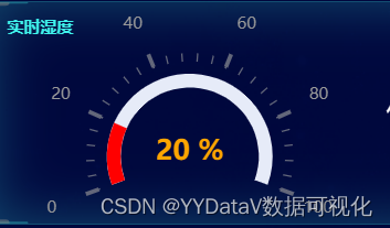
function init_echart_gauge_prec(container) {
    var chartDom = document.getElementById(container);
    var myChart = echarts.init(chartDom);
    option = {
        title: {
            text: "24小时雨量",
            top: "5%",
            left: "2%",
            textStyle: {
                color: "RGBA(63,242,235,1)",
                fontSize: "12",
            },
        },
        series: [
            {
                type: "gauge",
                center: ["50%", "70%"],
                startAngle: 200,
                endAngle: -20,
                min: 0,
                max: 300,
                splitNumber: 6,
                // 标尺为红色
                itemStyle: {
                    color: "red",
                },
                progress: {
                    show: true,
                },
                pointer: {
                    show: false,
                },
                // 小刻度与坐标轴的距离
                axisTick: {
                    distance: -25,
                    splitNumber: 5,
                },
                // 分割线与坐标轴的距离
                splitLine: {
                    distance: -30,
                },
                // 刻度标签
                axisLabel: {
                    distance: -30,
                    color: "#999",
                },
                detail: {
                    valueAnimation: true,
                    width: "60%",
                    lineHeight: 30,
                    borderRadius: 8,
                    offsetCenter: [0, "-5%"],
                    // 表盘中间字体大小
                    fontSize: 20,
                    fontWeight: "bolder",
                    formatter: "{value} mm",
                    color: "orange",
                },
                data: [
                    {
                        value: 20,
                    },
                ],
            },
        ],
    };
    window.addEventListener("resize", function () {
        myChart.resize();
    });
    myChart.setOption(option);
}
Echarts 柱状图
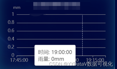
function init_echart_line_area_chart(container) {
var chartDom = document.getElementById(container);
var myChart = echarts.init(chartDom);
var option;
option = {
title: {
text: "短时降雨预报",
top: "5%",
left: "2%",
textStyle: {
color: "RGBA(63,242,235,1)",
fontSize: "12",
},
},
grid: {
left: "8%",
right: "8%",
top: "30%",
bottom: "10%",
containLabel: true,
},
tooltip: {
trigger: "axis",
formatter: "时间: {b}<br />{a}: {c}mm",
},
xAxis: {
type: "category",
axisLabel: {
textStyle: {
color: "#999",
fontSize: 14,
},
},
axisLine: {
lineStyle: {
color: "#999",
},
},
splitLine: {
lineStyle: {
color: "#999",
},
},
},
yAxis: {
name: "mm",
type: "value",
axisLabel: {
textStyle: {
color: "#999",
fontSize: 14,
},
},
axisLine: {
lineStyle: {
color: "#999",
},
},
splitLine: {
lineStyle: {
color: "#999",
},
},
},
series: {
name: "雨量",
type: "bar",
areaStyle: {},
},
};
option && myChart.setOption(option);
window.addEventListener("resize", function () {
myChart.resize();
});
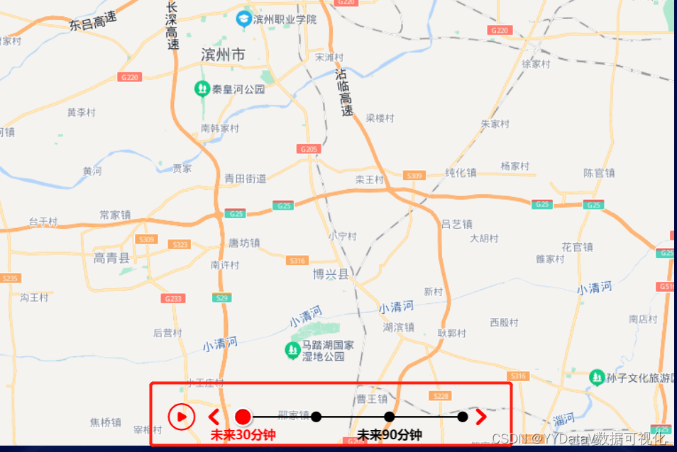
}Echarts 百度地图 + 时间轴
注:这个实现有些技术难度,很多小伙伴问我要如何实现,参考我的另一篇专题:地图可视化:基于 Echarts + 百度地图bmap + 时间轴timeline + 多边形(multi)polygon + 点scatter 的可视化案例_YYDataV数据可视化的博客-CSDN博客_echarts在地图上绘制多边形
四、更多案例
YYDatav的数据可视化《精彩案例汇总》_YYDataV的博客-CSDN博客❤️数据可视化❤️:基于 Echarts + Vue 实现的大屏范例【14】_小魔怪的博客-CSDN博客_echarts数据可视化❤️数据可视化❤️:基于 Echarts + Python 实现的大屏范例【13】国庆黄金周旅游监测㙍㙍㙍来了~_小魔怪的博客-CSDN博客❤️数据可视化❤️:基于 Echarts + Python 实现的大屏范例【12】(你想要的酷炫世界地图在这里了!)_小魔怪的博客-CSDN博客数据可视化:基于 Echarts + Python 实现的动态实时大屏范例【十一】https://yydatav.blog.csdn.net/article/details/120705616本次分享结束,欢迎多多交流 微信 6550523,商务合作请私聊。