R语言(5) 折线图、散点图
低级绘图函数:
lines() abline() points()
函数lines()其作用是在已有图上加线,命令为lines(x,y),其功能相当于plot(x,y,type=“1”),lines比abline更灵活。
函数abline()可以在图上加直线,其使用方法有四种格式。
(1)abline(a,b)
表示画一条y=a+bx的直线
(2)abline(h=i)
表示画出一条y=i的水平直线
(3)abline(v=i)
表示画出一条x=i的竖直直线
(4)abline(lm.obj)
表示绘出线性模型得到的线性方程 points()其作用是在已有图上加点。
library(readxl)
stock<-read_excel('stock.xlsx')
#折线图
plot(stock$date,stock$SH_closing_price,type='l',ylim=c(1500,13000))
#添加横线垂线
abline(h=3000,v=as.POSIXct('2015-01-30'),col='blue')
#添加折线
lines(stock$date,stock$SZ_closing_price,lty=2)


#散点图
stock$stock_class<-ifelse(stock$SH_closing_price<3000,1,2)
stock[c('SH_closing_price','stock_class')]
stock1<-subset(stock,stock_class==1)
stock2<-subset(stock,stock_class==2)
plot(stock1$SH_closing_price,stock1$investor_confidence_index,pch=16, col='blue',xlim=range(stock$SH_closing_price),ylim=range(stock$investor_confidence_index))
points(stock2$SH_closing_price,stock2$investor_confidence_index,pch=17,col='green')

#散点图第二种画法
#c('g','r')[c(1,2,1,2)]
#[1] "g" "r" "g" "r"
plot(stock$SH_closing_price,stock$investor_confidence_index,
col=c('blue','green')[stock$stock_class],pch=c(16,17)[stock$stock_class])

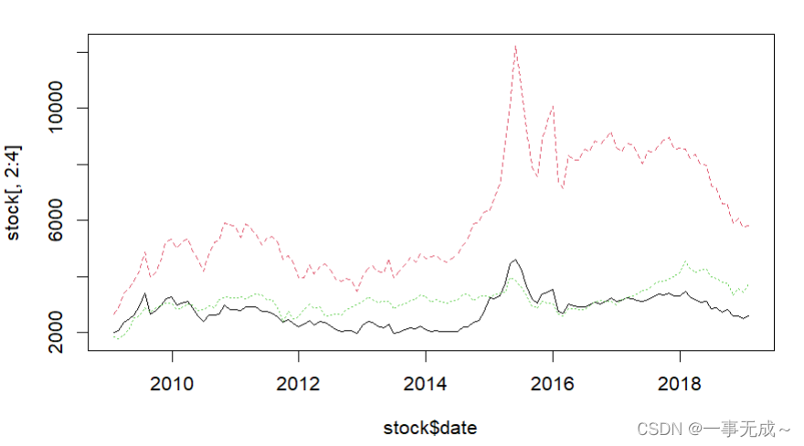
matplot()可以把一个数据集中的多个列画出来,但要求行数相等,参数为矩阵或者是向量
matplot(stock$date,stock[,2:4],lty=1:3,type='l')