一、float属性
block元素通常被现实为独立的一块,独占一行,多个block元素会各自新起一行,默认block元素宽度自动填满其父元素宽度。block元素可以设置width、height、margin、padding属性;
常见的块级元素有 div、form、table、p、pre、h1~h5、dl、ol、ul 等。
inline元素不会独占一行,多个相邻的行内元素会排列在同一行里,直到一行排列不下,才会新换一行,其宽度随元素的内容而变化。inline元素设置width、height属性无效;
常见的内联元素有span、a、strong、em、label、input、select、textarea、img、br等
1、浮动属性float的基本使用
首先明白如下两个概念:文档流,指的是元素排版布局过程中,元素会自动从左往右,从上往下的流式排列。脱离文档流,也就是将元素从普通的布局排版中拿走,其他盒子在定位的时候,会当做脱离文档流的元素不存在而进行定位。float属性就是将元素脱离文档流。基本使用实例如下:
2、float属性可以实现display:inline-block功能
让块级标签不但可以设置长高,还能独行显示:


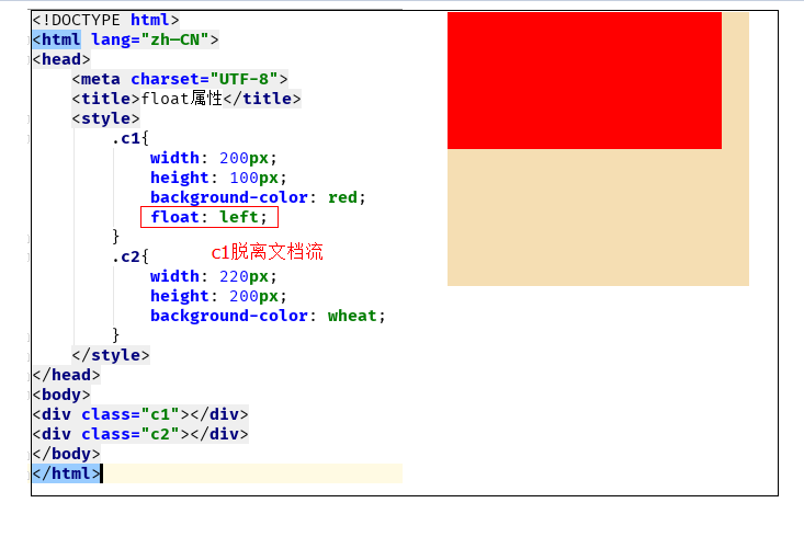
<!DOCTYPE html>
<html lang="zh—CN">
<head>
    <meta charset="UTF-8">
    <title>float属性</title>
    <style>
        .c1{
            width: 200px;
            height: 100px;
            background-color: red;
            float: left;
        }
        .c2{
            width: 220px;
            height: 200px;
            background-color: wheat;
            float: left;
        }
        .c3{
            width:200px;
            height: 100px;
            background-color: #2459a2;
            float: left;
        }
    </style>
</head>
<body>
<div class="c1"></div>
<div class="c2"></div>
<div class="c3"></div>
</body>
</html>
让内联标签不但可以独行显示,还能设置行高
<!DOCTYPE html>
<html lang="en">
<head>
    <meta charset="UTF-8">
    <title>Title</title>
    <style>
        .c4{
            width: 200px;
            height: 100px;
            background-color: saddlebrown;
            float: right;
        }
        .c5{
            width: 200px;
            height: 100px;
            background-color: rebeccapurple;
            float: right;
        }
        .c6{
            width: 200px;
            height: 100px;
            background-color: hotpink;
            float: right;
        }

    </style>
</head>
<body>
<span class="c4"></span>
<span class="c5"></span>
<span class="c6"></span>
</body>
</html>
3、父级塌陷现象
<!DOCTYPE html>
<html lang="en">
<head>
    <meta charset="UTF-8">
    <title>Title</title>
    <style>
        .c5{
            border: 2px solid black;
            width: 300px;
        }
        .c6{
            background-color: deeppink;
            float: left;  width:100px;  height: 100px;
        }
        .c7{
            background-color: blue;
            float: right;  width:100px;  height: 100px;
        }
        .c8{
            background-color: green;  width:300px;
            height: 40px;
        }

    </style>
</head>
<body>
<div class="c5">
    <div class="c6">c6 向左浮动</div>
    <div class="c7">c7 向左浮动</div>
</div>
<div class="c8">c8</div>
</body>
</h
<!DOCTYPE html>
<html lang="en">
<head>
    <meta charset="UTF-8">
    <title>Title</title>
<style type="text/css">
         * {
             margin:0;padding:0;
         }
        .container{
            border:1px solid red;width:300px;
        }
        #box1{
            background-color:green;float:left;width:100px;height:100px;
        }
        #box2{
            background-color:deeppink; float:right;width:100px;height:100px;
        }
         #box3{
             background-color:pink;height:40px;
         }
</style>
</head>
<body>

        <div class="container">
                <div id="box1">box1 向左浮动</div>
                <div id="box2">box2 向右浮动</div>
                <!--<div id="empty" style="height: 100px"></div>-->
        </div>
        <div id="box3">box3</div>
</body>
</body>
</html>
解决父级塌陷办法:
(1)设置高度:
给.container设置固定高度,一般情况下文字内容不确定多少就不能设置固定高度,所以一般不能设置“.container”高度(当然能确定内容多高,这种情况下“.container是可以设置一个高度即可解决覆盖问题。
或者给.container加一个固定高度的子div:
<div class="container">
                <div id="box1">box1 向左浮动</div>
                <div id="box2">box2 向右浮动</div>
                <div id="empty" style="height: 100px"></div>
</div>
<div id="box3">box3</div>
因为父级div没有设置高度,而儿子div又是浮动的,因此无法将父级div撑起来(若儿子div不是浮动的,可以撑起父级),这也是造成父级塌陷的原因。通过设置父级div的高度,当然可以解决这个问题,但是这样很不实际,预设的高度很不方便我们对其内容的扩充。
(2)清除浮动(推荐使用):
清除浮动语法如下:
clear:none       #默认值。允许两边都可以有浮动对象
clear:left          #不允许左边有浮动对象
clear:right         #不允许右边有浮动对象
clear:both         #不允许左右有浮动对象
但是需要注意的是:clear属性只会对自身起作用,而不会影响其他元素。应用实例如下:
<!DOCTYPE html>
<html lang="zh—CN">
<head>
    <meta charset="UTF-8">
    <title>解决父级塌陷</title>
    <style>
        .c1{
            width: 100px;
            height: 100px;
            background-color: #2459a2;
            float: left;
        }
        .c2{
            width: 100px;
            height: 100px;
            background-color: red;
            float: left;
            clear: both;
        }
        .c3{
            width: 100px;
            height: 100px;
            background-color: #7A77C8;
            float: left;
        }
    </style>
</head>
<body>
<div class="c1"></div>
<div class="c2"></div>
<div class="c3"></div>
</body>
</html>
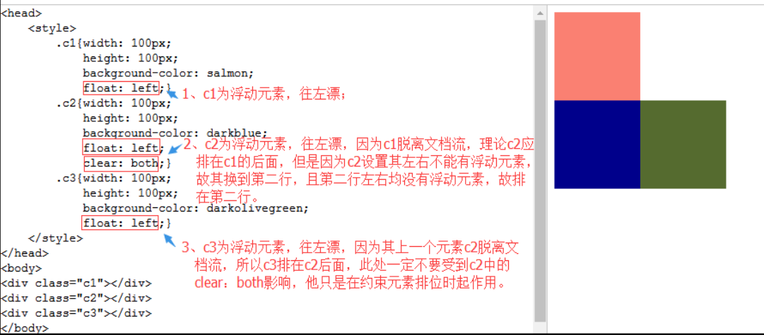
把握住两点:1、元素是从上到下、从左到右依次加载的。
2、clear: left;对自身起作用,一旦左边有浮动元素,即切换到下一行来保证左边元素不是浮动的,依据这一点解决父级塌陷问题。
解决父级塌陷:
'''

    .clearfix:after {             <----在类名为“clearfix”的元素内最后面加入内容;
    content: ".";                 <----内容为“.”就是一个英文的句号而已。也可以不写。
    display: block;               <----加入的这个元素转换为块级元素。
    clear: both;                  <----清除左右两边浮动。
    visibility: hidden;           <----可见度设为隐藏。注意它和display:none;是有区别的。
                                       visibility:hidden;仍然占据空间,只是看不到而已;
    line-height: 0;               <----行高为0;
    height: 0;                    <----高度为0;
    font-size:0;                  <----字体大小为0;
    }

    .clearfix { *zoom:1;}         <----这是针对于IE6的,因为IE6不支持:after伪类,这个神
                                       奇的zoom:1让IE6的元素可以清除浮动来包裹内部元素。


整段代码就相当于在浮动元素后面跟了个宽高为0的空div,然后设定它clear:both来达到清除浮动的效果。
之所以用它,是因为,你不必在html文件中写入大量无意义的空标签,又能清除浮动。
<div class="head clearfix"></div>

'''
<!DOCTYPE html>
<html lang="en">
<head>
    <meta charset="UTF-8">
    <title>Title</title>

    <style>
        *{
            margin: 0;
        }
         .header{
             width: 100%;
             background-color: #336699;
             border: 1px solid red;
         }
        .header .box1{
            width: 100px;
            height: 140px;
            background-color: goldenrod;
            float: left;
        }
        .header .box2{
            width: 80px;
            height: 40px;
            background-color: forestgreen;
            margin-left: 20px;
            float: left;
        }
        .content{
            width: 100%;
            height: 300px;
            background-color: darkgray;
        }
/*如下css的作用就是在.clearfix元素的后面加上一个没有实际内容的元素,清除左右浮动,解决父级塌陷,那个元素需要解决父级塌陷问题,只需给其class加个别名clearfix,解决重复问题。*/
        .clearfix:after{
              content: "";
              display: block;
              clear: both;
        }
    </style>
</head>
<body>
<div class="header clearfix">
    <div class="box1"></div>
    <div class="box2"></div>
</div>
<div class="content"></div>
</body>
</html>
二、display属性(块级标签)
块级标签特点: 独占一行, 可以设置长和宽 内联标签特点: 可以放在一行,不可以设置长和宽,根据内容自适应长和宽
none   --> 不显示

block  --> 块级

inline --> 内联

inline-block  --> 既在一行显示,又能设置长和宽
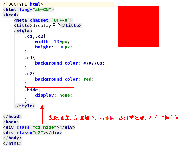
1、display:none
display:none可以隐藏某个元素,且隐藏的元素不会占用任何空间。也就是说,该元素不但被隐藏了,而且该元素原本占用的空间也会从页面布局中消失,通常结合js使用。
<!DOCTYPE html>
<html lang="zh—CN">
<head>
    <meta charset="UTF-8">
    <title>display标签</title>
    <style>
        .c1,.c2{
            width: 100px;
            height: 100px;
        }
        .c1{
            background-color: #7A77C8;
        }
        .c2{
            background-color: red;
        }
        .hide{
            display: none;
        }
    </style>

</head>
<body>
<div class="c1 hide"></div>
<div class="c2"></div>
</body>
</html>
2、display:block
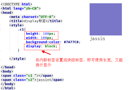
将内联标签变成块级标签:
<!DOCTYPE html>
<html lang="zh—CN">
<head>
    <meta charset="UTF-8">
    <title>display标签</title>
    <style>
        .c1{
            height: 100px;
            width: 100px;
            background-color: #7A77C8;
            display: block;
        }

    </style>

</head>
<body>
<span class="c1 "></span>
<span class="c2">jassin</span>
</body>
</html>
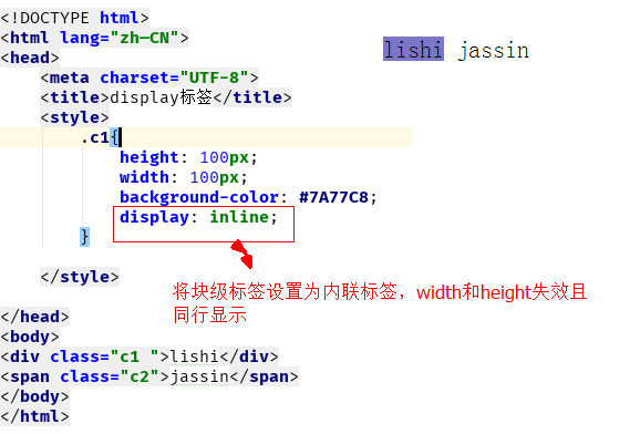
3、display:inline
将块级标签变成内联标签:
<!DOCTYPE html>
<html lang="zh—CN">
<head>
    <meta charset="UTF-8">
    <title>display标签</title>
    <style>
        .c1{
            height: 100px;
            width: 100px;
            background-color: #7A77C8;
            display: inline;
        }

    </style>

</head>
<body>
<div class="c1 ">lishi</div>
<span class="c2">jassin</span>
</body>
</html>
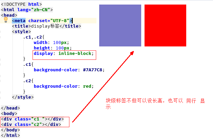
4、display:inline-block
将块级标签变成不但可以设置长宽,还能在同行显示:
<!DOCTYPE html>
<html lang="zh—CN">
<head>
    <meta charset="UTF-8">
    <title>display标签</title>
    <style>
        .c1,.c2{
            width: 100px;
            height: 100px;
            display: inline-block;
        }
        .c1{
            background-color: #7A77C8;
        }
        .c2{
            background-color: red;
        }
    </style>

</head>
<body>
<div class="c1 "></div>
<div class="c2"></div>
</body>
</html>
将内联标签变成不但可以同行显示,还能设置长宽:
将内联标签变成不但可以同行显示,还能设置长高:

三、position(定位)
            relative  (相对定位)

                根据自己原来的位置来做定位 ()

            absolute  (绝对定位)
                根据 往上找已经相对定位的元素的左上角 来做定位
                (通常配合相对定位使用)

            fixed     (固定定位)
1 、static
static 默认值,无定位,不能当作绝对定位的参照物,并且设置标签对象的left、top等值是不起作用的的。
2、relative(相对定位)
相对定位是相对于该元素在文档流中的原始位置,即以自己原始位置为参照物。有趣的是,即使设定了元素的相对定位以及偏移值,元素还占有着原来的位置,即占据文档流空间。对象遵循正常文档流,但将依据top,right,bottom,left等属性在正常文档流中偏移位置。而其层叠通过z-index属性定义。
注意:position:relative的一个主要用法:方便绝对定位元素找到参照物。
3、absolute:绝对定位
定义:设置为绝对定位的元素框从文档流完全删除,并相对于最近的已定位祖先元素定位,如果元素没有已定位的祖先元素,那么它的位置相对于最初的包含块(即body元素)。元素原先在正常文档流中所占的空间会关闭,就好像该元素原来不存在一样。元素定位后生成一个块级框,而不论原来它在正常流中生成何种类型的框。
重点:如果父级设置了position属性,例如position:relative;,那么子元素就会以父级的左上角为原始点进行定位。这样能很好的解决自适应网站的标签偏离问题,即父级为自适应的,那我子元素就设置position:absolute;父元素设置position:relative;,然后Top、Right、Bottom、Left用百分比宽度表示。
另外,对象脱离正常文档流,使用top,right,bottom,left等属性进行绝对定位。而其层叠通过z-index属性定义。
示例代码:
<!DOCTYPE html>
<html lang="en">
<head>
    <meta charset="UTF-8">
    <title>Title</title>
    <style>
        *{
            margin: 0;
        }
        .outet{
            /*position: relative;*/

        }
        .item{
            width: 200px;
            height:200px ;
        }
        .r1{
            background-color: #7A77C8;
        }
        .r2{
            background-color: wheat;
            /*position: relative;*/
            position: absolute;
            top: 200px;
            left: 200px;
        }
        .r3{
            background-color: darkgreen;
        }
    </style>
</head>
<body>

<div class="item r1"></div>
<div class="outet">

    <div class="item r2"></div>
    <div class="item r3"></div>
</div>


</body>
</html>
总结:参照物用相对定位,子元素用绝对定位,并且保证相对定位参照物不会偏移即可。
4、fixed(固定)
fixed:对象脱离正常文档流,使用top,right,bottom,left等属性以窗口为参考点进行定位,当出现滚动条时,对象不会随着滚动。而其层叠通过z-index属性 定义。 注意点: 一个元素若设置了 position:absolute | fixed; 则该元素就不能设置float。这 是一个常识性的知识点,因为这是两个不同的流,一个是浮动流,另一个是“定位流”。但是 relative 却可以。因为它原本所占的空间仍然占据文档流。
在理论上,被设置为fixed的元素会被定位于浏览器窗口的一个指定坐标,不论窗口是否滚动,它都会固定在这个位置。
示例代码:
<!DOCTYPE html>
<html lang="en">
<head>
    <meta charset="UTF-8">
    <title>Title</title>
    <style>
        *{
            margin: 0;
        }
        .back{
            background-color: wheat;
            width: 100%;
            height: 1200px;
        }
        span{
            display: inline-block;
            width: 80px;
            height: 50px;
            position: fixed;
            bottom: 20px;
            right: 20px;
            background-color: rebeccapurple;
            color: white;
            text-align: center;
            line-height: 50px;

        }
    </style>
</head>
<body>


<div class="back">
    <span>返回顶部</span>
</div>
</body>
</html>
四、z-index
#i2 {
  z-index: 999;
}

设置对象的层叠顺序,数值大的会覆盖在数值小的标签之上。
<!DOCTYPE html>
<html lang="zh—CN">
<head>
    <meta charset="UTF-8">
    <title>z-index模态框</title>
    <style>
        .cover {
            position: fixed; /* 设定固定属性*/
            top: 0; /*设置这些0是为了全屏分布*/
            right: 0;
            bottom: 0;
            left: 0;

            background-color: rgba(0, 0, 0, 0.2);
            z-index: 999;
        }

        .model{
            height: 400px;
            width: 600px;
            position: fixed;
            top: 50%;
            left: 50%; /*2个50%是为模态框让出位置*/
            background-color: white;
            margin-left: -300px;  /*设距离是为了让框移到中间*/
            margin-top: -200px;
            z-index: 1000;  /*控制谁在上谁在下*/
        }
    </style>
</head>
<body>
<div class="cover"></div>
<div class="model"></div>
</body>
</html>
<!DOCTYPE html>
<html lang="zh-CN">
<head>
    <meta charset="UTF-8">
    <meta http-equiv="x-ua-compatible" content="IE=edge">
    <title>磨砂背景</title>
    <style>
        body {
            background: url("beijing.png") no-repeat ;
            background-size: cover;  /*是照片平铺*/
            height: 720px;
        }
        .cover {
            position: fixed;  /*固定*/
            top: 0;
            right: 0;
            bottom: 0;
            left: 0;  /*全屏*/
            background-color: rgba(0,0,0, 0.5); /* 透明度*/
        }
    </style>
</head>
<body>

<div class="cover"></div>

</body>
</html>
五、 overflow溢出属性
| 值 | 描述 |
| visible | 默认值,内容不会被修剪,会呈现在元素框之外 |
| hidden | 内容会被修剪,并且 |