布局管理器案例集锦
布局管理器
1.简介
1.1Android的布局管理
1.使用XML文件声明界面布局的特点
- 将程序的表现层和控制层分离(利于代码的维护)
- 在后期修改用户界面时,无需更改程序的源代码
- 用户还能够通过可视化工具直接看到所设计的用户界面,有利于加快界面设计的过程,并且为界面设计与开发带来极大的便利性
(可以不运行就去看得见)
1.2常见的布局管理器
1.常见的几种类型的布局管理器:
- 线性布局
- 框架布局
- 表格布局
- 相对布局
- 网格布局
2.为什么要使用布局管理器?
选择合适的布局管理器就是我们需要做的。
- 为了让各种控件在不同的手机屏幕上都能运行良好,为了更好地管理Android应用的用户界面里的各种控件,Android提供了布局管理器。
- 使用布局管理器,可以根据运行平台来调整控件的大小,程序员要做的,就是选择合适的布局管理器。
3.布局管理器可以干什么?
- 布局管理器用于存放其它控件或者嵌套其它布局
- 布局支持嵌套
2.布局管理器
2.1LinerLayout
1.简介
通过LinerLayout中的属性,orientation=vertical或者是horizontal
- 在线性布局中,所有的控件都按照垂直或水平的顺序在界面上单行布局排列。
- 如果垂直排列,则每行仅包含一个界面控件,多个控件依次垂直往下;
- 如果水平排列,则只有一行,每一个控件依次向右排列,不会自动换行或换列。超出屏幕的控件将不会被显示。
2.知识补充
tools就是建立layout布局文件和activity之间的一个链接。指明当前的layout给哪个activity进行使用。

3.常见的属性
主要的属性就是基本的属性位置,高度和宽度。分割线,以及权重等。

4.weight属性的详解?
- layout_weight属性以控制各个控件在布局中的相对大小。
- layout_weight属性是一个非负整数值。
- 线性布局会根据该控件layoutweight值与其所处布局中所有控件layoutweight值之和的比值为该控件分配剩余占用的区域。
- 如果layout_weight指为0,控件会按原大小显示。
2.1.1案例一:activitylinearweight_demo1.xml
第一步:设置成为主要启动类
    <activity
            android:name=".LinearWeightDemo1Activity"
            android:exported="true">
                        <intent-filter>
                            <action android:name="android.intent.action.MAIN" />

                            <category android:name="android.intent.category.LAUNCHER" />
                        </intent-filter>
</activity>第二步:创建布局文件。activitylinearweight_demo1.xml
<?xml version="1.0" encoding="utf-8"?>
<LinearLayout xmlns:android="http://schemas.android.com/apk/res/android"
    android:layout_width="match_parent"
    android:layout_height="match_parent"
    android:orientation="vertical">
<!--    第一行-->
    <LinearLayout
        android:layout_width="match_parent"
        android:layout_height="wrap_content"
        android:orientation="horizontal">
        <Button
            android:layout_width="wrap_content"
            android:layout_height="wrap_content"
            android:layout_weight="0"
            android:text="确定"/>
        <Button
            android:layout_width="wrap_content"
            android:layout_height="wrap_content"
            android:layout_weight="0"
            android:text="取消"/>
        <Button
            android:layout_width="wrap_content"
            android:layout_height="wrap_content"
            android:layout_weight="1"
            android:text="测试"/>
    </LinearLayout>
<!--第二行-->
    <LinearLayout
        android:layout_width="match_parent"
        android:layout_height="wrap_content"
        android:orientation="horizontal">
        <Button
            android:layout_width="wrap_content"
            android:layout_height="wrap_content"
            android:layout_weight="2"
            android:text="确定"/>
        <Button
            android:layout_width="wrap_content"
            android:layout_height="wrap_content"
            android:layout_weight="1"
            android:text="测试"/>
        <Button
            android:layout_width="wrap_content"
            android:layout_height="wrap_content"
            android:layout_weight="0"
            android:text="取消"/>
    </LinearLayout>
<!--第三行-->
    <LinearLayout
        android:layout_width="match_parent"
        android:layout_height="wrap_content"
        android:orientation="horizontal">
        <Button

            android:layout_width="wrap_content"
            android:layout_height="wrap_content"
            android:layout_weight="2"
            android:text="确定"/>
        <Button
            android:layout_width="wrap_content"
            android:layout_height="wrap_content"
            android:layout_weight="1"
            android:text="取消"/>
    </LinearLayout>
<!--    第四行-->
    <LinearLayout
        android:layout_width="match_parent"
        android:layout_height="wrap_content"
        android:orientation="horizontal">
        <Button
            android:layout_width="wrap_content"
            android:layout_height="wrap_content"
            android:layout_weight="3"
            android:text="确定"/>
        <Button
            android:layout_width="wrap_content"
            android:layout_height="wrap_content"
            android:layout_weight="0"
            android:text="取消"/>
    </LinearLayout>
<!--    第五行-->
    <LinearLayout
        android:layout_width="match_parent"
        android:layout_height="wrap_content"
        android:orientation="horizontal">
<!--        红色区域-->
        <LinearLayout
            android:layout_width="wrap_content"
            android:layout_height="100dp"
            android:background="#ff0000"
            android:layout_weight="1"/>
<!--        绿色区域-->
        <LinearLayout
            android:layout_width="wrap_content"
            android:layout_height="100dp"
            android:background="@color/black"
            android:layout_weight="2"/>
    </LinearLayout>
</LinearLayout>
第三步:直接运行。activity文件不用写。
效果图:

2.1.2gravity
1.什么是gravity?
- android:gravity:控件包含的内容(如文本)显示在表示控件的什么位置,默认值为左侧。
注意:如果要用gravity属性,此组件的layoutwidth和layoutheight不能设置为wrap_content。此时设置的gravity属性没有效果,因为组件包裹着内容,无论设置什么,也都不能有改变
2.什么是layout_gravity?
- android:layout_gravity:设置该控件在父控件的显示位置。
(1)当 android:orientation="vertical" 时, android:layoutgravity只有水平方向的设置才起作用,垂直方向的设置不起作用。即:left,right,centerhorizontal生效。
(2)当 android:orientation="horizontal" 时, android:layoutgravity只有垂直方向的设置才起作用,水平方向的设置不起作用。即:top,bottom,centervertical生效。
(3)center都是有效的。
2.1.3gravity案例
第一步:先创建一个布局文件。activity_linearlayoutdemo.xml
- 现在是没有设置gravity的。
<TextView
    android:layout_width="wrap_content"
    android:layout_height="wrap_content"
    android:text="请输入要保存的电话号码"
    android:textSize="30dp"
    />

<EditText
    android:layout_width="fill_parent"
    android:layout_height="wrap_content" />

<LinearLayout
    android:layout_width="fill_parent"
    android:layout_height="100dp"
    android:orientation="horizontal">

    <Button
        android:layout_width="wrap_content"
        android:layout_height="wrap_content"
        android:text="保存"
        android:textSize="30dp"
        />
    <Button
        android:layout_width="wrap_content"
        android:layout_height="wrap_content"
        android:textSize="30dp"
        android:text="清空" />
</LinearLayout>
效果图:
- 可以发现保存和清空是在LinerLayout的左上方排列的。

第二步:现在有一个需求,需要将“保存”和“清空”放到右下角。
我们需要做的父设置一个右或者下。子设置一个下或者右。
第一种:父设置了一个右。
android:gravity="right"
效果图:
- 此时去了右边。

再设置下方排列:
android:layout_gravity="bottom"

第二种:right和bottom互换就可以了。
完整的布局文件代码:
<TextView
    android:layout_width="wrap_content"
    android:layout_height="wrap_content"
    android:text="请输入要保存的电话号码"
    android:textSize="30dp"
    />

<EditText
    android:layout_width="fill_parent"
    android:layout_height="wrap_content" />

<LinearLayout
    android:layout_width="fill_parent"
    android:layout_height="100dp"
    android:gravity="right"
    android:orientation="horizontal">

    <Button
        android:layout_width="wrap_content"
        android:layout_height="wrap_content"
        android:text="保存"
        android:layout_gravity="bottom"
        android:textSize="30dp"
        />
    <Button
        android:layout_width="wrap_content"
        android:layout_height="wrap_content"
        android:textSize="30dp"
        android:layout_gravity="bottom"
        android:text="清空" />
</LinearLayout>
2.1.4divider分割线
1.先准备一张图片。例如我准备的blue.png。
2.常见的属性?
- 1)android:divider设置作为分割线的图片
- 2)android:showDividers设置分割线的位置:none(无),begining(开始),end(结束),middle(每两个组件间)
- 3)dividerPadding:设置分割线的Padding
2.1.5背景边框和分割线
第一步:创建布局文件。activitylinearlayout_demo1.xml
- 布局文件实现了中间的分割线
第二步:创建一个边框。drawable/rectanglebackground.xml
参考博客,https://zhuanlan.zhihu.com/p/455361097进行设置不同控件的样式。
<?xml version="1.0" encoding="utf-8"?>
<shape xmlns:android="http://schemas.android.com/apk/res/android">
    <stroke
        android:width="3dp"
        android:color="@color/colorAccent"
        android:dashWidth="0dp"/>
    <corners
        android:radius="20dp"/>
</shape>
第三步:创建布局文件。
<?xml version="1.0" encoding="utf-8"?>
<LinearLayout xmlns:android="http://schemas.android.com/apk/res/android"
    android:layout_width="match_parent"
    android:layout_height="match_parent"
    android:orientation="vertical">
    <LinearLayout
        android:layout_margin="10dp"
        android:padding="20dp"
        android:background="@drawable/rectanglebackground"
        android:divider="@mipmap/red"
        android:showDividers="middle"
        android:dividerPadding="10dp"
        android:orientation="vertical"
        android:layout_width="match_parent"
        android:layout_height="wrap_content">
<!--     第一个区域-->
    <TextView
        android:text="请输入您的姓名"
        android:textSize="20dp"
        android:layout_width="match_parent"
        android:layout_height="wrap_content" />
    <EditText
        android:layout_width="match_parent"
        android:layout_height="wrap_content"
        />
    <TextView
        android:text="请输入电话号码"
        android:textSize="20dp"
        android:layout_width="match_parent"
        android:layout_height="wrap_content" />
    <EditText
        android:layout_width="match_parent"
        android:layout_height="wrap_content" />
    <Button
        android:text="保存"
        android:textSize="20dp"
        android:layout_width="match_parent"
        android:layout_height="wrap_content" />
    </LinearLayout>
<!--    一个空区域-->
    <TextView
        android:layout_width="match_parent"
        android:layout_height="20dp" />
<!--    第二个边框-->
    <LinearLayout
        android:layout_margin="10dp"
        android:padding="20dp"
        android:orientation="vertical"
        android:background="@drawable/rectanglebackground"
        android:divider="@mipmap/red"
        android:showDividers="end"
        android:layout_width="match_parent"
        android:layout_height="wrap_content">
        <TextView
            android:text="请输入您的学历"
            android:textSize="20dp"
            android:layout_width="match_parent"
            android:layout_height="wrap_content" />
        <EditText
            android:layout_width="match_parent"
            android:layout_height="wrap_content" />
        <TextView
            android:text="请输入住址"
            android:textSize="20dp"
            android:layout_width="match_parent"
            android:layout_height="wrap_content" />
        <EditText
            android:layout_width="match_parent"
            android:layout_height="wrap_content" />
        <Button
            android:text="提交"
            android:textSize="20dp"
            android:layout_width="match_parent"
            android:layout_height="wrap_content" />

    </LinearLayout>
</LinearLayout>
效果图:

第四步:取消显示divider
<?xml version="1.0" encoding="utf-8"?>
<LinearLayout xmlns:android="http://schemas.android.com/apk/res/android"
    android:layout_width="match_parent"
    android:layout_height="match_parent"
    android:orientation="vertical">
    <LinearLayout
        android:layout_margin="10dp"
        android:padding="20dp"
        android:background="@drawable/rectanglebackground"
        android:orientation="vertical"
        android:layout_width="match_parent"
        android:layout_height="wrap_content">
<!--     第一个区域-->
    <TextView
        android:text="请输入您的姓名"
        android:textSize="20dp"
        android:layout_width="match_parent"
        android:layout_height="wrap_content" />
    <EditText
        android:layout_width="match_parent"
        android:layout_height="wrap_content"
        />
    <TextView
        android:text="请输入电话号码"
        android:textSize="20dp"
        android:layout_width="match_parent"
        android:layout_height="wrap_content" />
    <EditText
        android:layout_width="match_parent"
        android:layout_height="wrap_content" />
    <Button
        android:text="保存"
        android:textSize="20dp"
        android:layout_width="match_parent"
        android:layout_height="wrap_content" />
    </LinearLayout>
<!--    一个空区域-->
    <TextView
        android:layout_width="match_parent"
        android:layout_height="20dp" />
<!--    第二个边框-->
    <LinearLayout
        android:layout_margin="10dp"
        android:padding="20dp"
        android:orientation="vertical"
        android:background="@drawable/rectanglebackground"

        android:layout_width="match_parent"
        android:layout_height="wrap_content">
        <TextView
            android:text="请输入您的学历"
            android:textSize="20dp"
            android:layout_width="match_parent"
            android:layout_height="wrap_content" />
        <EditText
            android:layout_width="match_parent"
            android:layout_height="wrap_content" />
        <TextView
            android:text="请输入住址"
            android:textSize="20dp"
            android:layout_width="match_parent"
            android:layout_height="wrap_content" />
        <EditText
            android:layout_width="match_parent"
            android:layout_height="wrap_content" />
        <Button
            android:text="提交"
            android:textSize="20dp"
            android:layout_width="match_parent"
            android:layout_height="wrap_content" />

    </LinearLayout>
</LinearLayout>
效果图:

不需要写activity。
2.1.6LinerLayout类
1.LinearLayout类可以对象实例化,通过Activity程序动态生成。
2.构造函数:
- public LinearLayout(Context context)
3.如何用Java类去动态的生成一个界面?
- Step1:创建线性布局管理器对象
- Step2:定义布局管理参数
- Step3:定义控件对象
- Step4:定义控件的布局管理参数
- Step5:往线性布局管理器中添加该控件
- Step6:往界面上增加该布局管理器
案例:动态生成一个布局文件。
在activity的activity中的create中写入如下的代码:
//         Step1:定义线性布局管理器
      LinearLayout layout = new LinearLayout(this);
      // Step2:定义线性布局管理器参数
      LinearLayout.LayoutParams params = new LinearLayout.LayoutParams(
            ViewGroup.LayoutParams.MATCH_PARENT,
            ViewGroup.LayoutParams.MATCH_PARENT);
      // 定义线性布局里控件的排列方式
      layout.setOrientation(LinearLayout.VERTICAL);
      // Step3:定义放入该线性布局管理器的控件
      TextView txt = new TextView(this);
      //Step4:定义控件的布局管理器参数
      LinearLayout.LayoutParams txtParams = new LinearLayout.LayoutParams(
            ViewGroup.LayoutParams.MATCH_PARENT,
            ViewGroup.LayoutParams.WRAP_CONTENT);
      //Step5:定义控件的布局管理器参数
      txt.setLayoutParams(txtParams);
      txt.setText("我是activity创建的布局");
      txt.setTextSize(30);
      //Step6:往布局管理器里增加控件
      layout.addView(txt,txtParams);
//    //Step7:增加新的布局管理器
      super.setContentView(layout,params);
2.2RelativeLayout
1.相对布局:指的是参考某一控件进行摆放其它控件,能够通过指定界面控件与其他控件的相对位置关系(上下左右等),以父容器或者兄弟组件参考+margin +padding就可以设置控件的显示位置。
2.相对布局常见的属性
- 基本属性
- 根据父容器定位
- 根据兄弟容器定位
- margin扩充
- padding扩充
3.基本属性

4.根据父容器定位。
只能去true或者是false。

5.根据兄弟容器定位
只能取控件的id值。

6.margin扩充

扩展:什么是margin?
margin设置的是控件和控件之间的距离。

7.padding扩充

扩展:什么是padding?


2.2.1相对布局案例1
1.布局文件代码。
不用写activity的文件代码。
<?xml version="1.0" encoding="utf-8"?>
<RelativeLayout xmlns:android="http://schemas.android.com/apk/res/android"
    xmlns:app="http://schemas.android.com/apk/res-auto"
    xmlns:tools="http://schemas.android.com/tools"
    android:layout_width="match_parent"
    android:layout_height="match_parent"
    tools:context=".relativeLayoutDemo">
<!--第一步:设置一个全局的相对布局-->
<!--第二步:创建一个textView,一个EditText,两个button-->
    <TextView
        android:id="@+id/name"
        android:layout_width="wrap_content"
        android:layout_height="wrap_content"
        android:text="用户名"
        />
<!--设置在name控件的下方-->
    <EditText
        android:id="@+id/editName"
        android:layout_width="match_parent"
        android:layout_height="wrap_content"
        android:layout_below="@id/name"
        />
<!--    设置在edit组件的下方-->
<!--    设置在父组件的右边显示-->
    <Button
        android:id="@+id/button1"
        android:layout_width="wrap_content"
        android:layout_height="wrap_content"
        android:text="取消"
        android:layout_below="@id/editName"
        android:layout_alignParentRight="true"
        />
<!--设置在edit组件的下方-->
<!--    设置在兄弟组件的左边显示-->
    <Button
        android:id="@+id/button2"
        android:layout_width="wrap_content"
        android:layout_height="wrap_content"
        android:text="确认"
        android:layout_marginRight="10dp"
        android:layout_below="@id/editName"
        android:layout_toLeftOf="@id/button1"
        />
</RelativeLayout>
效果图:

2.2.2梅花造型-案例2
1.梅花造型案例:
又是一个不用编写activity文件的案例。
效果图:

第一步:mipmap中导入四张图片
- img1-img4
第二步:创建一个activity,并设置成主启动类。
<!--        梅花造型案例-->
        <activity android:name=".RelativeLayoutDemo1Activity" android:exported="true">
            <intent-filter>
                <action android:name="android.intent.action.MAIN" />

                <category android:name="android.intent.category.LAUNCHER" />
            </intent-filter>
        </activity>
第三步:创建布局文件。activity_flowerlayout.xml。
创建的步骤,主要就是创建一个父的相对布局的控件。
1.设置第一个img控件为参考的父控件。设置居中显示。
2.第二个设置在中间控件的左侧,并垂直居中。前者根据兄弟控件定位,后者根据父控件进行定位。
3.第三个设置在中间控件的右侧,并垂直居中。前者根据兄弟控件定位,后者根据父控件进行定位。
4.第四个设置在中间控件的下侧,并水平居中。前者根据兄弟控件定位,后者根据父控件进行定位。
4.第五个设置在中间控件的上侧,并水平居中。前者根据兄弟控件定位,后者根据父控件进行定位。
2.2.3梅花案例-扩展
疑问:我能否采用不同形式显示,比如我不是以中间的为参考,我现在以最顶部的为参考。
<!--    案例扩展-->
    <RelativeLayout
        android:id="@+id/relative001"
        android:layout_width="match_parent"
        android:layout_height="300dp"
        >
<!--设置水平居中-->
        <ImageView
            android:id="@+id/img01"
            android:layout_width="80dp"
            android:layout_height="80dp"
            android:layout_centerHorizontal="true"
            android:src="@mipmap/pic1"/>

        <!-- 在上边图片的下边并且居中 -->
        <ImageView
            android:id="@+id/img02"
            android:layout_width="80dp"
            android:layout_height="80dp"
            android:layout_below="@id/img01"
            android:layout_centerInParent="true"
            android:src="@mipmap/pic2"/>

        <!-- 在中间图片的右边并且垂直居中 -->

        <ImageView
            android:id="@+id/img03"
            android:layout_width="80dp"
            android:layout_height="80dp"
            android:layout_toRightOf="@id/img02"
            android:layout_centerVertical="true"
            android:src="@mipmap/pic3"/>

        <!-- 在中间图片的上面并且水平居中-->
        <ImageView
            android:id="@+id/img04"
            android:layout_width="80dp"
            android:layout_height="80dp"
            android:layout_toLeftOf="@id/img02"
            android:layout_centerVertical="true"
            android:src="@mipmap/pic4"/>

        <!-- 在中间图片的下面并且水平居中 -->
        <ImageView
            android:id="@+id/img05"
            android:layout_width="80dp"
            android:layout_height="80dp"
            android:layout_below="@id/img02"
            android:layout_centerHorizontal="true"
            android:src="@mipmap/pic5"/>
    </RelativeLayout>
效果图:
实现的效果没有以中间为参考的齐。

3.TableLayout
1.简介:表格布局(TableLayout)也是一种常用的界面布局,采用表格的形式排列控件,只要将控件放在单元格里,控件就可以整齐排列。支持嵌套,可以将另一个表格布局放置在前一个表格布局的网格中,也可以在表格布局中添加其他界面布局,例如线性布局、相对布局等等
2.组成:在TableLayout中,行数由TableRow控制,即布局中有多少个TableRow对象,就有多少行,每个TableRow中可以放置多个控件。
总之tableRow决定行数,每个行上可以放置多个控件。
3.表格布局的示意图:

4.列数怎么指定?
列数主要靠的控件的数量去指定的。
列数从0开始的。
(1)每次向TableLayout中添加一个TableRow,该TableRow就是一个表格行,TableRow也是容器,因此可以不断地添加其他控件,每添加一个控件该表格就增加一列,该TableLayout的列数由每行中最多的单元格决定。
(2)在表格布局中,整个表格布局的宽度则取决于父容器的宽度。
3.1表格布局的属性
1.简介:TableLayout 继承自LinearLayout 类,除了继承来自父类的属性和方法, TableLayout 类中还包含表格布局所特有的属性和方法。
2.表格布局特有的属性?
注意是tableLayout特有的属性
隐藏,收缩和拉伸。
Shrinkable:可以收缩适应父容器的空间。
Stretchable:可以拉伸适应父空间。
Collapsed:列的所有单元格会被隐藏。
一个列可以同时具有 Shrinkable 和Stretchable 属性,在这种情况下,该列的宽度将任意拉伸或收缩以适应父容器。

3.属性名称:接2
列号都是从0开始算的, 可以设置多个,用逗号隔开比如"0,2", 所有列都生效,则用"*"号即可设置的是被隐藏的列的序号
- 设置是可以收缩的列的序号
- 设置可以被拉伸的列的序号
4.不设置拉伸和收缩时:
- 1、默认每个tablerow里的控件都是原始大小。
- 2、如果控件数量少,则只在靠左边的位置显示,占不满一行
- 3、如果控件数量多,则一行显示不开时,剩下的就显示不出来
5.设置拉伸时?
- 如果控件数量少,占不满一行时,拉伸列会拉伸充满剩余的空间
- 如果控件数量多已经占满了一行时,拉伸不起作用
6.设置收缩时?
- 如果控件不满一行,则收缩不起作用,都按照自身尺寸显示
- 如果控件一行放不下时,要把设置为收缩的列收缩,以容纳其他控件
3.2案例1
1.如何设置列号?
android:layout_column属性
例如:就表示第二个格子。
android:layout_column="2":
2.如何设置跨越行号?
android:layout_span属性
例如:表示合并4个单元格,也就说这个组件占4个单元格
android:layout_span="4"
3.案例1:设置收缩。
(1)默认的显示方式:不收缩,不拉伸
<TableRow>
    <Button
        android:layout_width="wrap_content"
        android:layout_height="wrap_content"
        android:text="0"
        android:textSize="15dp" />

    <Button
        android:layout_width="wrap_content"
        android:layout_height="wrap_content"
        android:text="1"
        android:textSize="15dp" />

    <Button
        android:layout_width="wrap_content"
        android:layout_height="wrap_content"
        android:text="2"
        android:textSize="15dp" />

    <Button
        android:layout_width="wrap_content"
        android:layout_height="wrap_content"
        android:text="3"
        android:textSize="15dp" />

    <Button
        android:layout_width="wrap_content"
        android:layout_height="wrap_content"
        android:text="4"
        android:textSize="15dp" />

    <Button
        android:layout_width="wrap_content"
        android:layout_height="wrap_content"
        android:text="5"
        android:textSize="15dp" />
</TableRow>
效果图:
- 可以发现第四个按钮和第五个按钮受到了影响。

(2)设置收缩和拉伸的显示方式
收缩和拉伸都是在TableLayout的基础上进行的
第一步:在TableLayout中设置可以收缩。
android:shrinkColumns="1,2"
第二步:重新运行,查看效果
- 可以发现,1和2组件已经看不到文字了,被收缩了。
4.案例2:设置android:layout_column=属性。
(1)布局文件
<TableRow>

    <TextView
        android:text="第一列"
        android:textSize="20dp"
        android:background="@color/colorGreen"/>

    <TextView
        android:layout_column="3"
        android:padding="3dip"
        android:text="跳开"
        android:textSize="20dp"
        android:background="@color/colorRed"/>
</TableRow>
(2)效果图
- 指定特定的列号,把原先默认排在1号位置直接变成了3号位置
5.案例3:设置列的合并。
(1)设置合并5个单元格
<TableRow>

    <TextView
        android:layout_span="5"
        android:background="#FFC0C0C0"
        android:gravity="center_horizontal"
        android:padding="3dip"
        android:text="合并5个单元格"
        android:textColor="#f00"
        android:textSize="20dp" />
</TableRow>
(2)效果图
3.3案例2
<!--    设置了内容垂直居中显示,设置全部列可以进行拉伸-->
    <TableLayout
        android:id="@+id/TableLayout1"
        android:layout_width="match_parent"
        android:layout_height="match_parent"
        android:background="#66FF66"
        android:gravity="center_vertical"
        android:stretchColumns="0,3"
        android:textSize="20dp">
<!--        第一行-->
<!--        有两个占用位置的textView-->
        <TableRow>
            <TextView />
            <TextView
                android:layout_width="wrap_content"
                android:layout_height="wrap_content"
                android:text="用户名:" />
            <EditText
                android:layout_width="wrap_content"
                android:layout_height="wrap_content"
                android:minWidth="150dp" />

            <TextView />
        </TableRow>
<!--第二行-->
        <TableRow>

            <TextView />

            <TextView
                android:layout_width="wrap_content"
                android:layout_height="wrap_content"
                android:text="密  码:" />

            <EditText
                android:layout_width="wrap_content"
                android:layout_height="wrap_content"
                android:minWidth="150dp" />

            <TextView />
        </TableRow>
<!--第三行-->
        <TableRow>

            <TextView />

            <Button
                android:layout_width="wrap_content"
                android:layout_height="wrap_content"
                android:text="登陆" />

            <Button
                android:layout_width="wrap_content"
                android:layout_height="wrap_content"
                android:text="退出" />

            <TextView />
        </TableRow>

    </TableLayout>
效果图:
- 靠的是两边的内容都充满,从而实现的居中效果。

4.框架布局
4.1简介
框架布局给人的特点就是全部组件都堆砌在一个空间上了。
1.框架布局(FrameLayout)是最简单的界面布局,这个布局直接在屏幕上开辟出一块空白的区域,且子控件的位置是不能够指定的,默认状态下只能够放置在空白空间的左上角。如果有多个子控件,后放置的子控件将遮挡先放置的子控件。
4.2框架布局的属性
1.简介
虽然默认的是左上角,但是可以自定义去设置对应的位置,可以设置在控件上显示的内容。
- 屏幕上开劈出的“特别行政区”
- 子控件对齐到左上角
- 控件会重叠
- “特别行政区”大小由子控件的最大尺寸决定
- 虽然默认会将控件放置在左上角,但可以通过layout_gravity属性,指定到其他的位置
前景图像: - 永远处于帧布局最上面,直接面对用户的图像,就是不会被覆盖的图片。

4.3案例1-空间堆砌
第一步:先创建一个backgroud自定义的组件。rectanglebackground.xml
设置的是带圆角边框的和边框的线,以及线的颜色。
<?xml version="1.0" encoding="utf-8"?>
<shape xmlns:android="http://schemas.android.com/apk/res/android"
    android:shape="rectangle">
    <stroke
        android:width="3dp"
        android:color="@color/colorAccent"
        android:dashWidth="0dp"/>
    <corners
        android:radius="20dp"/>

</shape>
第二步:设置主启动类。
<!--        框架布局-墙角堆砌-->
        <activity android:name=".FrameLayout1Activity" android:exported="true">
            <intent-filter>
                <action android:name="android.intent.action.MAIN" />

                <category android:name="android.intent.category.LAUNCHER" />
            </intent-filter>
</activity>第二步:创建布局文件。activityframelayout1.xml
<?xml version="1.0" encoding="utf-8"?>
<FrameLayout xmlns:android="http://schemas.android.com/apk/res/android"
    xmlns:tools="http://schemas.android.com/tools"
    android:layout_width="match_parent"
    android:layout_height="match_parent"
    android:foreground="@drawable/rectanglebackground"
    android:foregroundGravity="top|left"
   >
    <TextView
        android:layout_width="300dp"
        android:layout_height="300dp"
        android:background="#ff00ff"/>
    <TextView
        android:layout_width="200dp"
        android:layout_height="200dp"
        android:background="#00ffff"/>
    <TextView
        android:layout_width="150dp"
        android:layout_height="150dp"
        android:background="#00ff00"/>

</FrameLayout>
效果图:

4.4案例2-渐变案例
实现的过程就是设置不同宽度大小和颜色的textView。
设置全部空间水平居中显示
布局文件代码:
<?xml version="1.0" encoding="utf-8"?>
<FrameLayout xmlns:android="http://schemas.android.com/apk/res/android"
    android:layout_width="wrap_content"
    android:layout_height="wrap_content"
    android:orientation="horizontal"
    android:layout_gravity="center"

    >

    <!-- 一次定义7个Textview,先定义的TextView位于底层,后定义的TextView位于上层 -->

    <TextView
        android:id="@+id/view01"
        android:layout_width="wrap_content"
        android:layout_height="wrap_content"
        android:background="#ff0000"
        android:height="400px"
        android:width="910px" />

    <TextView
        android:id="@+id/view02"
        android:layout_width="wrap_content"
        android:layout_height="wrap_content"
        android:background="#dd0000"
        android:height="400px"
        android:width="820px" />

    <TextView
        android:id="@+id/view03"
        android:layout_width="wrap_content"
        android:layout_height="wrap_content"
        android:background="#bb0000"
        android:height="400px"
        android:width="730px" />

    <TextView
        android:id="@+id/view04"
        android:layout_width="wrap_content"
        android:layout_height="wrap_content"
        android:background="#990000"
        android:height="400px"
        android:width="640px" />

    <TextView
        android:id="@+id/view05"
        android:layout_width="wrap_content"
        android:layout_height="wrap_content"
        android:background="#770000"
        android:height="400px"
        android:width="550px" />

    <TextView
        android:id="@+id/view06"
        android:layout_width="wrap_content"
        android:layout_height="wrap_content"
        android:background="#550000"
        android:height="400px"
        android:width="460px" />

    <TextView
        android:id="@+id/view07"
        android:layout_width="wrap_content"
        android:layout_height="wrap_content"
        android:background="#330000"
        android:height="400px"
        android:width="370px" />

</FrameLayout>
效果图:

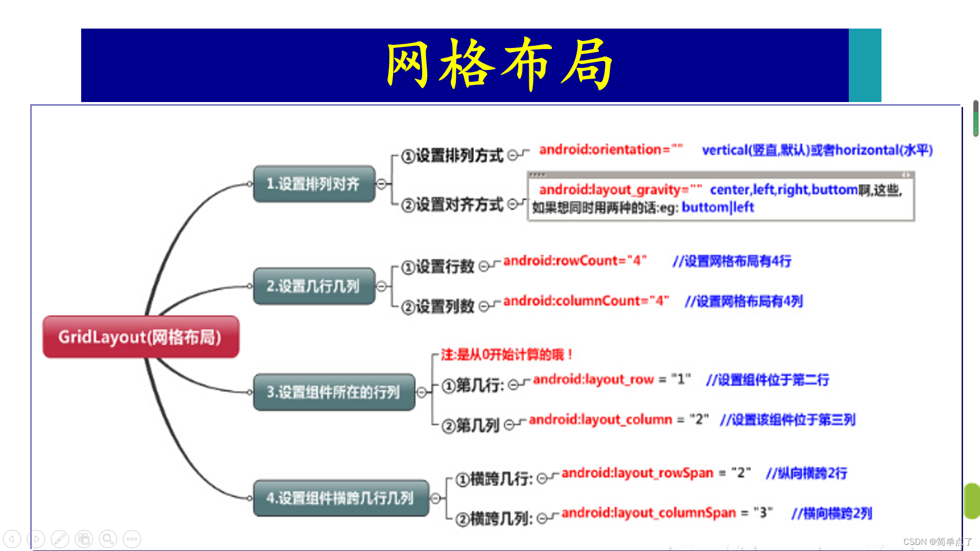
5.GridLayout
5.1简介
1.简介:网格布局GridLayout:用一组无限细的直线将绘图区域分成行,列和单元,并指定控件的显示区域和控件在该区域的显示方式。
2.网格布局可以干什么?
- 可以自己设置布局中控件的排列方式
- 可以自定义网格布局有多少行,多少列
- 可以直接设置控件位于某行某列
- 可以设置控件横跨几行或者几列
5.2属性
1.常见的属性:
几行几列。rowCount几行,columnCount几列。
列和行都是从0开始计数的。
可以进行列或者是行的合并。
2.注意:
- android:gravity:这个是针对控件里的元素来说的,用来控制元素在该控件里的显示位置。例如,在一个Button按钮控件中设置如下两个属性,android:gravity="left"和android:text="提交",这时Button上的文字“提交”将会位于Button的左部。
- android:layoutgravity:这个是针对控件本身而言,用来控制该控件在包含该控件的父控件中的位置。同样,当我们在Button按钮控件中设置android:layoutgravity="left"属性时,表示该Button按钮将位于界面的左部。
5.3案例1-计算器
1.GridLayout1Activity.java
第一步:设置成主启动类
<!--        网格布局-计算器-->
        <activity android:name=".GridLayout1Activity" android:exported="true">
            <intent-filter>
                <action android:name="android.intent.action.MAIN" />

                <category android:name="android.intent.category.LAUNCHER" />
            </intent-filter>
        </activity>
第二步:设置自定义的组件样式。
好处:可以实现样式的复用。
(1)btn的背景颜色
- drawable/btn_bgc.xml
<?xml version="1.0" encoding="utf-8"?>
<shape xmlns:android="http://schemas.android.com/apk/res/android">
<!--btn的背景颜色-->
<!--    solid设置的是填充的颜色-->
    <solid android:color="#fff"/>
</shape>
(2)btn的样式
- styles.xml
<?xml version="1.0" encoding="utf-8"?>
<resources>
    <style name="textview3">
        <item name="android:textSize">30dp</item>
        <item name="android:textColor">#0578EC</item>
        <item name="android:layout_height">wrap_content</item>
        <item name="android:layout_width">wrap_content</item>
<!--        指定自定义的点击样式-->
        <item name="background">@drawable/btn_bgc</item>

          </style>
</resources>
第三步:创建布局文件
先看效果图:

推测布局文件的组成:
- 6行,4列。rowCount="6"。columnCount="4"
- 水平排列。orientation="horizontal"
<?xml version="1.0" encoding="utf-8"?>
<LinearLayout xmlns:android="http://schemas.android.com/apk/res/android"
    android:layout_width="match_parent"
    android:layout_height="match_parent"
    android:background="#ffffff"
    >
<!--    网格布局-->
<GridLayout
    android:layout_width="match_parent"
    android:layout_height="wrap_content"
    android:rowCount="6"
    android:columnCount="4"
    android:orientation="horizontal"
    >
<!--    第一行:横跨4列-->
    <EditText
        style="@style/textview3"
        android:layout_columnSpan="4"
        android:layout_width="match_parent"
        android:layout_height="wrap_content"
        android:textSize="50dp"/>
<!--fill_horizontal横向填充-->
<!--    第二行-->
    <Button style="@style/textview3"
        android:text="清除"
        android:layout_columnSpan="2"
        android:layout_gravity="fill_horizontal"/>

    <Button style="@style/textview3"
        android:text="回退"
        android:layout_columnSpan="2"
        android:layout_gravity="fill_horizontal"/>
<!--第三行-->
    <Button style="@style/textview3"
        android:text="7"
        android:layout_columnWeight="1"
        android:layout_rowWeight="1"
        />
    <Button style="@style/textview3"
        android:text="8"
        android:layout_columnWeight="1"
        android:layout_rowWeight="1"
        />
    <Button style="@style/textview3"
        android:text="9"
        android:layout_columnWeight="1"
        android:layout_rowWeight="1"
        />
    <Button style="@style/textview3"
        android:text="÷"
        android:layout_columnWeight="1"
        android:layout_rowWeight="1"
        />

    <Button style="@style/textview3"
        android:text="4"
        android:layout_columnWeight="1"
        android:layout_rowWeight="1" />
    <Button style="@style/textview3"
        android:text="5"
        android:layout_columnWeight="1"
        android:layout_rowWeight="1"
        />
    <Button style="@style/textview3"
        android:text="6"
        android:layout_columnWeight="1"
        android:layout_rowWeight="1"
        />
    <Button style="@style/textview3"
        android:text="X"
        android:layout_columnWeight="1"
        android:layout_rowWeight="1"
        />

    <Button style="@style/textview3"
        android:text="1"
        android:layout_columnWeight="1"
        android:layout_rowWeight="1"
        />
    <Button style="@style/textview3"
        android:text="2"
        android:layout_columnWeight="1"
        android:layout_rowWeight="1"
        />
    <Button style="@style/textview3"
        android:text="3"
        android:layout_columnWeight="1"
        android:layout_rowWeight="1"
        />
    <Button style="@style/textview3"
        android:text="-"
        android:layout_columnWeight="1"
        android:layout_rowWeight="1"
        />

    <Button style="@style/textview3"
        android:text="."
        android:layout_columnWeight="1"
        android:layout_rowWeight="1"
        />
    <Button style="@style/textview3"
        android:text="0"
        android:layout_columnWeight="1"
        android:layout_rowWeight="1"
        />
    <Button style="@style/textview3"
        android:text="="
        android:layout_columnWeight="1"
        android:layout_rowWeight="1"
        />
    <Button style="@style/textview3"
        android:text="+"
        android:layout_columnWeight="1"
        android:layout_rowWeight="1"
        />

</GridLayout>
</LinearLayout>
5.4常用属性
参考博客:https://www.jianshu.com/p/2488847f9013
1.常用属性
- android:columnCount:设置布局管理器的列数,控件会自动换行进行排列;
- android:rowCount:设置布局管理器的行数
- android:layout_row:设置控件所在的行
- android:layout_column:设置控件所在的列
- android:layout_rowSpan:跨越的行数
- android:layout_columnSpan:跨越的列数
- layout_gravity=“fill”:该控件填满所跨越的整行或整列
- layoutgravity=“fillhorizontal”:该控件填满所跨越的整行
2.属性补充
- android:layout_columnWeight=“1“ 列权重
- android:layout_rowWeight=”1”行权重
例如:可以实现对列的扩充。


5.5案例2-计算器2
只是对5.4属性的一个简单的回顾。
布局文件
<?xml version="1.0" encoding="utf-8"?>
<GridLayout xmlns:android="http://schemas.android.com/apk/res/android"
    xmlns:tools="http://schemas.android.com/tools"
    android:id="@+id/GridLayout1"
    android:layout_width="wrap_content"
    android:layout_height="wrap_content"
    android:columnCount="4"
    android:orientation="horizontal"
    android:rowCount="7" >

    <TextView
        android:layout_columnSpan="4"
        android:layout_gravity="fill"
        android:layout_marginLeft="5dp"
        android:layout_marginRight="5dp"
        android:background="#FFCCCC"
        android:text="0"
        android:textSize="50sp" />

    <Button
        android:layout_columnSpan="2"
        android:layout_gravity="fill"
        android:text="回退" />

    <Button
        android:layout_columnSpan="2"
        android:layout_gravity="fill"
        android:text="清空" />

    <Button android:text="+" />

    <Button android:text="1" />

    <Button android:text="2" />

    <Button android:text="3" />

    <Button android:text="-" />

    <Button android:text="4" />

    <Button android:text="5" />

    <Button android:text="6" />

    <Button android:text="*" />

    <Button android:text="7" />

    <Button android:text="8" />

    <Button android:text="9" />

    <Button android:text="/" />

    <Button android:text="." />

    <Button android:text="0" />

    <Button android:text="=" />
    <Button android:text=" 计算"
        android:layout_columnSpan="2"
        android:layout_column="2"
        android:layout_row="6"
        android:layout_gravity="fill"/>

</GridLayout>
效果图:

6.ConstraintLayout
6.1简介
1.简介:ConstraintLayout非常适合使用可视化的方式来编写界面,但并不太适合使用XML的方式来进行编写。通过托拉拽的方式即可完成。
参考博客:http://blog.csdn.net/guolin_blog/article/details/53122387
6.2案例
实现的过程完全是靠的拖拽的形式。

拖拽形成的代码:
<?xml version="1.0" encoding="utf-8"?>
<androidx.constraintlayout.motion.widget.MotionLayout xmlns:android="http://schemas.android.com/apk/res/android"
    xmlns:app="http://schemas.android.com/apk/res-auto"
    xmlns:tools="http://schemas.android.com/tools"
    android:layout_width="match_parent"
    android:layout_height="match_parent"
    app:layoutDescription="@xml/activity_main_scene"
    tools:context=".MainActivity"
    tools:layout_editor_absoluteX="0dp"
    tools:layout_editor_absoluteY="0dp">

    <Button
        android:id="@+id/button6"
        android:layout_width="wrap_content"
        android:layout_height="wrap_content"
        android:text="Button"
        app:layout_constraintEnd_toEndOf="parent"
        tools:layout_editor_absoluteY="364dp" />

    <EditText
        android:id="@+id/editTextTextPersonName2"
        android:layout_width="wrap_content"
        android:layout_height="wrap_content"
        android:ems="10"
        android:inputType="textPersonName"
        android:text="Name"
        tools:layout_editor_absoluteX="101dp"
        tools:layout_editor_absoluteY="217dp" />

    <EditText
        android:id="@+id/editTextTextPersonName3"
        android:layout_width="wrap_content"
        android:layout_height="wrap_content"
        android:ems="10"
        android:inputType="textPersonName"
        android:text="Name"
        tools:layout_editor_absoluteX="96dp"
        tools:layout_editor_absoluteY="166dp" />
</androidx.constraintlayout.motion.widget.MotionLayout>
7.实战案例
QQ登录界面的设计。
