WPF 简单的ComboBox自定义样式。
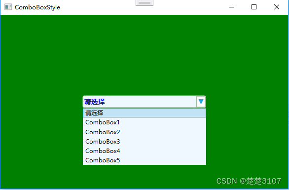
先看下效果图,是不是自己想要的效果,点击之前:

点击下拉框之后:
好,如果满足自己的需求就继续往下看。如何制作一个简单的ComboBox样式。 先分解一下ComboBox的构成。由三部分组成,1 TextBlock,2 ToggleButton,3 Popup组成。如下图:

那么分别作出三个控件的样式,组合在一起,就是一个简单的Combobx样式了。首先看一下ToggleButton的样式:
 <ControlTemplate x:Key="MyToggleBtnStyle"
                         TargetType="ToggleButton">
            <Border Name="MyBorder"
                    Background="AliceBlue"
                    BorderThickness="1"
                    BorderBrush="LightGray">
                <Path Name="MyPath"
                      Fill="LightGray"
                      Height="10"
                      Width="10"
                      Data="M29.917 8.6c-0.158-0.356-0.509-0.6-0.917-0.6h-26c-0.552 0-1 0.448-1 1 0 0.263 0.102 0.502 0.268 0.681l-0.001-0.001 13 14c0.183 0.197 0.444 0.32 0.733 0.32s0.55-0.123 0.732-0.319l0.001-0.001 13-14c0.166-0.178 0.267-0.417 0.267-0.68 0-0.145-0.031-0.282-0.086-0.406l0.003 0.006z"
                      Stretch="Fill">
                </Path>
            </Border>
            <ControlTemplate.Triggers>
                <Trigger Property="IsMouseOver" Value="True">
                    <Setter TargetName="MyPath" Property="Fill" Value="#FF22A0E2"></Setter>
                    <Setter TargetName="MyBorder" Property="Background" Value="White"></Setter>
                </Trigger>
            </ControlTemplate.Triggers>
        </ControlTemplate>
主要就是定义2个地方。
1:一个方向向下的一个三角形。
2:鼠标滑过是的显示颜色。
TextBlock的显示样式:它被定义在了ComboBox样式中了。Combobox左边是TextBlock,右边是ToggleButton。
<ControlTemplate TargetType="ComboBox">
<Grid>
<Grid.ColumnDefinitions>
<ColumnDefinition Width="7*"/>
<ColumnDefinition Width="3*" MaxWidth="20"/>
</Grid.ColumnDefinitions>
<Border Grid.Column="0"
BorderBrush="LightGray"
BorderThickness="1,1,0,1"
Background="AliceBlue" CornerRadius="3 0 0 3">
<TextBox x:Name="myTxt"
Text="{TemplateBinding Text}"
Background="Transparent"
BorderThickness="0"
VerticalContentAlignment="Center"
FontSize="14"
FontWeight="Bold"
Foreground="Blue"/>
</Border>
<Border Grid.Column="1"
BorderBrush="LightGray"
BorderThickness="1" CornerRadius="0 3 3 0">
<ToggleButton Content="" IsChecked="{Binding Path=IsDropDownOpen, Mode=TwoWay, RelativeSource={RelativeSource TemplatedParent}}"
ClickMode="Press"
Template="{StaticResource MyToggleBtnStyle}"></ToggleButton>
</Border>
</Grid>
</ControlTemplate>它是定义在ComboBox样式资源中的。对它的显示修改有几个地方。
1:CornerRadius。定义了左上,左下的圆角。CornerRadius="3 0 0 3" 它代表的意思是左上,右上,右下,左下。顺时针顺序的圆角角度。在把右边的ToggleButton 的CornerRadius="0 3 3 0" 右上,右下定义下圆角。这样整个ComboBox都是角度为3的圆角了。
Popup显示样式:基本没有改动,用原始的显示。
 <Popup Name="MyPopup"
                                   IsOpen="{TemplateBinding IsDropDownOpen}"
                                   Placement="Bottom">
                                <Border MinWidth="{TemplateBinding ActualWidth}"
                                        MaxHeight="{TemplateBinding MaxDropDownHeight}">
                                    <ScrollViewer MaxHeight="{TemplateBinding MaxDropDownHeight}"
                                                  HorizontalScrollBarVisibility="Auto"
                                                  VerticalScrollBarVisibility="Auto">
                                        <StackPanel Background="AliceBlue"
                                                    IsItemsHost="True"/>
                                    </ScrollViewer>
                                </Border>
                            </Popup>
好了。贴一下总的代码。总共两个页,一个xaml文件,一个.cs文件。
xmal:
<Window x:Class="ComboboxTest.MainWindow"
xmlns="http://schemas.microsoft.com/winfx/2006/xaml/presentation"
xmlns:x="http://schemas.microsoft.com/winfx/2006/xaml"
xmlns:d="http://schemas.microsoft.com/expression/blend/2008"
xmlns:mc="http://schemas.openxmlformats.org/markup-compatibility/2006"
xmlns:local="clr-namespace:ComboboxTest"
mc:Ignorable="d"
Title="ComboBoxStyle" Height="450" Width="800" Background="Green">
<Window.Resources>
<ControlTemplate x:Key="MyToggleBtnStyle"
TargetType="ToggleButton">
<Border Name="MyBorder"
Background="AliceBlue"
BorderThickness="1"
BorderBrush="LightGray">
<Path Name="MyPath"
Fill="LightGray"
Height="10"
Width="10"
Data="M29.917 8.6c-0.158-0.356-0.509-0.6-0.917-0.6h-26c-0.552 0-1 0.448-1 1 0 0.263 0.102 0.502 0.268 0.681l-0.001-0.001 13 14c0.183 0.197 0.444 0.32 0.733 0.32s0.55-0.123 0.732-0.319l0.001-0.001 13-14c0.166-0.178 0.267-0.417 0.267-0.68 0-0.145-0.031-0.282-0.086-0.406l0.003 0.006z"
Stretch="Fill">
</Path>
</Border>
<ControlTemplate.Triggers>
<Trigger Property="IsMouseOver" Value="True">
<Setter TargetName="MyPath" Property="Fill" Value="#FF22A0E2"></Setter>
<Setter TargetName="MyBorder" Property="Background" Value="White"></Setter>
</Trigger>
</ControlTemplate.Triggers>
</ControlTemplate>
<Style x:Key="MyCbbStyle" TargetType="ComboBox">
<Setter Property="BorderBrush" Value="#0e66fa"/>
<Setter Property="Template">
<Setter.Value>
<ControlTemplate TargetType="ComboBox">
<Grid>
<Grid.ColumnDefinitions>
<ColumnDefinition Width="7*"/>
<ColumnDefinition Width="3*" MaxWidth="20"/>
</Grid.ColumnDefinitions>
<Border Grid.Column="0"
BorderBrush="LightGray"
BorderThickness="1,1,0,1"
Background="AliceBlue" CornerRadius="3 0 0 3">
<TextBox x:Name="myTxt"
Text="{TemplateBinding Text}"
Background="Transparent"
BorderThickness="0"
VerticalContentAlignment="Center"
FontSize="14"
FontWeight="Bold"
Foreground="Blue"/>
</Border>
<Border Grid.Column="1"
BorderBrush="LightGray"
BorderThickness="1" CornerRadius="0 3 3 0">
<ToggleButton Content="" IsChecked="{Binding Path=IsDropDownOpen, Mode=TwoWay, RelativeSource={RelativeSource TemplatedParent}}"
ClickMode="Press"
Template="{StaticResource MyToggleBtnStyle}"></ToggleButton>
</Border>
<Popup Name="MyPopup"
IsOpen="{TemplateBinding IsDropDownOpen}"
Placement="Bottom">
<Border MinWidth="{TemplateBinding ActualWidth}"
MaxHeight="{TemplateBinding MaxDropDownHeight}">
<ScrollViewer MaxHeight="{TemplateBinding MaxDropDownHeight}"
HorizontalScrollBarVisibility="Auto"
VerticalScrollBarVisibility="Auto">
<StackPanel Background="AliceBlue"
IsItemsHost="True"/>
</ScrollViewer>
</Border>
</Popup>
</Grid>
</ControlTemplate>
</Setter.Value>
</Setter>
</Style>
</Window.Resources>
<Grid>
<StackPanel Orientation="Vertical"
HorizontalAlignment="Center"
VerticalAlignment="Center">
<Grid>
<StackPanel Orientation="Vertical"
HorizontalAlignment="Center"
VerticalAlignment="Center">
<ComboBox Name="myCbb"
Height="25"
Width="250"
DisplayMemberPath="Name"
SelectedValuePath="ID"
SelectedIndex="0"
Style="{StaticResource MyCbbStyle}"/>
</StackPanel>
</Grid>
</StackPanel>
</Grid>
</Window>
.cs
using System.Windows;

namespace FontTest
{
    /// <summary>
    /// MainWindow.xaml 的交互逻辑
    /// </summary>
    public partial class MainWindow : Window
    {
        public MainWindow()
        {
            InitializeComponent();
        }
    }

    public class CbbData
    {
        public string ID { get; set; }

        public string Name { get; set; }
    }
}
好了。一个ComboBox样式制作就介绍到这里,以后再介绍Button的自定义样式。